|
We were given this live project to design a poster for their indie comics purchasing app. key parts of the brief were that it should have a tablet on which comic covers could be dropped in, and it was suggested it have a retro 1950's element. It was agreed with the tutor that I could make this a primarily typographic job. However I did study 1950s advertisements for inspiration, and decided to reappropriate a painted image which allowed for a front-facing tablet without seeing only the backs of the figures. Another strength of this image was that in involved two people: images with a single figure can suggest loneliness, possibly best avoided given a stereotype for comics' readers. Also here, the two figures are not so involved with each other as to exclude the viewer from the scene. The presence of spare seats in the image also seemed to fit unstated elements of the job: which is a fairly new service aiming to attract people and expecting to be popular. The spare seats suggests people are invited and expected! The poster was specified as A2 size, but there did not appear to be a setting for this, so I did in A3, and simply increased the resolution. Stage one was I redrew the image as line drawing to give it more of 'comics inking' look, from the watercolour of the original. I also added a tablet (which will sit on a chair not shown here). I created different elements on different layers, in case I want to, for example, reposition them in relation to each other. 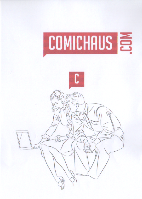 I then decided it would suit the brief, and appeal to their market better if I made the male figure wear a space suit. Note that the line colours showing here is just a device to help me keep track of what layer each element is on. 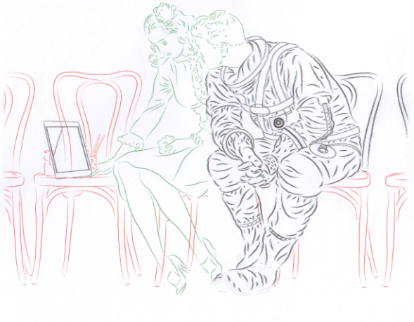 The brief involved using the Comichaus logo and the 'C' icon for the app. I wanted to add some additional text, to make the poster more typographically interesting, and looked for a 1950s font. I found, one called Life Savers, mimicking (presumably hand-lettered) text used on 1950s adverts for the American sweets. This seemed a good choice, as it has a hand-lettered look (image below - top), like word balloons, and the serif style contrasts with the Comichaus logo font. I looked for a more space-age/retro sci-fi style for the astronaut, as seen below, bottom.. I also tried a few variations of text justification, resizing and spacing. I decided to have the word 'at' be (as far as possible) lead horizontally to the logo so that it read as part of the dialogue. 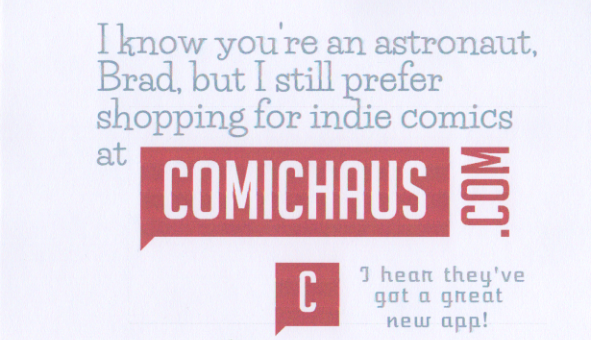 The extra font didn't look good for dialogue, and generally seemed to over complicate it, so I changed it to Life Savers. In Illustrator I created some speech bubbles. the 'rounded square' style seemed to fit with the 'space-age' design 1950s look. The white (rather than transparent) background of the Comichaus logo meant I couldn't place it in front of the balloon without it obscuring some of it, so I placed in initially behind the balloon. I did spend time tweaking the relationships between the logo and balloons, for example to have the word 'com' align with the end of the word 'comics' above, and the right hand edge of the balloon below. I shaped the balloon tails to reflect the stylised ones on the Comichaus logo. I made the balloons and text grey to ensure that the Comichaus logo was more visible in the distance. Comichaus wanted to put into the poster images of some of the comics available, so I used the background space (mimicking the source image), to drop in some images of the titles promoted on their web site. Converting the line layers to colours (to distinguish them while working) as shown above did cause problems when I converted them back to black - they appeared grey. I was able to fix this by dropping duplicate layers on top and using the 'darken' setting. 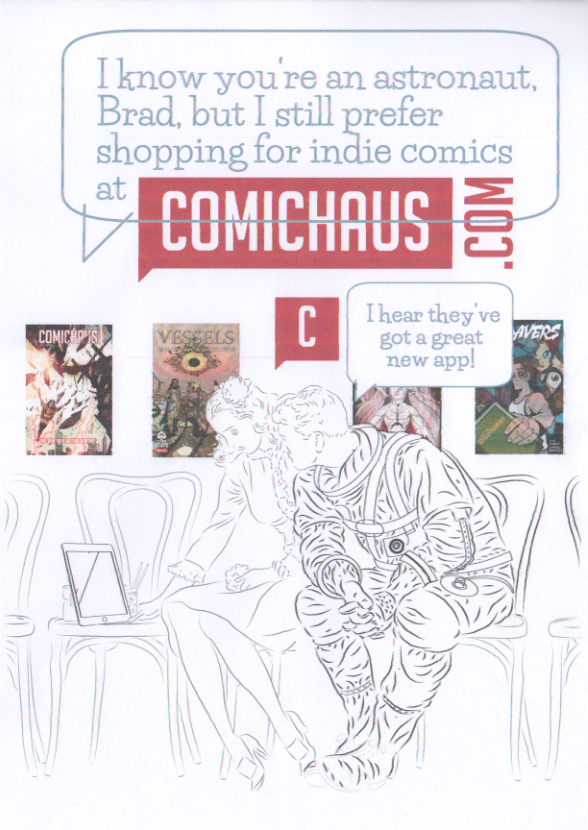 I flatted in colours in Manga Studio, by creating a bitmap version of the 'inked' image, and a colour flat layer below, as seen in progress below. Note that the striping effect is a printer fault on this scanned proof and does not affect the job as submitted. 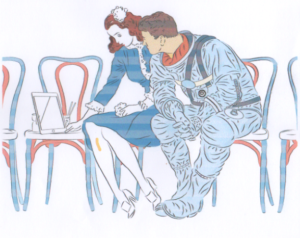 The version below shows some further work on various details. I've swapped around some of the comic covers to better enhance the overall composition, For example, the cover behind the man's shoulder was too noticeable, so I replaced it with one with more even tone to be less distracting, and the cover now behind the woman's head, seemed to suggest she was a mentally immersed in the story world. I also worked out how to use the magic wand tool to select and delete the white background of the Comichaus logo, and moved it to in front of the balloon. 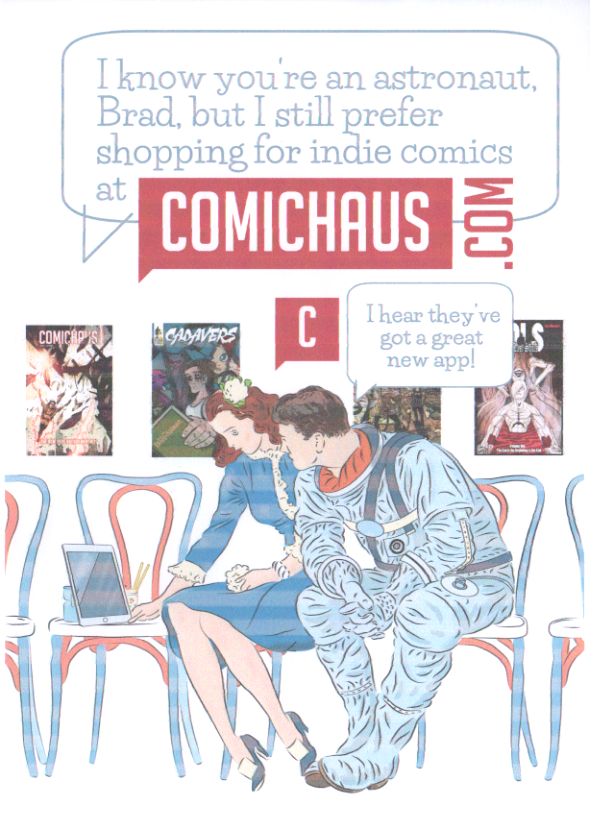 theseI made some enhancements to the colour on the figures by using the magic wand tool, and hightlight/shade functions. I purchased some watercolour brushes to and used these to create some subtle watercolour details to pitch the image between the watercolour original and a more 'comics' look. 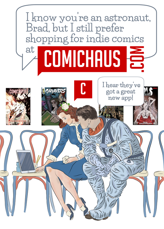
0 Comments
Leave a Reply. |
AuthorGraham Johnstone ~ Master of Design - Comics and Graphic Novels student 2016-17 Archives
August 2017
Categories |
 RSS Feed