|
I've now set this up and 'placed' the Photoshop files of my comic from semester 1 into the pages.
Initially I had problems with the 'place' function. the intended times would appear in the 'links' menu but nothing was visible. I'm thinking the problem may be to do with use of Dropbox: the files had perhaps not finished syncing to Dropbox. In any event it worked fine with earlier images already saved to Dropbox. I did some work to compose a cover with a combination of images overlaid on top of each other, however this proved difficult, and I'm now thinking it would be best to do that in Photoshop, and then just put it together.
0 Comments
Tangled Tales is an interactive book I produced some years ago. It's interactive nature required that it be hand-made in tiny editions. I had more recently commissioned a web designer to create an electronic version for my web site, and then as an ebook. Due to the unique interactivity, it was only viable to do for iTunes. As part of the Comics Production module I am publishing this to Apple's iTunes store - the only platform that can take the interactivity. I have sought recommendations for the cover blurb from some creators with a particular interest in such work people: Matt Madden (author of 99 Ways to Tell a Story), and Jason Shiga (creator of Meanwhile and other interactive comics/apps). I've also contacted artist Ed Pinsent who gave me a quote I used on original publication to check he is happy for me to reuse this, or an amended version. _________________________________ I have written a blurb, as follows:
‘Tangled Tales is a beguiling sequence of poetic strips and perhaps the earliest example I have encountered of its type: the rigorous permutational structure... yields dreamy, seemingly chance-based results’. We were given this live project to design a poster for their indie comics purchasing app. key parts of the brief were that it should have a tablet on which comic covers could be dropped in, and it was suggested it have a retro 1950's element. It was agreed with the tutor that I could make this a primarily typographic job. However I did study 1950s advertisements for inspiration, and decided to reappropriate a painted image which allowed for a front-facing tablet without seeing only the backs of the figures. Another strength of this image was that in involved two people: images with a single figure can suggest loneliness, possibly best avoided given a stereotype for comics' readers. Also here, the two figures are not so involved with each other as to exclude the viewer from the scene. The presence of spare seats in the image also seemed to fit unstated elements of the job: which is a fairly new service aiming to attract people and expecting to be popular. The spare seats suggests people are invited and expected! The poster was specified as A2 size, but there did not appear to be a setting for this, so I did in A3, and simply increased the resolution. Stage one was I redrew the image as line drawing to give it more of 'comics inking' look, from the watercolour of the original. I also added a tablet (which will sit on a chair not shown here). I created different elements on different layers, in case I want to, for example, reposition them in relation to each other. 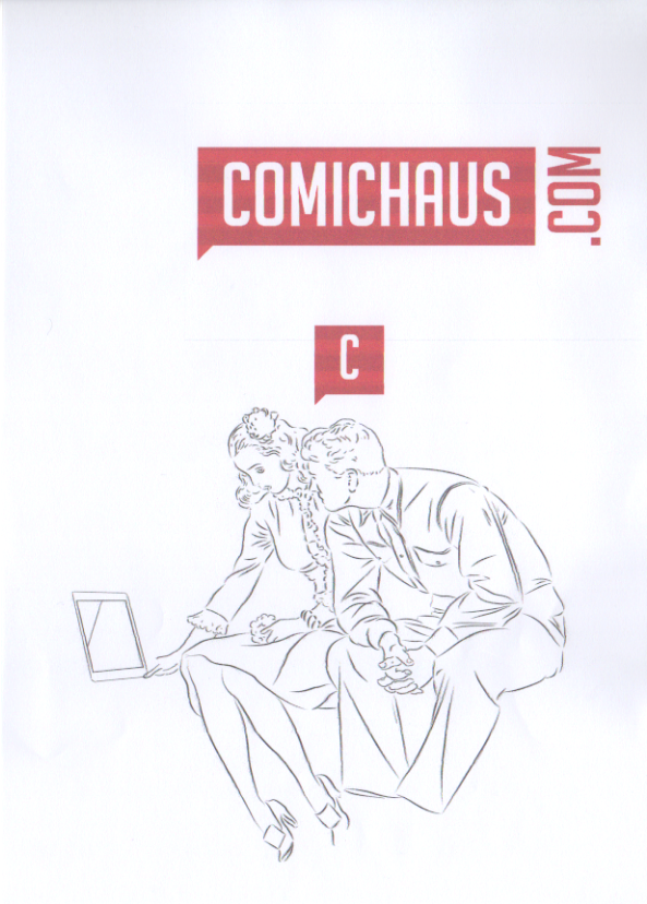 I then decided it would suit the brief, and appeal to their market better if I made the male figure wear a space suit. Note that the line colours showing here is just a device to help me keep track of what layer each element is on. 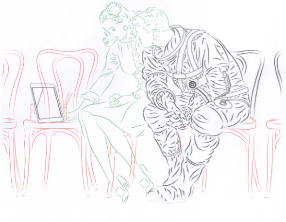 The brief involved using the Comichaus logo and the 'C' icon for the app. I wanted to add some additional text, to make the poster more typographically interesting, and looked for a 1950s font. I found, one called Life Savers, mimicking (presumably hand-lettered) text used on 1950s adverts for the American sweets. This seemed a good choice, as it has a hand-lettered look (image below - top), like word balloons, and the serif style contrasts with the Comichaus logo font. I looked for a more space-age/retro sci-fi style for the astronaut, as seen below, bottom.. I also tried a few variations of text justification, resizing and spacing. I decided to have the word 'at' be (as far as possible) lead horizontally to the logo so that it read as part of the dialogue. 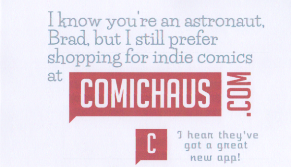 The extra font didn't look good for dialogue, and generally seemed to over complicate it, so I changed it to Life Savers. In Illustrator I created some speech bubbles. the 'rounded square' style seemed to fit with the 'space-age' design 1950s look. The white (rather than transparent) background of the Comichaus logo meant I couldn't place it in front of the balloon without it obscuring some of it, so I placed in initially behind the balloon. I did spend time tweaking the relationships between the logo and balloons, for example to have the word 'com' align with the end of the word 'comics' above, and the right hand edge of the balloon below. I shaped the balloon tails to reflect the stylised ones on the Comichaus logo. I made the balloons and text grey to ensure that the Comichaus logo was more visible in the distance. Comichaus wanted to put into the poster images of some of the comics available, so I used the background space (mimicking the source image), to drop in some images of the titles promoted on their web site. Converting the line layers to colours (to distinguish them while working) as shown above did cause problems when I converted them back to black - they appeared grey. I was able to fix this by dropping duplicate layers on top and using the 'darken' setting. 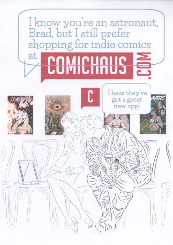 I flatted in colours in Manga Studio, by creating a bitmap version of the 'inked' image, and a colour flat layer below, as seen in progress below. Note that the striping effect is a printer fault on this scanned proof and does not affect the job as submitted. 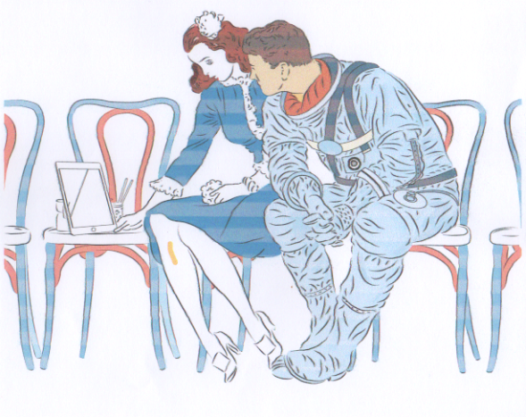 The version below shows some further work on various details. I've swapped around some of the comic covers to better enhance the overall composition, For example, the cover behind the man's shoulder was too noticeable, so I replaced it with one with more even tone to be less distracting, and the cover now behind the woman's head, seemed to suggest she was a mentally immersed in the story world. I also worked out how to use the magic wand tool to select and delete the white background of the Comichaus logo, and moved it to in front of the balloon. 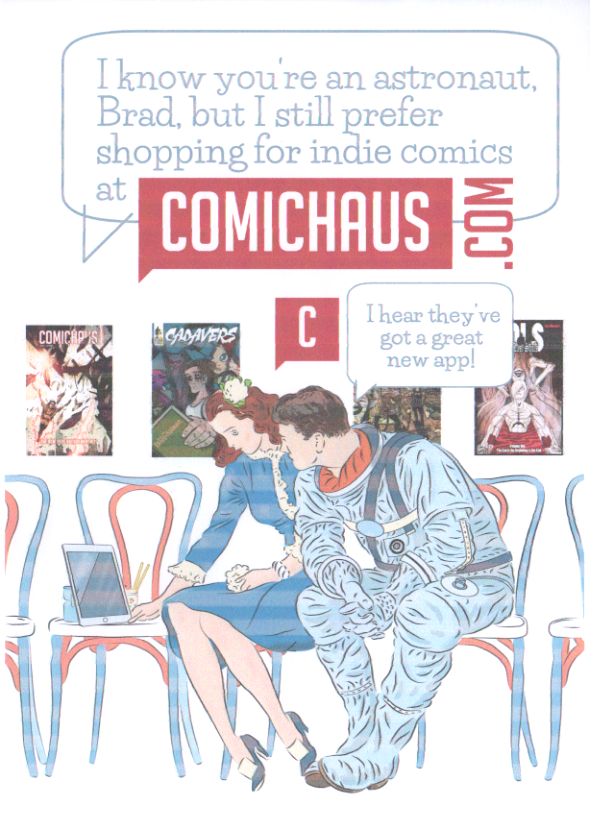 theseI made some enhancements to the colour on the figures by using the magic wand tool, and hightlight/shade functions. I purchased some watercolour brushes to and used these to create some subtle watercolour details to pitch the image between the watercolour original and a more 'comics' look. 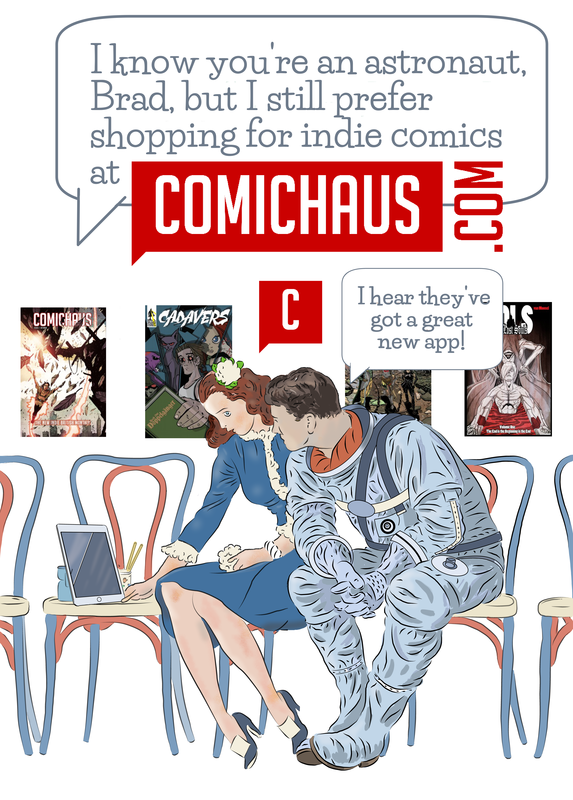 The first story for this will be about early renaissance perspective pioneer Paolo Uccello. During semester one I had begun a comic about him with a view to submitting for something that required it to be four pages. This was tight for the story, resulting in 4 A4 pages, each with 12 panels.
I will rework this, using bigger panels, and repaginated to fit the same size asa the Vermeer pages from semester one. I have met with Jobs and Business Glasgow re preparing a Business Plan, and they have given me a template to work from. The basis of this is my being a sole trader as comic artist/graphic novelist.
For the first semester I had produced a comic about 17th Century painter Vermeer. I had a whole book outlined, with a number of scenes written.
However, I had started to feel that project which was fairly traditional narrative and illustration was, perhaps constricting, and would not show off my artistic range and versatility. In discussion with the Course Coordinator, it was agreed that I instead produce a number of short pieces on different artists, that would be gathered as an anthology. I had been unclear on the blog expectations/arrangements for this semester - hence the lack of posts to date.
I will make posts from this point that retrospectively show my thinking process. In the first semester I had problems with the (communal) internet at my studio, which caused problems in updating my block. attempts to upload images would time out, and eventually the internet failed completely/ This meant I had to use my mobile to upload to final work for creating Comics. However, a new internet system has been installed, so hopefully there will be no significant problems with that this semester. |
AuthorGraham Johnstone ~ Master of Design - Comics and Graphic Novels student 2016-17 Archives
August 2017
Categories |
 RSS Feed