|
I'm now working on panel 3, at the bottom right of this two-page spread. I've spent a bit of time with the 3D models trying to find the right pose for Uccello, who was sleeping on the floor in the previous panel. I first of all tried working from the pose from the previous panel (post immediately below), which I had been quite pleased with. Using reference shots on the internet, I reposed this to suggest him getting up from the position he had been in. 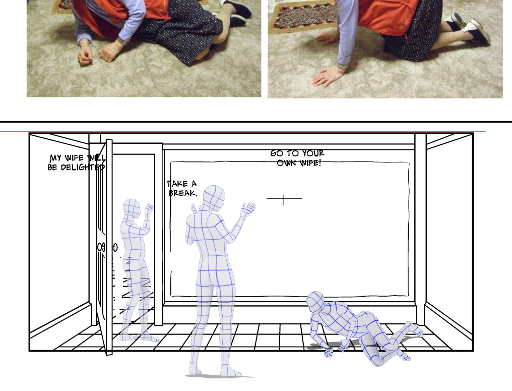 While that looked good in some ways, it didn't seem to fit with my idea of the time elapsed from the previous panel, where i was thinking that the patron ad time to take in the artwork eve before speaking the three lots of text above. I other words it doesn't make sense for Uccello to still be on the ground at that point, given he is with a patron, and as we have established, powerful man. I tried him further in the process of sitting up, and yawning. 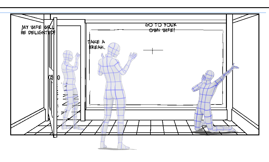 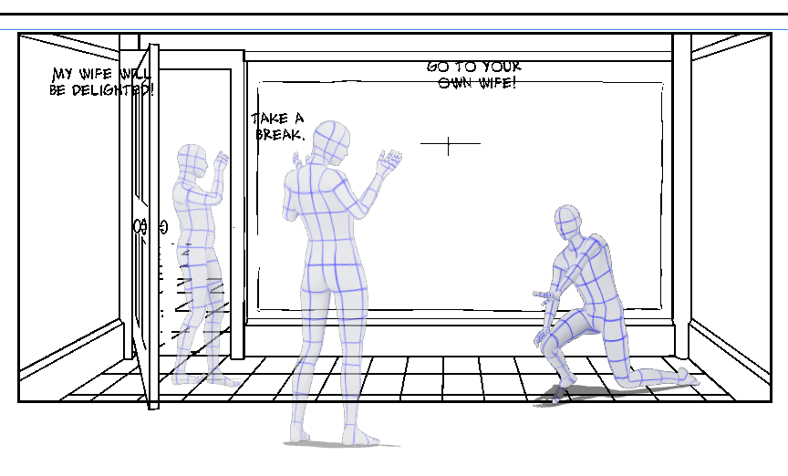 Even though he has just woken up, such a theatrical yawn in from of a patron, who was already dissatisfied with him, might seem like a deliberate provocation.
The last one might do, with a bot o tweaking. perhaps I am over-thinking this, I haven't agonised this much over other panels. but this spread is the climax of the story, so genuinely important. It might help to move some of the word balloons towards the right, which will reduced the experience of time passing before he has stood up. that's to say, the word ballots will them appear to happen after the moment Uccello is picture, because of the tradition of reading left to right. Of course, if I just drew Uccello stood up, it's unlikely many people would see anything wrong with that, but I do want to get the most out of this panel. I think I'll work on the other figures/other pages, and come back to this.
0 Comments
I have done some further work on this double-page spread. I have inked over the 3D models. I used a pencil layer to very roughly sketch in Uccello's clothes. I don't do 'full pencils' - that seems to defeat the purpose of doing it on the computer. I have also added in parts of the drawn image, which corresponds to Uccello's actual painting (first in the series of three) - those shown are all pasted in from earlier pages, where we seen them as studies, or else imaginary images, as seen on Page 1 where Uccello is imagining the scene as described by various witnesses. It doesn't seem to read as elegantly as the 3D models over a photo of the actual painting ( as previously posted), it looks a bit messy and cluttered, but I hope that will be solved simply by colouring the figures and room. The figures in Uccello's drawing won't be in colour. I'll omit the drawing when I create the bitmap inks layer. So by these methods i should be able to make the drawing read as a discrete element in the overall composition. Note that this is a double page spread - so intended to be seen rather bigger than it appears here. This spread doesn't fall in the centre pages, so it'll be printed on two separate sheets, so i avoided having any of the figures cross the centre line/join. It seems an easy thing to paste components together, but these were all drawn separately in different line styles and weights, and different scales, so there is a lot of work in placing them accurately, so I can build up the rest of Uccello's careful composition around them. Also I've had to spend some time getting the relative tonal balances looking right. The next panel (bottom left) will show an essentially complete drawing of the finished composition, that i will make by adding to the in progress version in the main panel. I actually have some more finished drawings of the riders (used individually on earlier pages) that I kept back to use in panel two. 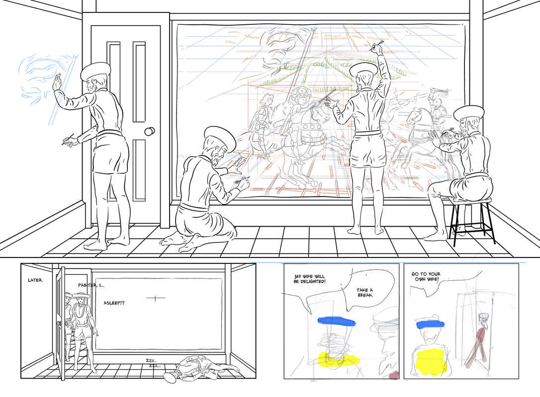 I was pleased with the composition of panel two - it's important here to let the reader see the whole drawing on the wall, and I though this was quick and elegant solution - Uccello on the floor asleep fits well with the story - after Rocco's initially menacing but ultimately helpful intervention, I am trying to suggest in this page that Uccello is in an almost manic state, obsessed with getting his vision down, and working until he dropped. Initially I had omitted Rocco from this panel, but I felt that in narrative terms, as this is the climax of the story, he should appear. It wasn't easy to fit him into the scene: Salimbini needs to have just entered, to convey the precise moment where he sees the sleeping Uccello, but has not yet noticed the drawing. It wouldn't be consistent with their relationship for Rocco to enter before his master, so the only option was to glimpse Rocco in the doorway behind Salimbini. I tried to create the impression that Rocco was trying to catch a glimpse into the room over his master's shoulder. The composition was perhaps slightly better before I added Rocco, but given the difficulty, I think it works pretty well. I'll see if I can do something with the colouring or tone layer to keep Rocco in the background, although his costume being less colourful than his masters may achieve that in itself. I haven't entirely worked out panel 3, but I think it would have a good symmetry to make it a wide panel to match panel 2. I will show Uccello waking/sitting up, Salimbini admiring the drawing. If I can for it all in, I will have Rocco slightly doff (or at least touch) his hat to Uccello, in ackowledgement of the latter's progress, the success of Rocco's intervention, and to suggest some sort of 'in it together' bond between these two. UPDATE I had a nagging sense that the sleeping Uccello in panel 2 was reminiscent of a classic figure from art - I've just realised it's this painting of the death of the poet Chatterton, by Henry Wallis. 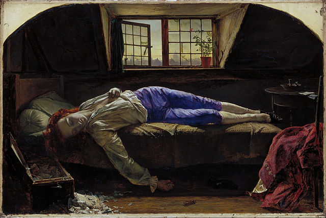 While I was happy with the 'Alex Toth' lettering font, and balloon style, the letters seemed a bit too close together (possibly to do with the default settings on Manga Studio 5) and the tutor had suggested some further work on getting the spacing right. I increased the line spacing from 0 to 1.5 (although it's upper case, the hand-written aesthetic means that some letters are slightly raised or lower, and in particular the 'M's have long tails that were a bit too close to the row below. I increased the character spacing from 0 to 1. I quickly resized the balloons to accommodate the more widely space text, but this means some of the balloon tails need adjusted. This same page, with the lettering in it's previous state, can be seen, for comparison, below on the 'Page 7' post from 19/7/2017. 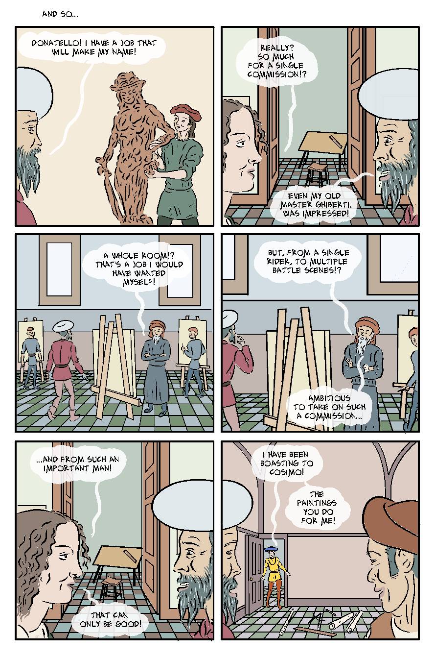 I also applied the same lettering settings to a page which has a different style of balloons. Looking at this now, the above style looks better. I think it's perhaps to do with the more rigid edges on the balloons below clashing with the looser lettering style, and in particular it's variation of vertical position. 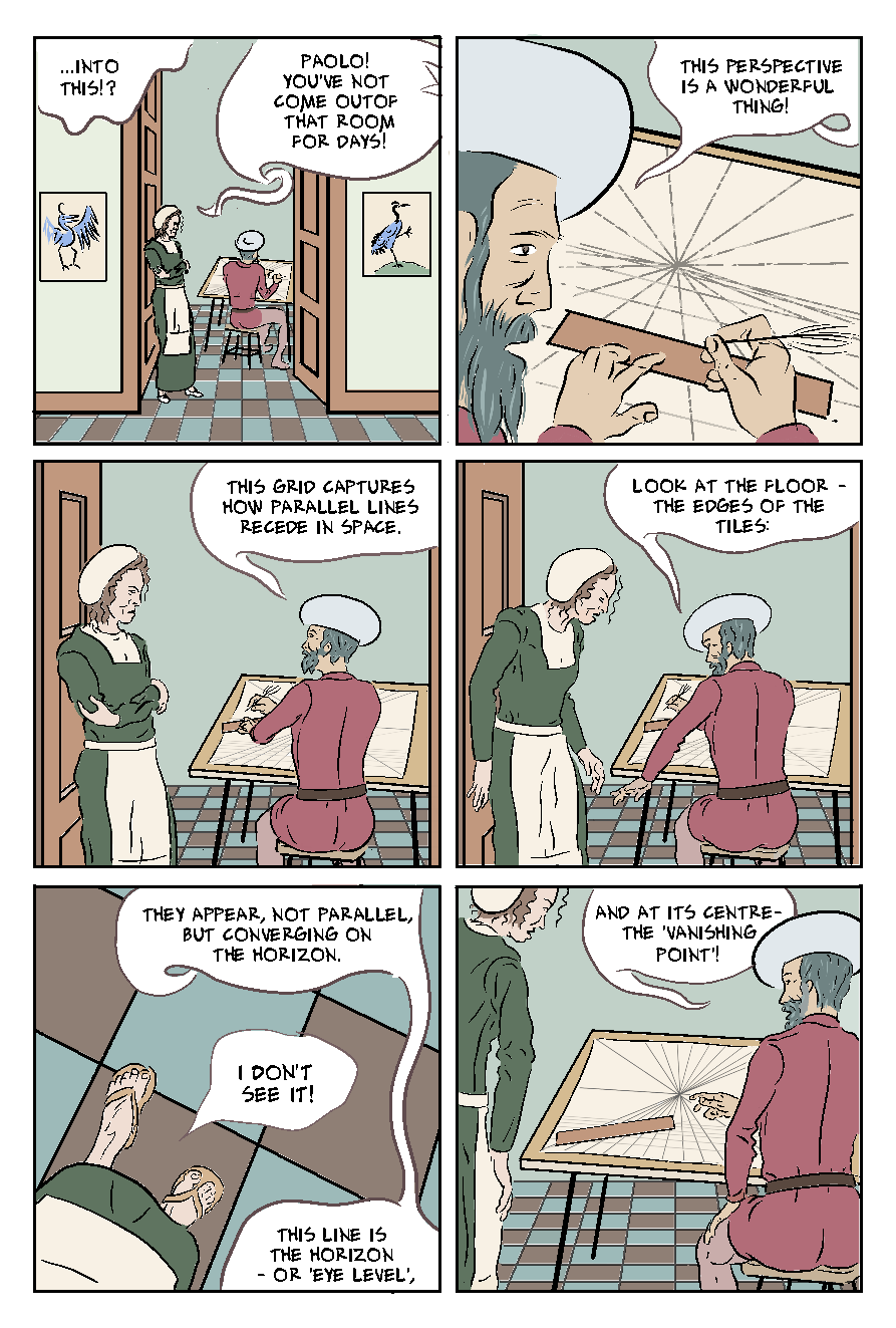 Below I changed the balloons to the type I preferred on page 6, as posted previously. This generally works better, though I think I can still finesse th pacing and edges of some of the balloons.  There were still a couple of methodological issues though. In panel five the double balloon is Uccello speaking, which hopefully the rider can be clear about because his wife's balloon has a tail pointing toward her - it was hard to find a place where a tail could end, because going to the edge of the panel to the right, meant it was going towards the figure o his wife in panel 6. I tried running it along the lower part of panel 6, up to Uccello, but that didn't look right either. Also, the text 'into this?' continues Uccello's unspoken thought from the previous page, and this doesn't work as well as version one (top) where it is clearly a thought bubble, distinct from the word balloons. I'll need some more wrought/work on that.
The borderless balloons and tails do tend to look better where they are on a flat colour, as in panels 3, 4 and 6, above, and less well when they are over drawn details. I've posted previously about how upgrading to Manga Studio 5 seemed to slow down my graphics table to the point of unusuability, and I eventually got round this with an app that let me use my iPad Pro and Apple Pencil in lieu of a graphics tablet. This does have an additional advantage that I can also do this on my home Mac, which I'd been doing, due to a few days of not feeling well (and then just being on a roll). When I did go back to my studio, I found I'd left my Apple Pencil at home. I was able to work without this to copy/paste/amend backgrounds, and compose the picture with 3D models (see post immediately below), however I had to hold fire on the inking.
The other problem I'd had at my studio, was slow, interrupted, and eventually kaput internet. This was particularly a nuisance in terms of saving work to Dropbox to access at home. The internet is working now, but often my latest versions of pages are not saved. For example, on page 20 (see post immediately below) I had completed the background and posed 3D models, which have obviously not updated to Dropbox. I had hoped to work from home today (still not feeling 100%, and it's a bit of variety), but it occurs to me that anything I do on that page might cause problems in that I'll have two versions each with changes I will want to keep. I guess I could get round it my saving aa a new page outside of Clip Studio's page management, and then copying over panels, etc - but it's still a nuisance, and there could be unforeseen issues. This is the only two page spread in the story. More correctly, it's a panel that is the full width of the two pages: this aspect ratio reflecting the paintings the story is about. After Uccello being stuck at the studies stage, and then released by Rocco's intervention (putting him into the armour, and -figuratively - into the battle), he finally pulls his work together into a single scene. The photo of Uccello's painting won't actually be in the scene, though elements of it (as seen on earlier pages) will be at various stages of drawing. I pasted it in here to get the dimensions right, and to help me compose the figures sensitively, in relation to it. I spend some time on arranging the figures, to get some variety in the poses and composition, without obscuring key details of the painting. I managed to place the centre right figure tidily between horse coming from each direction - it looks as he if is organising the battle, or conducting an orchestra. Putting him at the centre of the battle like this demonstrates his change - Rocco's intervention has moved him from a cautious distance to being (figuratively and compositionally) in the centre of the battle. I'll recreate Uccello's picture as a drawing at different stages. I plan to use part pencil and part ink effects, and have thew drawings more developed towards the right - so it reads, and seems to develop with time, left to right in comic tradition. The bottom panel on the left hand page will use the same shot, with the patron entering the door, and Uccello sleeping on the floor. There are a few reasons for this choice: it means the figures are not obscuring the (now largely complete) painting; the comic probably needs the closure of seeing the finished composition; and also we get to see the patron's shock at the sleeping Uccello, before he sees the completed drawing. I haven't fully worked out the panel (s) on the right yet, but making it a single panel would create a pleasingly symmetrical page design. It will show Uccello waking up, as the patron Salimbini looks at the painting, and Rocco gives Uccello a conspiratorial wink or tip of the hat (Rocco's gamble has paid off). 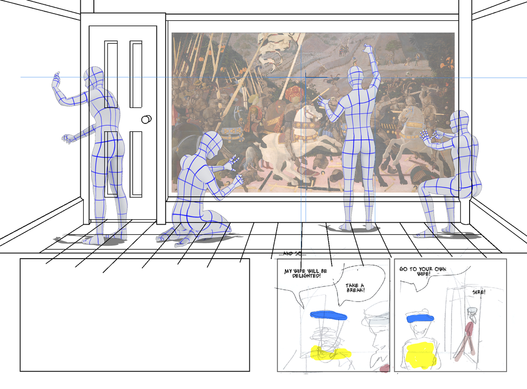 Page 7, one of the earliest pages I drew, and needing some reworking, before it was ready to colour. Thewrestrong aspects to the page, I wanted to keep though. In panels 1, 3 - 4, Uccello is asking for help from colleagues, and I deliberately put barriers between them. I did something similar between Uccello and his wife, with the door frame and the open doors creating a gap or void - I have literally put his (lack of) work between them. Panel 5 reprises this shot, but the wife, (excited by the rewards of this commission moves forward) , as he (further daunted by the challenge) moves back. I carefully composed them in relation to the door-frame to emphasise this. The next panel provides a further literal and metaphorical intrusion into Uccello's space, as the patron pops into the room, with the effect of ratcheting up the stakes. 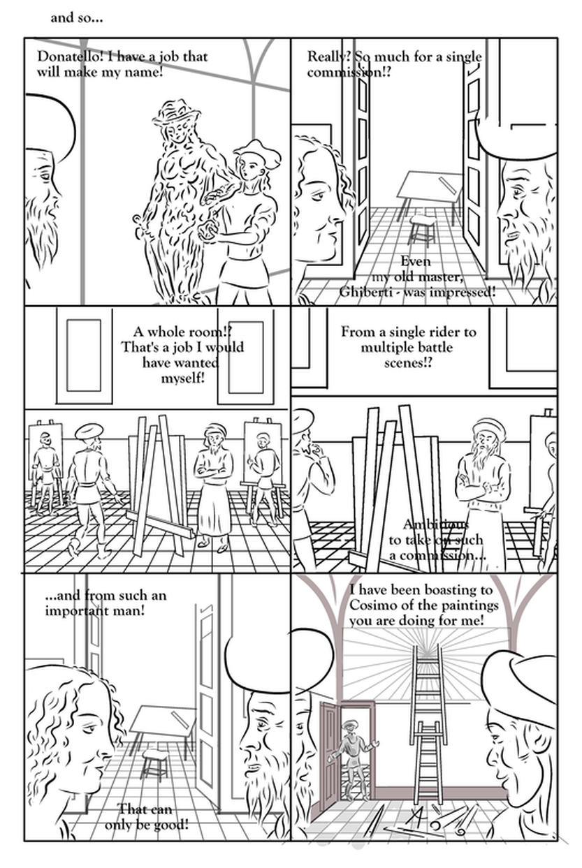 I redrew the figure of Donatello in panel 1, the original had too much line stablisation to work at the bigger size, and I also ensured it matched the drawing of him on page 11. I also redrew the backgrounds for the two panels of Uccello and his wife. Panel 4 had been partly pasted and enlarged from panel 3: it mostly worked, but the lines for the tiles were a bit thick, so I reduced the width of them. I also redrew some of the Uccello faces, to be consistent with later drawings. For panel 6, it's only the face of Rocco (right) that is unchanged. I liked the ladder and the perspective lines on the upper panel visually, butI I had drawn it on the basis that he would be working directly onto the upper walls, but I subsequently decided that him being up a ladder would be visually cumbersome, and distract from the interaction of the characters, so I changed this panel.  Having made these changes, I was able to do flats. I was noticeable how much quicker it was to flat the more recently drawn panels. I have tended to use the approach of drawing a white layer underneath figures, etc, and would often deliberately leave a white halo around the figure - I sure paid the price for that in the extra time it took me to flat the tiles in the middle row!  This page is fairly unusual in containing the full six panels, and also unusual in featuring four different locations. I tried to give them all distinctively coloured walls. I tried to do the same with the floors, though it was difficult. The colour schemes in panel 2/5, and 6 are already set: with hindsight, I would have been better to colour them first on this page to help me keep the new scene (middle row) I tried to do that, but's it's not so effective moving back across pages. Despite the amount of work it was (as noted above) to do the tiles in those panels, I think it may be better to remove them: they are quite busy panels, with a lot on the tiled areas. It may be possible to take down the tiles on a tone layer, though. 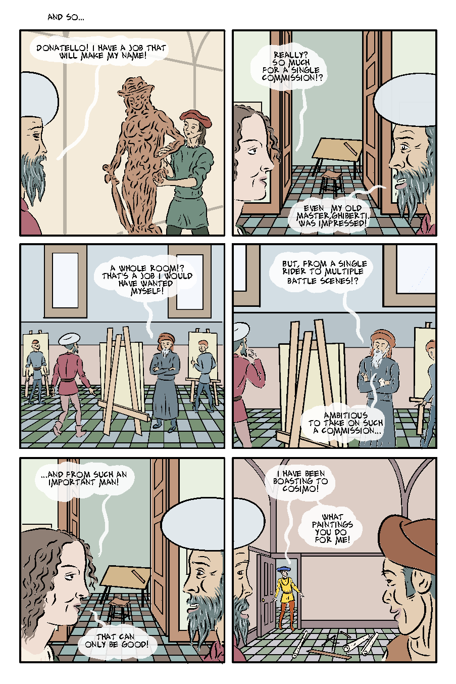 I may have to redo the balloons, as I going to work on the character and line spacing of the lettering, though i may be able to just enlarge the balloons.  On checking the page this morning, I went back and made some minor changes: redrew Rocco's face (panel 6, right) to make it look less vectored); fixed the line spacing on panel 4 balloon 1; added some ink lines for the wife's clothing in panel 5, added colour on pupils (panel 2), etc.
It occurs to me now that I've drawn the woman with a hat in other scenes - am torn between being consistent, and liking these panels as they are... the This is the biggest panel in the story - the full width of two pages, and elegantly reflecting the 5' high by 10' wide proportion of the paintings that are the subject of the story. The panel below is meant to suggest multiple depictions of the artist in a single room, working on the paintings, as such it reprises a scene on page 14 (previously posted about when it was page 13), that uses a similar effect, so this panel reprises, but also escalates that by: including more figures of Uccello; showing a bigger area of the room, and being actually bigger (double the size) on the page. I had proposed to make this almost a cutaway view of room, but wonder if it's better just to focus on him drawing on wall what will be the first painting. This will also give me an image I can use adapt for the cover and end-papers. 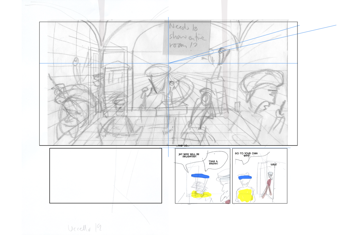 My web platform Weebly is doing some really annoying things! On the post below all the images are full width on the edit version, but then it publishes with some of them really small. That's particularly useless for this post where it's about texture overlays, that are invisible at that size! I've tried 'fixing' it and reposting, but whenever I refresh the public page of the blog it has the same problem. I don't know if it doesn't like me having so many bits of text between the pictures.
It's very frustrating! it's taken me about 90 mins for this post (and I had all the textures already in the pages). The textures must be really large files - it was freezing my (brand new) iMac for up to ten minutes just to import a page from Manga Studio! I'll have one more try just now, and then I'll leave it and try and fix tomorrow. UPDATE I've put horizontal dividers between the pictures and blocks of text, and that seems to have fixed it. I think I've said elsewhere that i was trying to stay fairly close to flay colour, in keeping with the work of my subject. I had discussed with the tutor applying and aged or distressed overlay to the pages, and I've begun experimenting with this. First of all I searched online for free to use textures. I found this plaster effect, which I thought would work because of the number of interior scenes with relatively blank space.  In the page below I tried two different things: the top panel has the plaster texture over the rear wall in straight greyscale. I would need to choose between approaches here - either make it the texture of the wall, and so remove it from the figures, or just use it as a texture over everything. I've done the latter on the lower two panels, where I also changed the plaster image to a brown colour. This works fairly well over everything - it's quite subtle, and adds a bit of visual variety. The brown works here as a contrast to the green of the background, it might not works so well on the (majority of) scenes with brownish walls. I could probably change the colour of the plaster texture for individual scenes, without it being noticeable to the average reader. In each case the plaster texture is at 30% opacity The next question this raise is - should the texture be over the gutters and page borders? If so would it need a subtle flat colour over all the white areas? 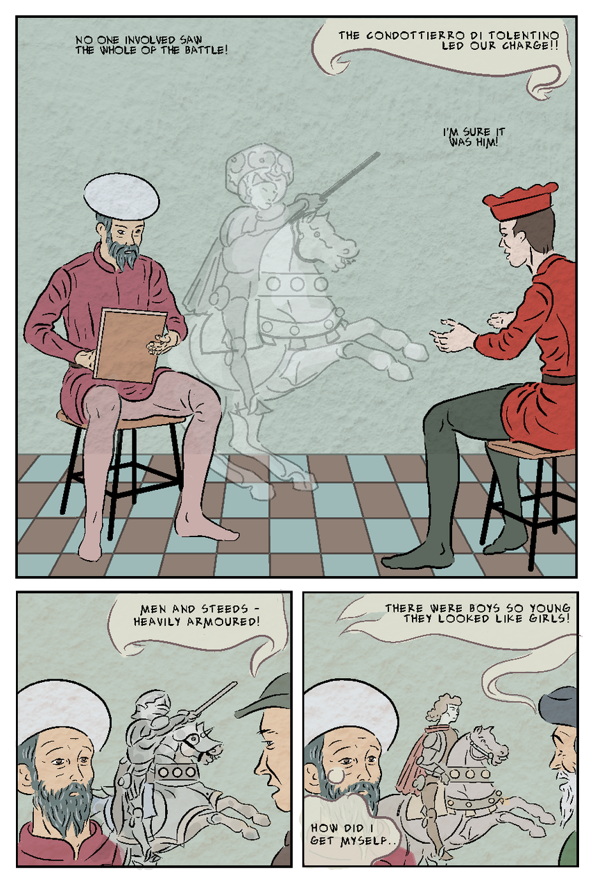 I then tried a 'distressed' texture, as seen below. This, in contrast to the subtle tones of the plaster texture, was more high contrast black and white.  I converted this into an ochre colour, and overlaid it on the page below at about 10% opacity. Here I extended it over the white border and gutters. This scene is a the bedroom of a very rich man with a new young wife, so it won't make sense if it looks like the room is shabby - it needs to be clear it's the picture.  Here's a further version, which adds a high contrast version of the plaster image, and a cream/paper colour underneath the colour flats layer. I think the cream improves the effect on the 'white' areas, and the extra texture softemns the overall effect  I also worked with the distressed image, using the magic wand an fill tools, to add a cream/ochre overly, that omitted areas, leaving some useful whites, as below.  I the overlaid this on a page, as shown below. 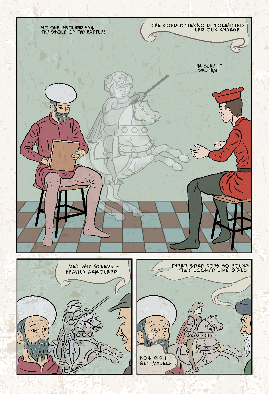 I'm undecided about the one above: the texture layer on it's own looks aesthetic, but overlaid on a page the distressed marks are perhaps too noticeable in places and too subtle in others. It looks like marble though - which would make it work well on the tiled floors.
I had already decided on the 'Alex Toth' hand-lettering font, and as I work through the pages preparing them for flatting, I have been changing the lettering as I go along. The eagle eyed tutor had spotted in my pages (with the original typeset style font) that some text blocks, even on a single page, had different letter spacing. This is s strange effect of having imported some text to Manga Studio 5, from version 4. This effect remained, when I changed the font to Alex Toth. I previously reduced the font size to 7. partly because it reduced the line weight, which I felt was a bit heavy for my drawn lines, however I wondered if that was getting a bit small. It may be that the wider spacing makes it easier to read. I couldn't find a way in the settings to change the letter spacing, is I had to copy then paste a block of text with the wider spacing, and then change the text - a bit laborious, but worth trying on a couple of pages to see if it looks better. On page 6 (see post immediately below) the first version shows MS5's regular spacing, and the second and third post the wider spacing. I had originally in my short version of the story created my own type of balloons, which aimed to look medieval - almost like the scrolls and banners sometimes used in art as photo word balloons. I'd thought os using a different type for each character. I wonder now though if what might have been charming over four pages would become tiring over twenty two pages...? 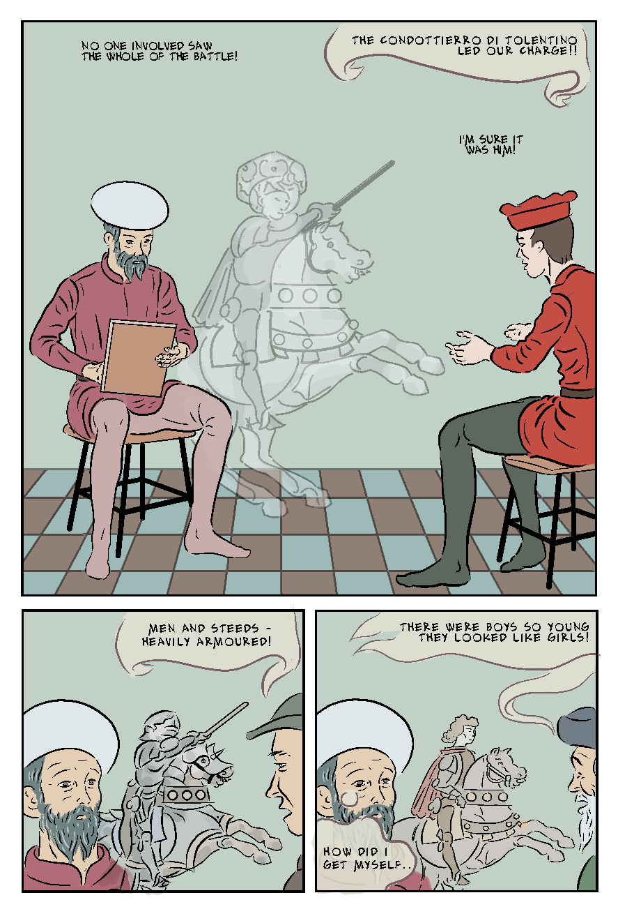 Figure 1 - showing both spacings on Alex Both font, and my original balloons. I have been leaving the balloons to the end, as I find it easier to do such things all in one go. However, just to make the text readable on my flatted draft versions I roughly marked underneath the text (where required) with a 150 sized marker, and added some ballon tails - I actually like the look. I have made the wide approx70% opaque so it takes some of the colour below. It works on the examples, but experience suggests that it gets complicated riding this over visually busy areas. If opting for this particular style. I'm sure I could finesse it better.
There is a further example of these ad hoc balloons in the post immediately below. |
AuthorGraham Johnstone ~ Master of Design - Comics and Graphic Novels student 2016-17 Archives
August 2017
Categories |
 RSS Feed