|
This one has the perspective guidelines left in - showing the vanishing point in just the right place. 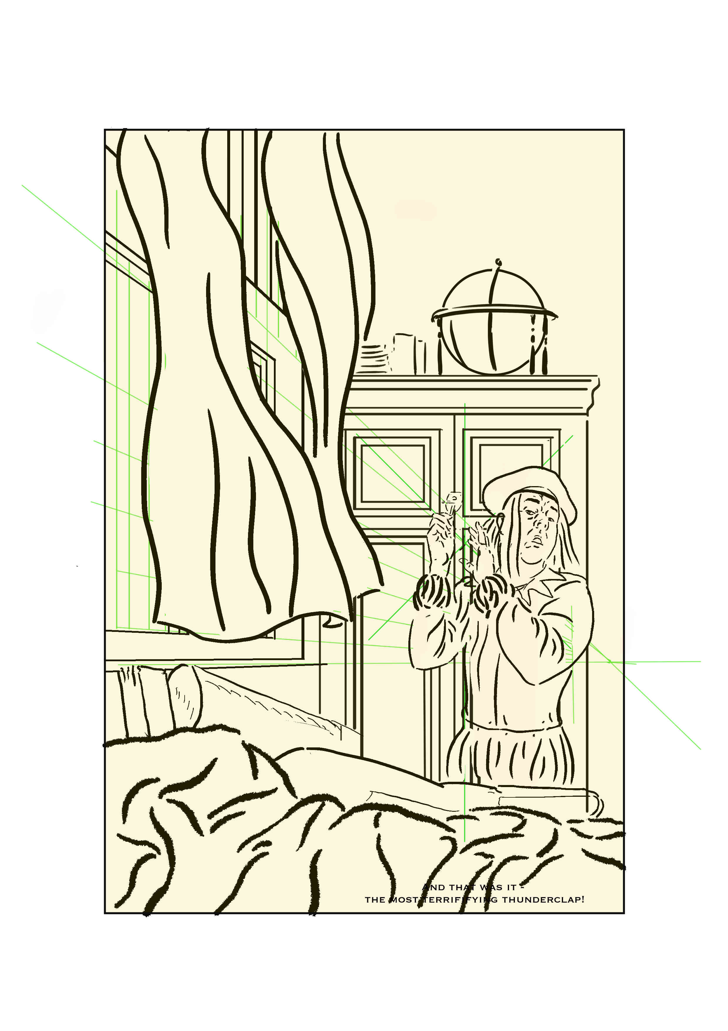 The lettering and in particular, the balloons as shown, aren't necessarily the final ones: I just find it useful to have them there to get the flow of the story and to help with planning space.
Further to the post below, I've decided a few things;
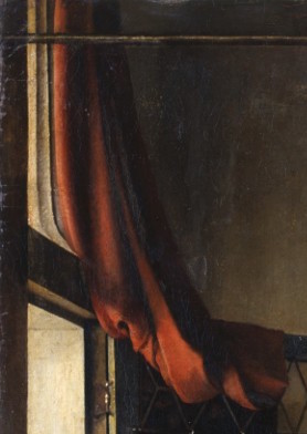
Discussed this page with the tutor at the last class, in relation to the last panel conveying the windows coming due to an explosion. This raised a tension between historical accuracy and communication/dramatic effect. The windows in Vermeer paintings are famously leaded glass, so drew this as rectangular glass panels coming out of the leading. Discussion with the tutor raised the issue of how well this conveyed the explosion. Another issue with this scene is the timing of the explosion in relation to the text, and his reaction, i.e. should the figure be reacting to the explosion? A further issue is that it doesn't fit with the story for Vermeer to be injured, so the glass exploding needs to be conveyed in such a way hat it's plausible he does'nt get injured. 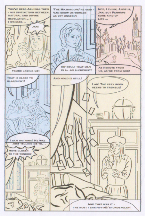 Following the class this week on flats, I have used the process to redo a page I had already done some colouring on. I outputted the line art page from Manga Studio 4 as a bitmap file and then imported into Manga Studio 5 Paint, and created flats using the bucket fill method. I retained my existing colour layer as a low opacity overlay just to add a bit of depth on e.g. skin tones. I still don't think I have nailed this 100%, but it's definitely a solid move towards a more efficient process for colouring,  |
AuthorGraham Johnstone ~ Master of Design - Comics and Graphic Novels student 2016-17 Archives
August 2017
Categories |

 RSS Feed