|
I'm undecided about whether to add tones - they might act against the flat quality I wanted to suit my subject's style. Nonetheless I have tried a few attempts. The version below is before application of a tone layer. 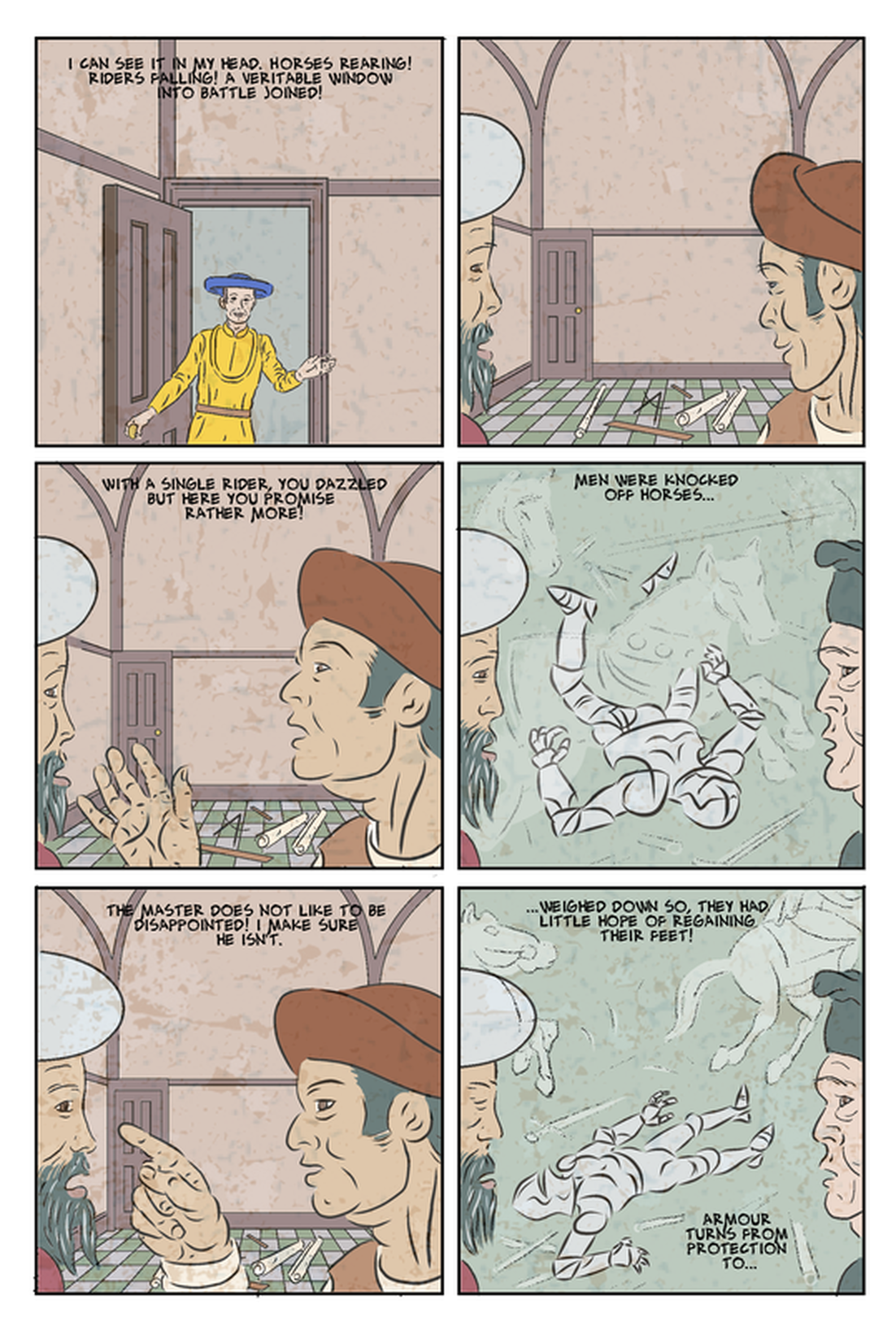 In the version below I used the magic wand tool to select areas and then went over then with a large textured airbrush, and a single colour a lilac/grey. It ended up just looking like airbrush. Also the areas areas that most needed tonal distinction - between the faces and background, were so close in colour and tone as to be not easily selectable by the magic wand. I tried going back over with an erase to define the edge of faces - don't think it worked particularly well. 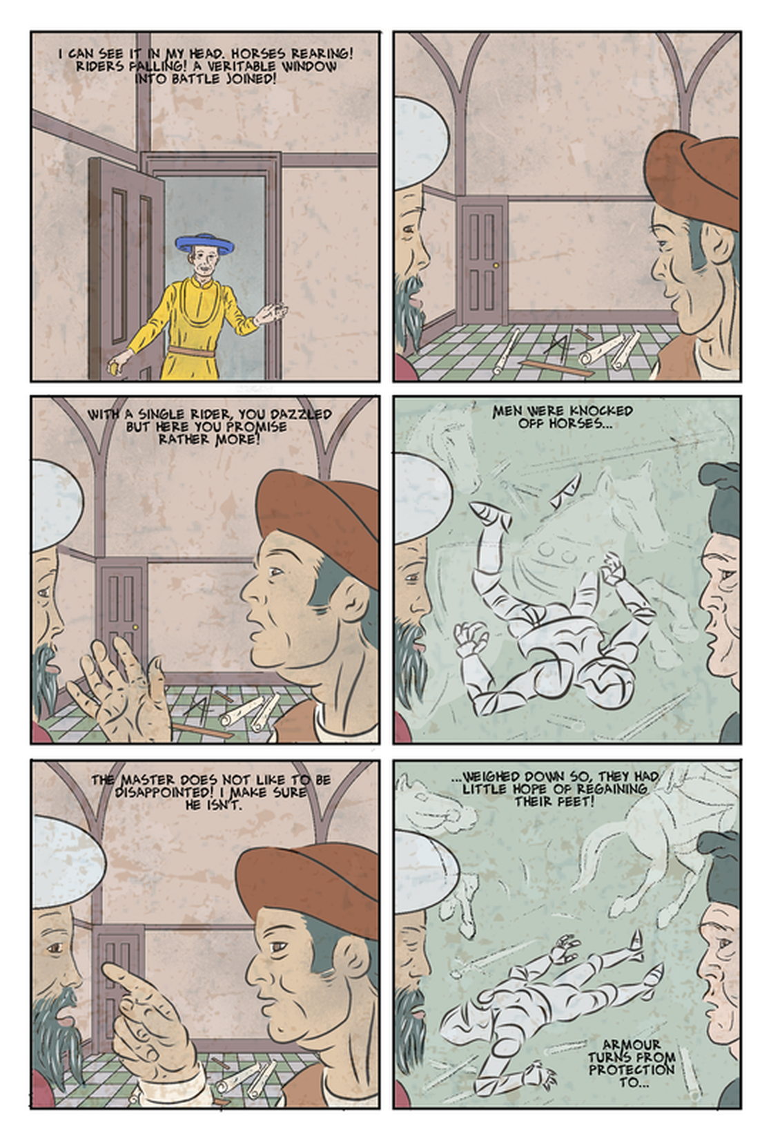 I tried a similar approach, but with a charcoal brush, and it looked much the same. My third attempt used a brush called 'Painterly_02' at 310 size. 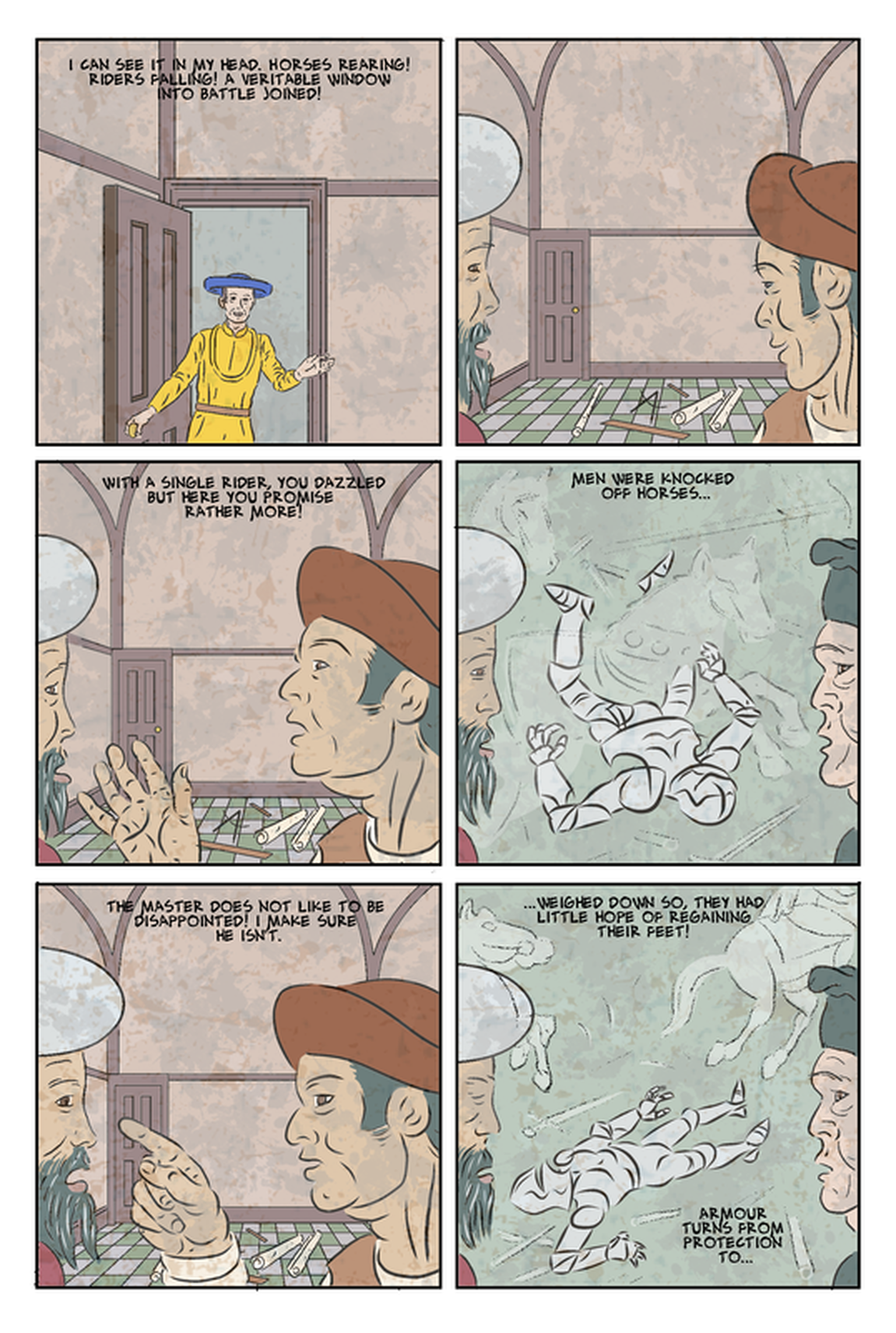 It worked okay on the faces, and on the green backgrounds, where it creates a quite appealing richness - does it really help it as a comic though. The issue may be that there is too much contrast over the hot coloured areas, and they might work with the same brush in a different colour.
0 Comments
For what's page 4, of the long version, most of the images were taken form my aborted 4 page comic, as seen in the image immediately below. 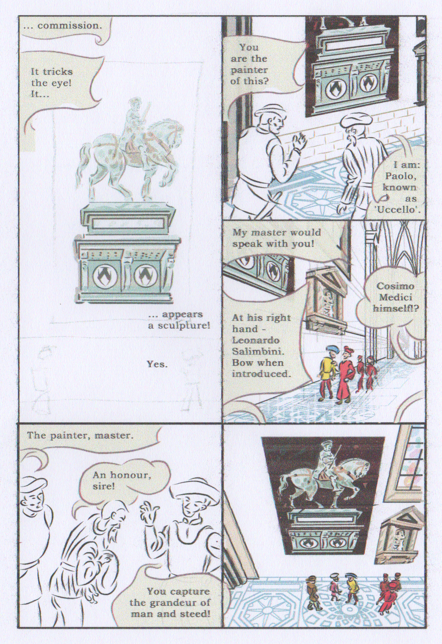 I had done a fair bit of work on the original in creating these elaborate balloons, and pacing them, in a fairly dense and text heavy comic. I felt this page needed an outdoor shot to help the transition between Uccello's home/studio, and the cathedral or 'Duomo', so rearranged the page, including this, in the version below. I also redrew the figures, using the 3D models, and image of the horseman in the tall panel. 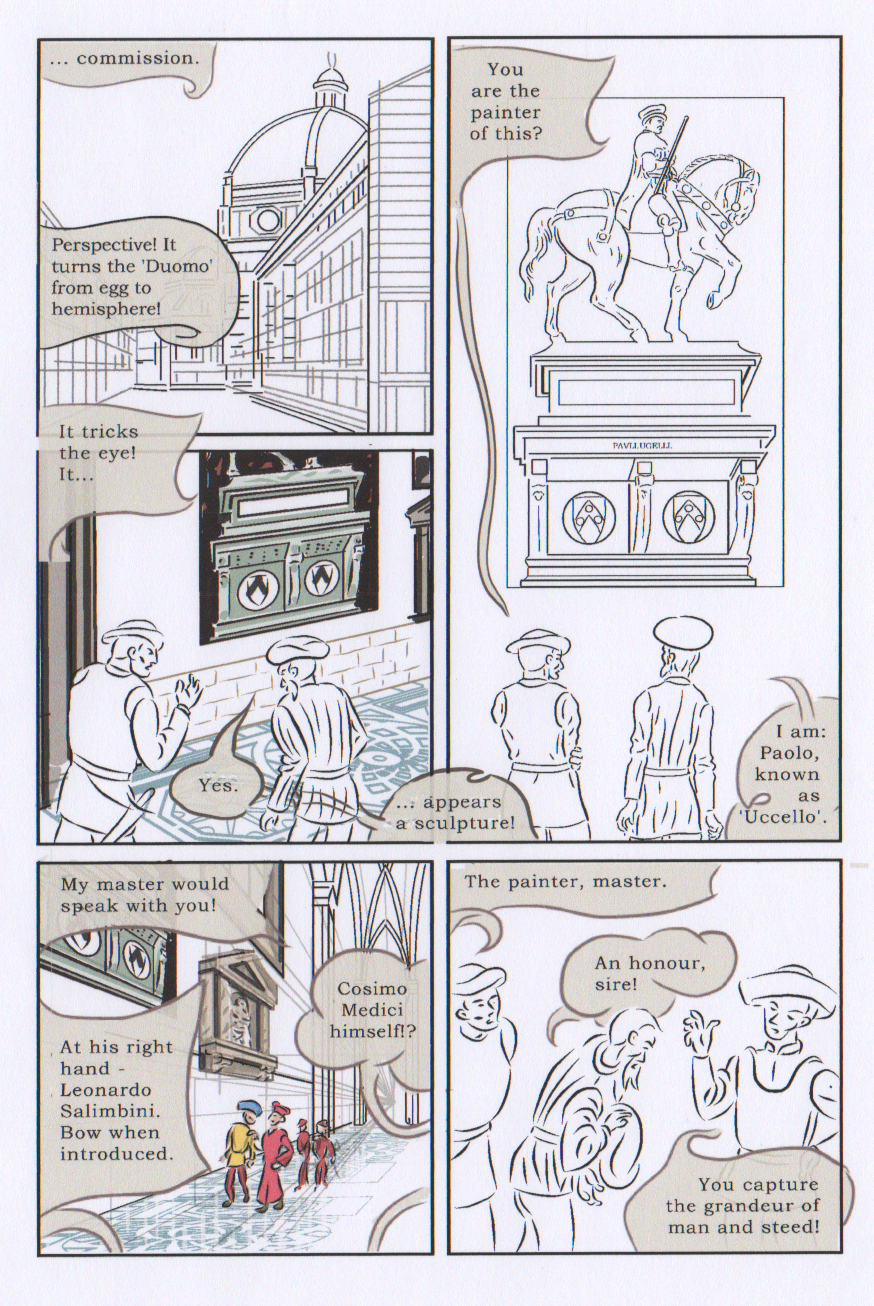 I had been pleased with some of the original images (though somehow, in panel 2, above, i managed to get a hand the wrong way round!), I had created them in Manga Studio 4, with mu old graphics tablet, and heavy correction (they call it ‘stabilisation’ on MS version 5). i had developed a certain mastery that made the correction look good. I particularly liked the panel on the bottom left (in the version above). Anyway, long story short, they look incongruous with most of the later pages, so I decided to go back and change them. 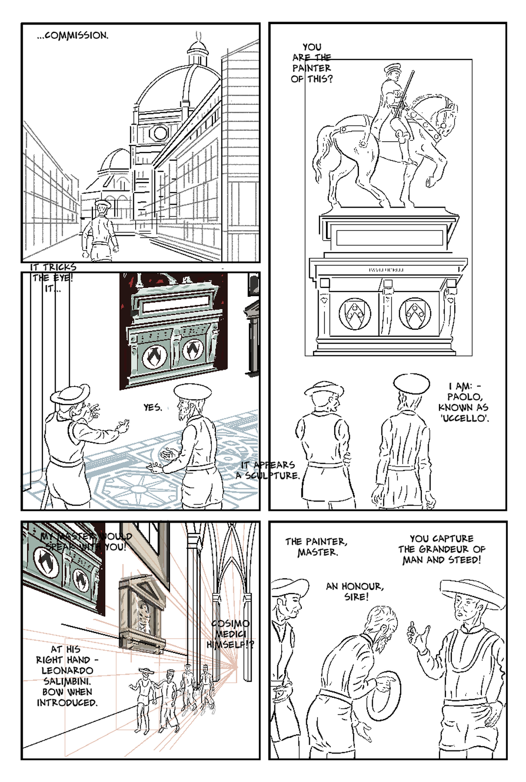 In the last panel, I spend some time getting the 3D models dragged into roughly the same composition, and capturing Uccello’s pose as he ‘bows and scrapes’ as they call, before a person of high status. I think the revised version lacks the compositional energy of the original, and looks stilted in comparison, but ultimately, it’s not going to distract readers by looking incongruous. I have now, at different times redrawn all of the figures - all that remains from my original is the painting and architectural feature.
I've just noticed that panel 5 is missing the patterned floor - I think I just made it invisible, while working on other elements, and that it's still there in the page files! I've gone and fixed this. i've also noticed a slight ghost image of the figures, which was an earlier attempt at them - I've now deleted that. I also had to what I call 'underdraw' the figures with white so the floor pattern isn't showing through them. This then obliterated the perspective lines, which I want to visible. This would be overdone if i used it repeatedly, so I've only used it in panels where we are seeing through Uccello's eyes, as here. I tried moving the perspective lines to on top of the figures, but then they were too strong over the architectural features, so i duplicated the later, and put one above and one below, reducing the opacity of each from 30% to 20%. There's also a stray line at the bottom of Rocco (left)'s jacket. I've also gone back and fixed that. it was surprising hard to get that one line for his leg right - happily I always save the 3D model layers so I just had to make that visible. These are examples of the numerous corrections I am continually making, to get the best pages. I added the walking figure of Uccello to panel 1. My initial idea was that we were seeing the outside, as Uccello was inside, but removing one of the word balloons from version two created the space to do that. It seems a sensible addition. I have continued to experiment with textures. the page in the post below uses the 'plaster' and distressed' textures I have used in other pages, but perhaps more successfully here. I also pasted the distressed effect over the tiled floor, only, here and some other pages, to give a marble like effect.
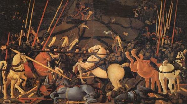
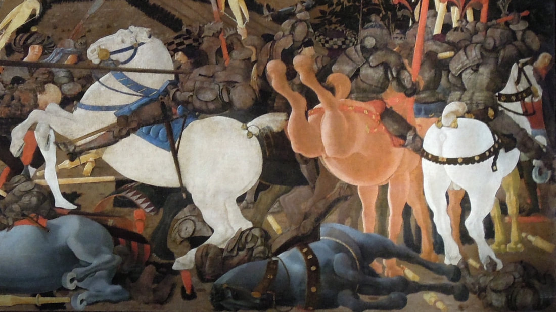
Otherwise, I've been concentrating on getting the pages draw, and redrawing some early pages that now look pretty weak. The character Rocco wears a sword, that he brandishes at Uccello on page 17 (below). It occurred to me after completing and colouring the page, that in the scene where he is brandishing the sword, I omitted to draw in the scabbard. I went back to add it by pasting from another panel (see line image in main picture, below). It was hard to compose in relation to the image, but I got it satisfactory in that panel. The scabbard would actually be mostly hidden behind his leg. In the other two panels, there is only going to be a tiny bit of it visible, and coloured the same as his belt, so I think it will just be confusing. So the question is - complete accuracy, or what makes more visual sense? 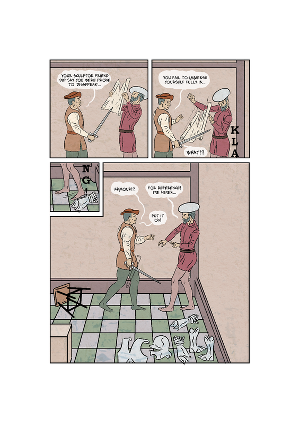 I have previously posted on this sequence at earlier stages. This is near the end of the story, and Rocco (the patron's major demo) has got Uccello to put on armour he has for reference (miraculously it is a perfect fit!), and a bit to 'put him into the battle' and enable him to bring his studies together into the battle scene(s). My plan was that these pages would have essentially the same shot of Uccello on a stool, but overlaid with his imagined images of the battle. 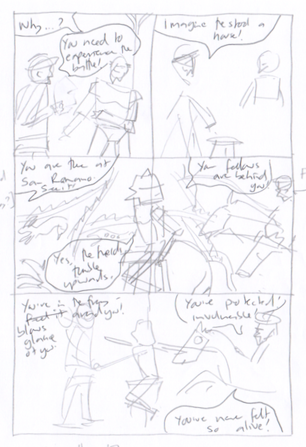 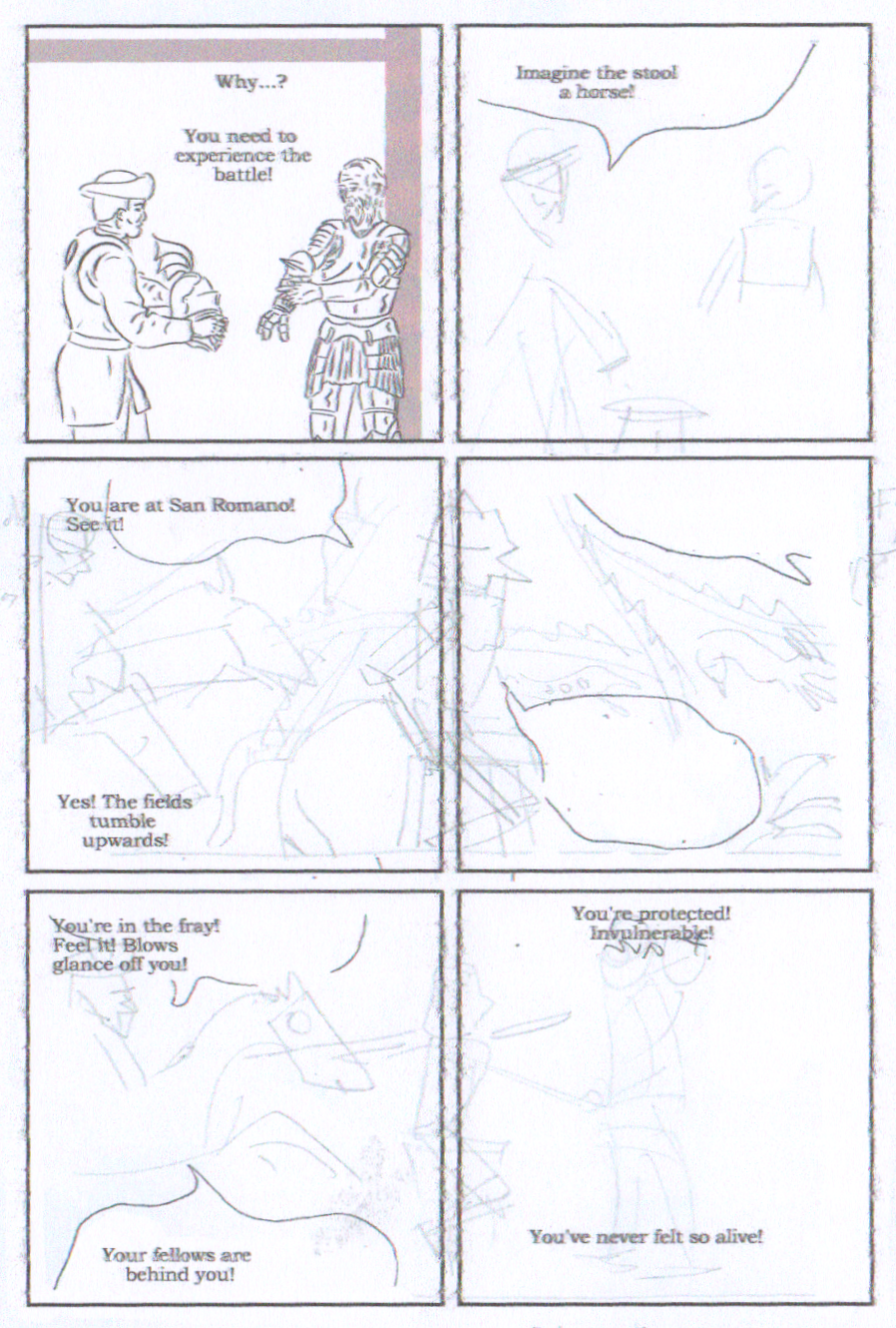 I decided to extend this sequence to two pages, one advantage of this is that I was able to use row-wide panels, reflecting the aspect ratio of the paintings the story is about. I was able to draw the room background and paste it into the other panels, and the same with Uccello on the stool. I had the pages drawn, and still had to add the details of Uccello's imagining of the battle. 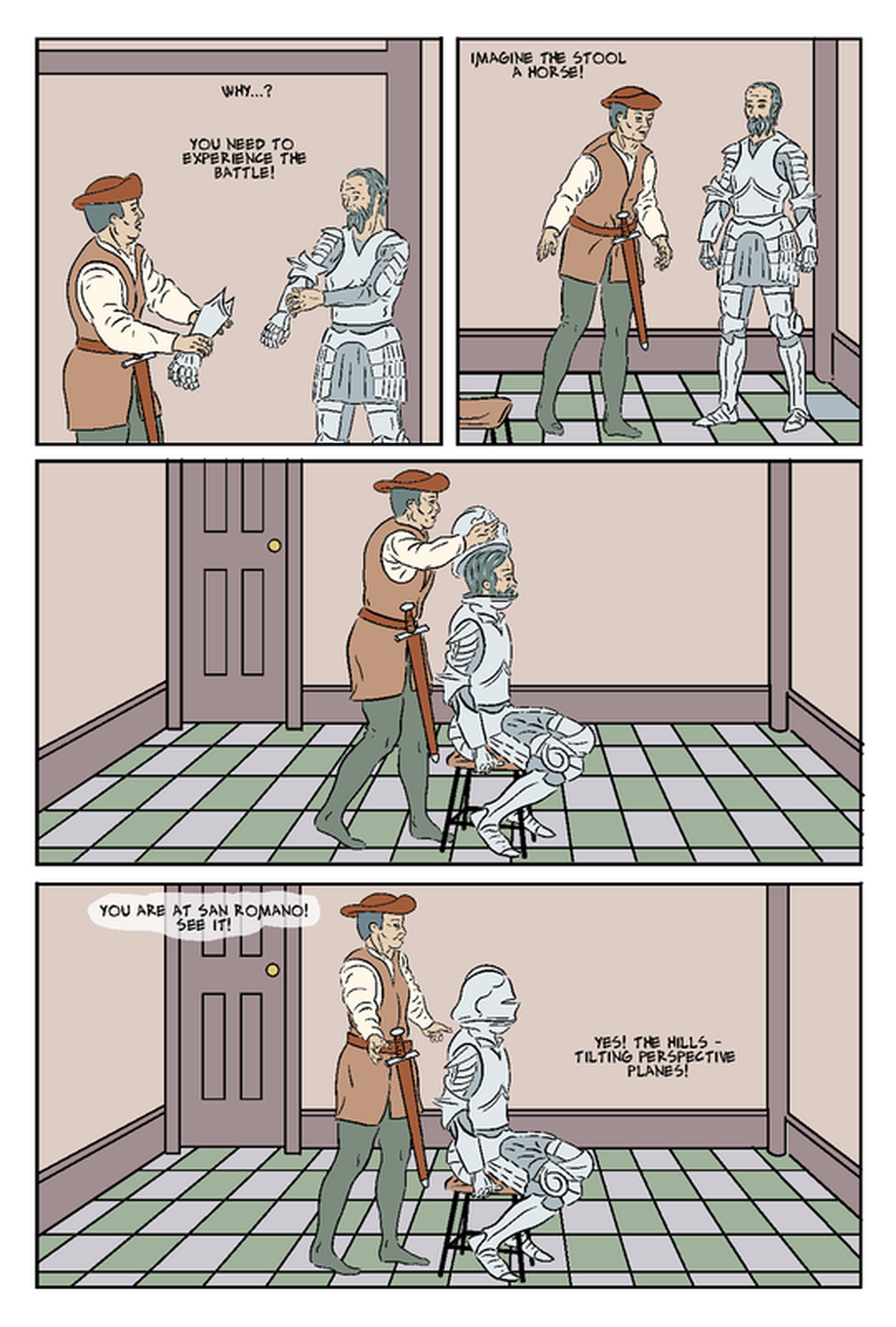 The next task was to overlay on panel 3 the first stage of Uccello's imagining of (not yet the battle itself) the scene of the battle. I wanted this to reflect an earlier panel (below, from Page 11) where Uccello had tried to map out in perspective the battle scene. 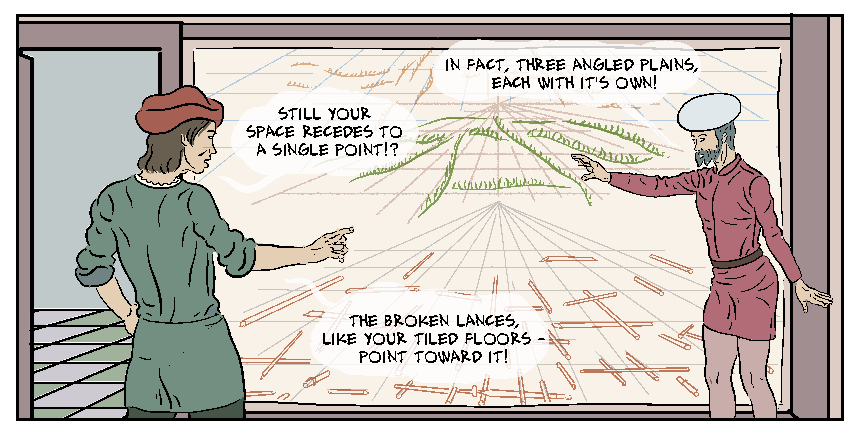 I pasted in Uccello's perspective space, from page 11 (above), overlaying this on the already colour flatted page. 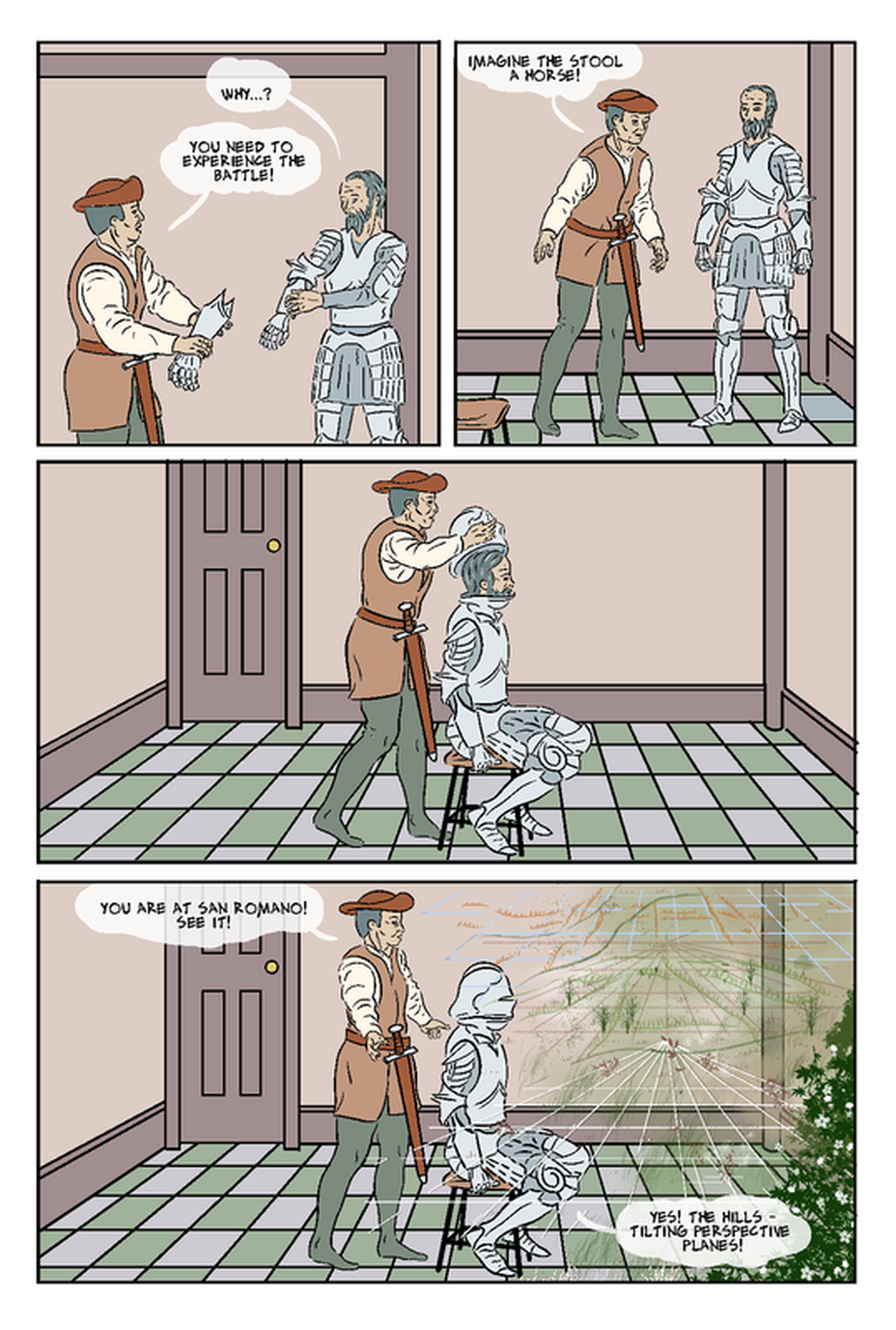 I duplicated the blue perspective layer in white and placed it under the blue, to make these lines stand out. I made use of a lot of the special tools like pencil, pastel and airbrushes, and brushes for specific effects such as grass and trees. It was helpful to have a chance to explore these various tools, and in many ways the effect is successful, but perhaps too incongruous with the overall style. I decided to leave this for the time being, and work on the, more complex, second page of this scene. The second page would have overlaid scenes of the battle - drawn from Uccello's paintings, as sketched in below. It’s worth noting here that I changed, from my original roughs, the direction Uccello was facing. The position of the characters and stool in the room, in terms of a cinematic continuity, suggested (keeping a fixed camera) Uccello would be facing to the left. This is of course goes against the conventional reading direction (in the West) from left to right, but it would have fitted with the power relations in the scene, that Uccello was feeling somewhat disempowered and disoriented. However, swapping it to have him facing right was ultimately a far better approach, because it let the elements of the Uccello painting face in the same direction, and indeed, in that the battle moves from left to right. 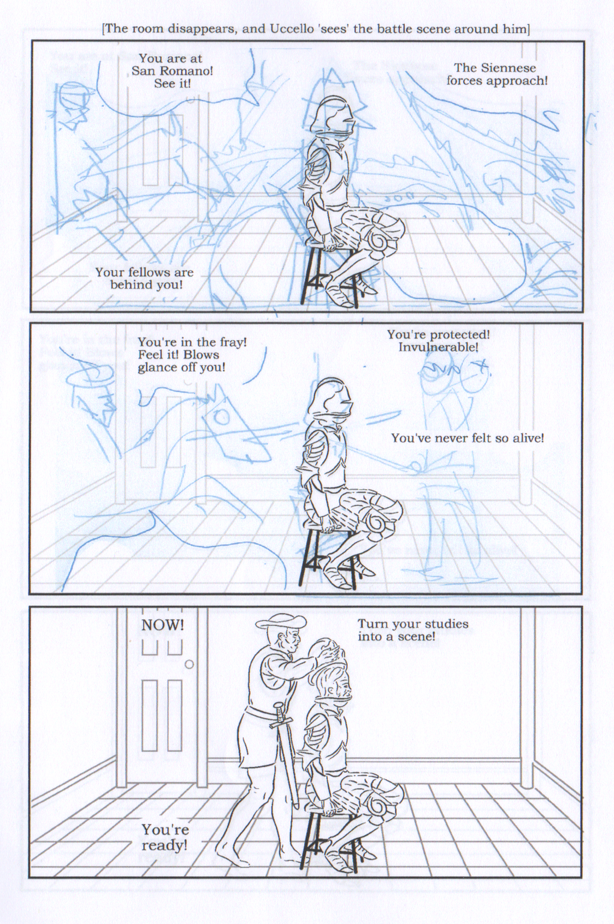 I had already inked/pasted elements on to the page, including the flats. It is more traditional to leave flatting until the drawing/inking stage is complete, but I knew I wanted the background flatted in, to overlay the imagined battle scenes over. The exception to this was the middle panel, which represents his total immersion the imagined battle, and so would have no visible trace of his actual surroundings in the patron's room. In the end I was able to take the battle elements directly from Uccello's painting (The Battle of san Romano - 1st of a series of three paintings, this one in London). This was good because my underlying reason for the comic is to reimagine and illuminate the process of making the paintings, and this then showed elements of the battle imagined before being realised in the final design. I pasted the painting into Manga Studio as a reference layer to overdraw. In the first panel I chose and carefully placed elements of the images that reflected my text: his 'fellows behind him', and the opposing forces 'approaching'. In the second panel, I used all the foreground figures from the painting, again, carefully arranging these in the panel for the best composition. This was somewhat constrained by wanting to be true to Uccello's composition, and the figures needing to be broadly to scale in relation to the repeated image of Uccello. I did consider reducing the size of the armoured figure of Uccello - this would have given a sense of the scale of the battle in relation to him, but in the end, I decided that the visual elegance of keeping the Uccello figure the same outweighed the slight mis-scale of the figures. Removing the border of this panel helped in a number of ways: it gave me more space for the figures, and to work the lettering around them, it also made the composition look better, and most importantly it reflected a shift for Uccello, from being in a room imagining a battle, to actually being there, in open space, at the battle. The cropping of the furthest left figure, partly came out of getting the best arrangement of the other figures in relation to the fixed position of Uccello, but it fits with what Rocco (out of camera) is telling Uccello, that he is safe with the Florentine forces behind him: we see only a single opposing horseman, whereas Uccello's 'fellows behind [him]' extends off the page, as if to infinity... 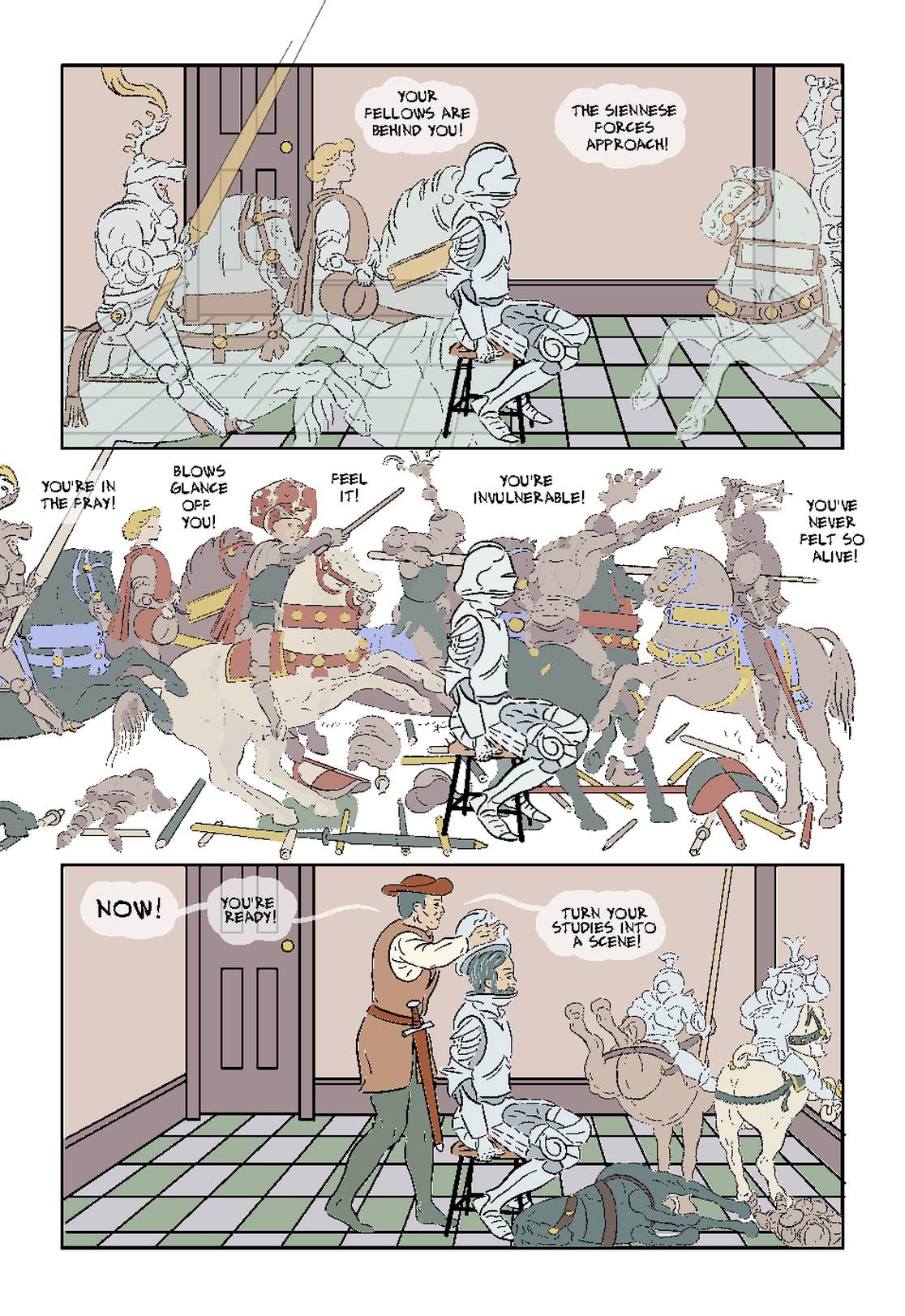 For the third panel (above), I wanted to suggest Uccello's vision lingering, and slowly 'evaporating', as Rocco removes the helmet from him. After some study of the Uccello paintings, I decided to base the imagined images on Uccello's second painting (below left) in the series, specifically the bottom right of it (below, right), which shows a fallen horse its armoured rider, and two riders racing away from the scene. The placing suited the sequentiality within my panel , where (working from top right) we have seen the empty room, then Rocco bringing Uccello back to it through removing the helmet, and finally, we see his vision in the process of leaving him.
It's worth saying something here about the rendering. I wanted the imagined figures and horses to seem a bit less real and tangible than the room and Uccello, and I used a number of techniques to achieve this, including drawing them in 'pencil' and colouring them (at times) on translucent layers letting the background show through. That's easier to say than it was to do though! I have a number of 'pencil' brushes for Manga Studio, but it still was not easy to find one that (within an inked and coloured page) looked obviously like pencil, and not just grey lines. I chose the most suitable, and worked on a Monochrome rather than Greyscale layer. While this didn't clearly scream ‘pencil', it did give a less dark and tangible line than inking, (and is not as pixelated as the fairly low res version posted above). This technique proved slow and laborious to colour flat, as the colour would leak through any weak points in the line, so I had to do a considerable amount of drawing in lines with a marker before filling, and still had to erase numerous overflows. Possibly working with an enlarged view of the picture didn't help, as, in hindsight, I was possibly fixing things most readers either wouldn't have spotted or registered as wrong.
It’s not usual to add colour flats while the pages are unfinished (perhaps reflecting the ‘Ford Factory’ division of labour in mainstream comics), but it worked here to add the flats, as I wanted the imagined images to look ghostly, and show the background behind them. To this end I overlaid a further colour flat layer, with reduced opacity, and coloured the images on that. This also gave the advantage that I could modulate the level of opacity for the best balance on the finished colour layer. The imagined images don’t look quite translucent enough in the version above, but I have since gone back and fixed that. Panel 2 though, required a slightly different approach, as here i was trying to convey that he has now forgotten his actual surroundings in the patron’s room, and is immersed in the battle scene. However I still wanted the battling figures to look less real and solid than the figure of Uccello. First of all I created a new flat layer and coloured all the battling figures in a flat grey/brown - this gave quite a pleasing silhouette effect. Over this I added a reduced opacity coloured layer to colour the individual details - this achieved the intended effect of both greying the colours, and retaining the silhouette effect slightly. To add some subtle modelling I went back and applied a darker grey/brown to parts of the ‘under-draw’ layer. This page has been perhaps the most work of any, but I think has solved a problem I was leaving off, as is suitably impactful for this climactic scene. I will also be able to use my drawn battling figures for my versions of Uccello’s developing designs for the painting, on the next pages. I've previously posted about balloons, but here I want to extend that to captions and thought bubbles. I'll begin by recapping my thinking on the balloons. My initial pages for the story, in an attempt to create a period effect, used balloons that looked like scrolls and banners. Initially I tried to use a different style of 'balloon' for each character. It looks quite nice on some pages, but at other times, like this draft of page 9, it got a bit busy, due to the combination of different characters speaking, and thought bubbles. 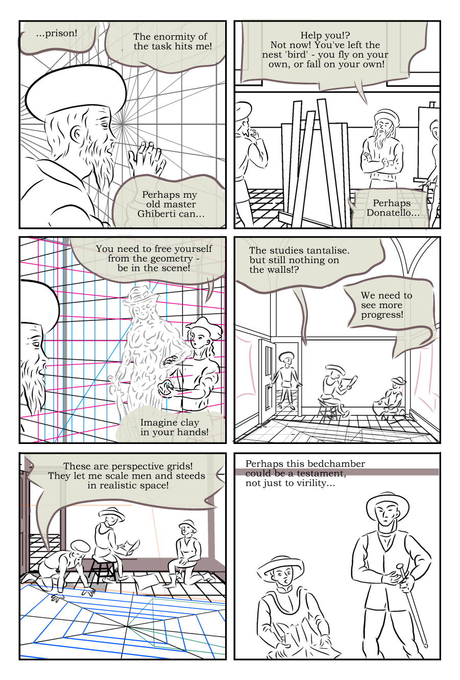 Changing the text to the Alex Toth (tribute) hand-lettering font makes it look a bit better (note, I improved the spacing after I did this page). 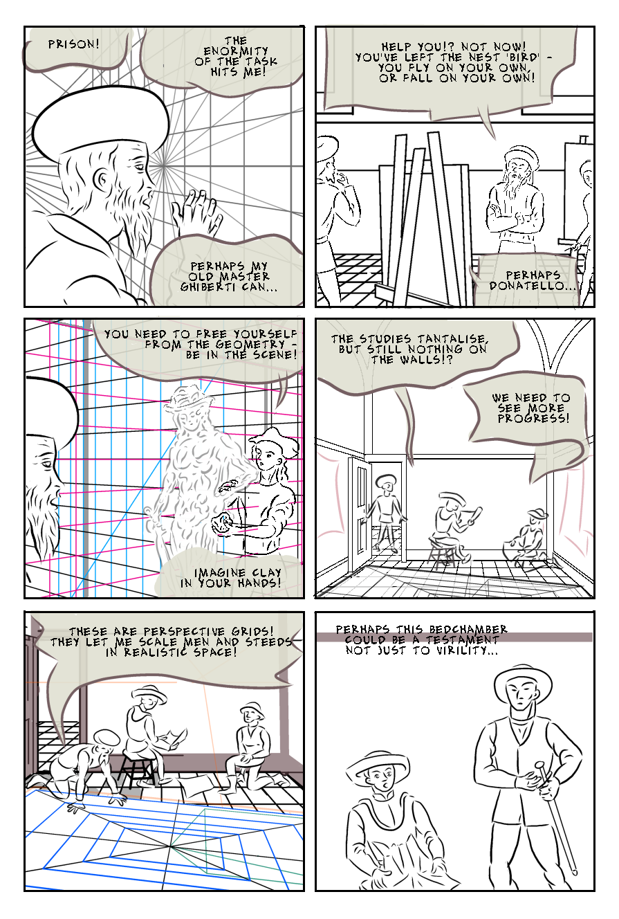 I think my decision to change the balloon style to the borderless style shown below, was a good one. I think that the borderless balloons manage to be readable, without encroaching on the drawings. There is no point trying ti update the balloons on the above example, as it only reads against a coloured backgrounds shown below. 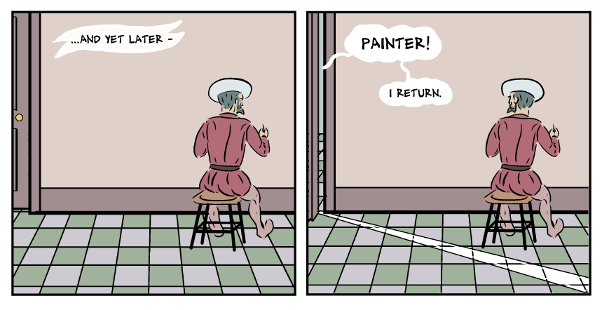 Narrative captionI have occasional captions, which require to be clearly distinguished from the dialogue balloons. The first one i attempted was on page 14, as shown above. I drew a scroll shape just in white, with no border, which seems to work pretty well. There are also a couple of instances of Uccello's thoughts that need to be either captions, or thought bubbles. A few lone rectangular boxes might look incongruous, and scrolls might cause confusion with the narration captions, e.g. '...and yet later...' as seen above. Perhaps the best solution is actually obvious and simple - have them like the speech balloons, which, (lets face it), are more like bubbles anyway, but instead of tails, use the traditional small bubbles to indicate whose thoughts it is. That seems sensible, but I won't know for sure until I try in on a real example. Thought BubbleIn the page below I had a thinks balloon/caption required in the bottom right panel. I tried a few options, of which this was the least worst. I think it's hard in this panel, as the thought bubble is a response to the word balloon, so needs to be read after it. not sure I've solved this, but will keep trying. 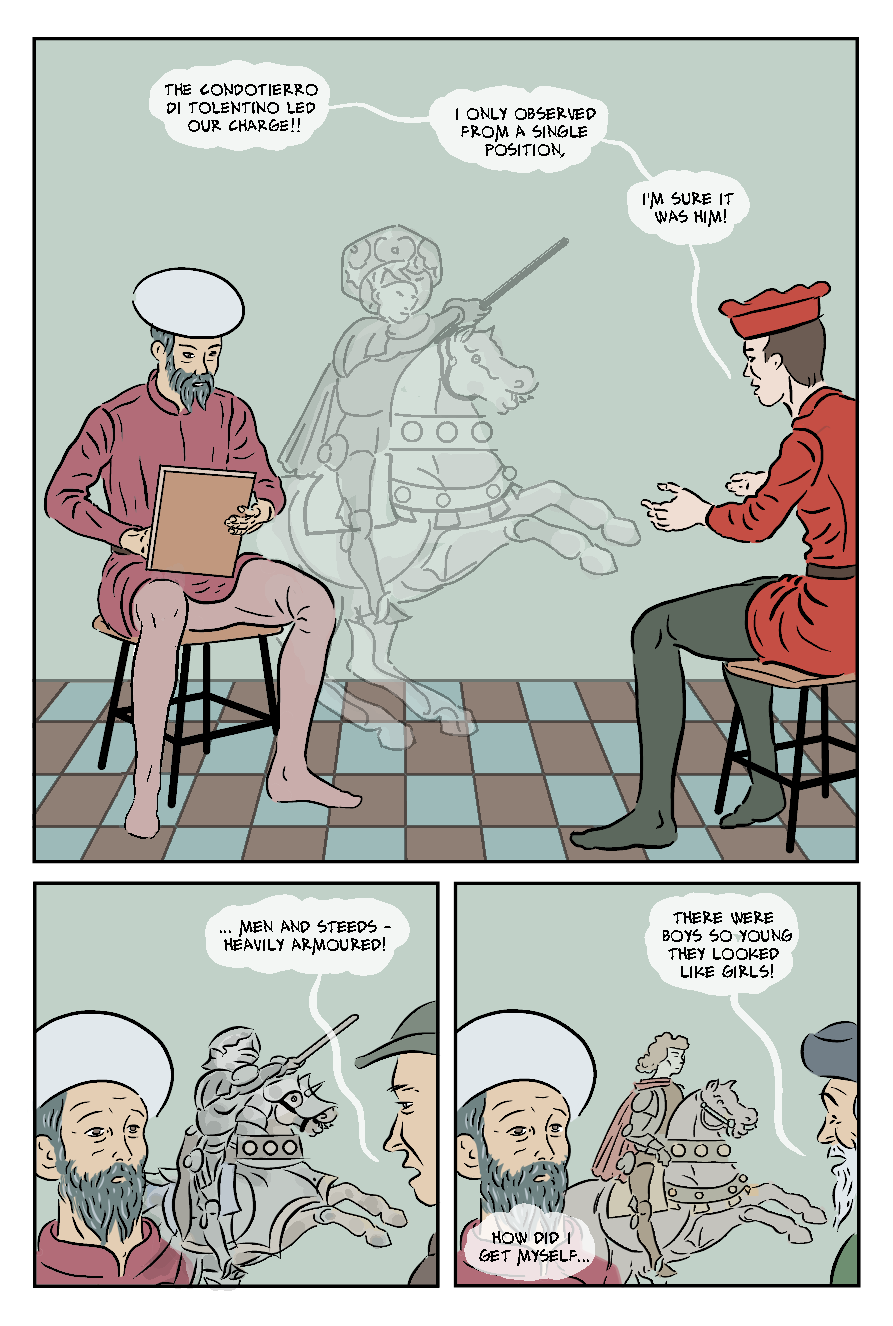 I've written about this page before, when it was page 12 (I added some pages to the story). It was redrawn from a panel for my abortive original version of the story, and was one of the first I used 3D models on. I was very pleased with at he time, but now it looks less good, indicating that I've gotten better at inking over the 3D models. I've only just finished flatting it. Partly I left it off as I have to add a drawing he is working on, that will also appear on other panels, and which i haven't done yet. Although I did some as I went along, I've been trying to leave my drawings of the drawings (and also the related imagined scenes) to do them all together at the end. 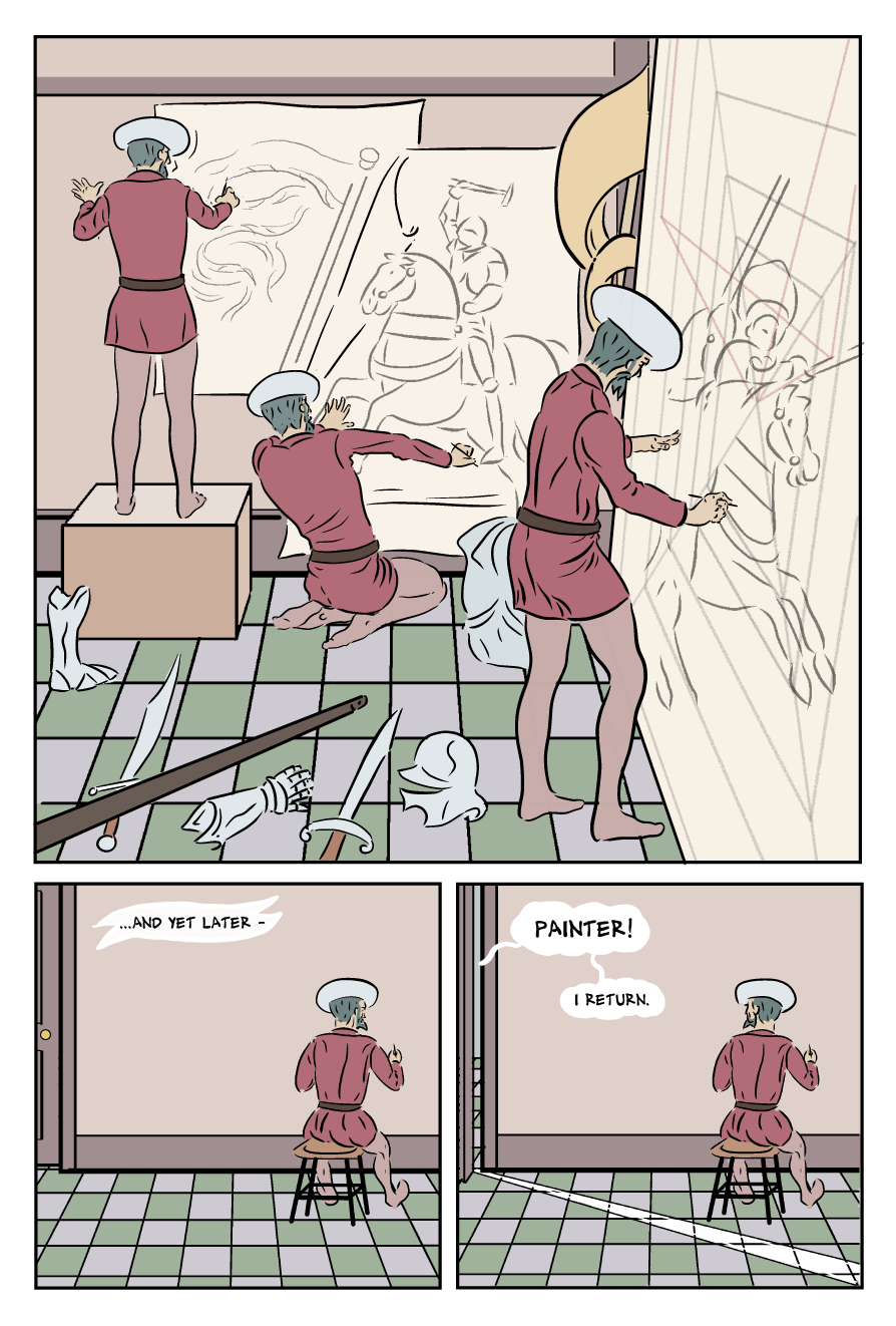 Below is my (very) rough breakdown/sketches for the final page - it probably first needs some explanation, as to what is meant to be happening. Row 1 is Salimbini (the patron) with Uccello after he has seen and accepted the progress represented by the completed 'cartoon' for the first painting. I also added Rocco (the patron's major demo) to this scene, as he had played a key role in enabling Uccello's breakthrough that let him turn a set of studiess into the complete scene. As discussed in the post below, I had turned these two panels into a single wide panel, on the previous page, however I may have to return it to the final page to put a 'moment of reaction' panel on the previous page. Row 2 shows Uccello walking home and passing his sculptor friend Donatello. I am thinking now I should add the other artist, Ghiberti, to this panel. Donatello, like Uccello, was a pupil of Ghiberti, so it's perfectly likely that they could be together. I will need rework on the dialogue for that row. to give Ghiberti a line. The sculptor Donatello, is meant to come across as a friend, even though he is shown as cheekily mocking of his friend's somewhat theoretical approach to 3 dimensions in art. Donatello was a key figure in the return to the lost classical techniques of sculpture in the round. as a sculptor, Donatello is not a rival in the direct sense of competing for the same jobs, whereas Ghiberti feels Uccello has chanced upon a job that Ghiberti's studio would have been better placed for. Possible lines:
Row 3 shows Uccello reunited with his wife, after being essentially held prisoner at the patron's pending 'a satisfactory position...'. In the first panel (I may not use borders) he arrives on the imaginary steed. In the second panel we see his wife pulled up onto the steed - this mirrors her monetary fantasy of being carried away from there difficult marriage to Uccello, by the heroic horseman from his earlier painting (page 3), and suggests the narrative concept of a 'new equilibrium' at the end of the story, may extend from his work life into his domestic life. 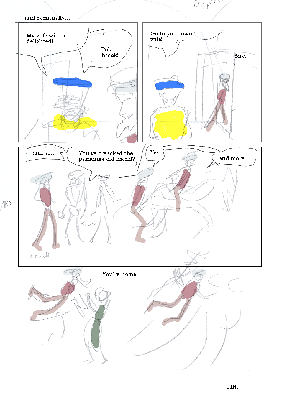 I've made some of the chances in the updated version below, with panel 1, being pasted in from the previous page. The rest may not look very much, but I'm now clearer and more confident in my mind for tackling this crucial last page. I may omit the panel border(s) for the middle row, to suggest Uccello's sense of release. I could draw in some of the ground, which would act as divider between this and the borderless row below. 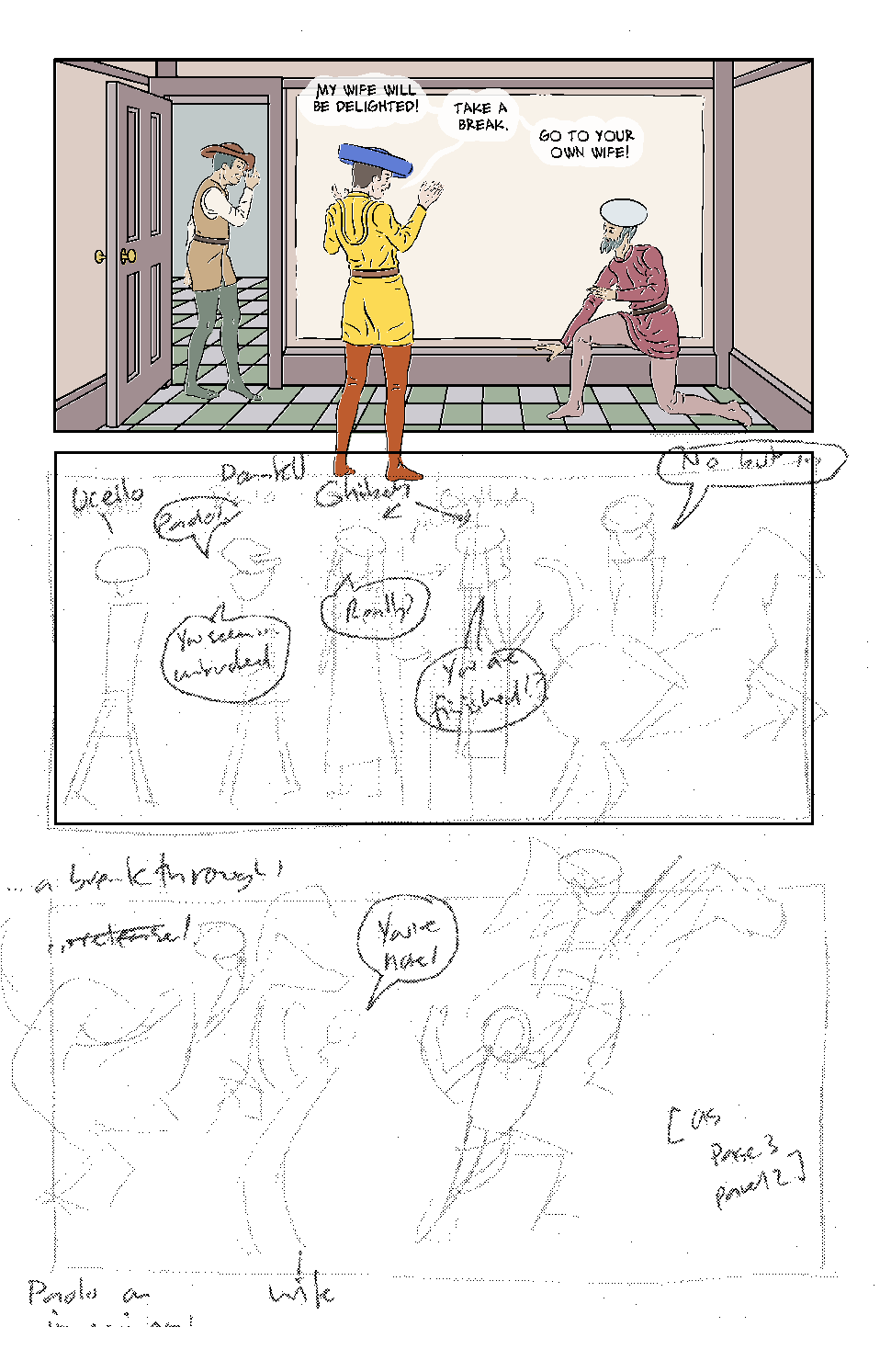 The image above seems to have slightly offset the inks layer from the colour - it looked okay in Manga Studio, and I'm sure it's easily fixed. Below is the panel, (below, right) from page 3, of Uccello's wife (there is no record of her name) imagining herself being swept away by the rider in her husband's painting (below, left). the final panel of my story (sketched above) mirrors this, but with the revitalised Uccello on an imaginary horse, sweeping her away. 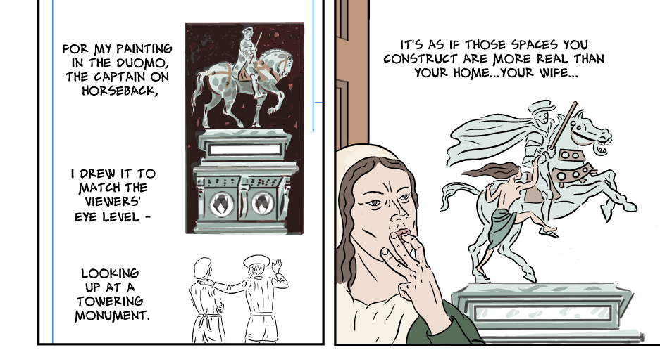 I finished drawing and inking the last panel of the spread pages 20-21. I did agonise/labour over the poses in this more than usual, but that seemed appropriate, as it is a key part of the conclusion.As noted in post 4 on this topic, Uccello getting up from the floor, was particularly difficult. I've opted for a later moment i that action, and am fairly pleased with it, although an unintentional effect is that he appears to be leaning his right hand on the skirting. I'll sleep on that, before deciding if it need changed. I said in the previous post that I wanted to have Rocco tip his hat to Uccello, in acknowledgement that the former's gamble had paid off for both of them. Moving Salimbini back from the painting (and so towards the reader, and out of the panel) meant he was not in the way of the look between the other two. 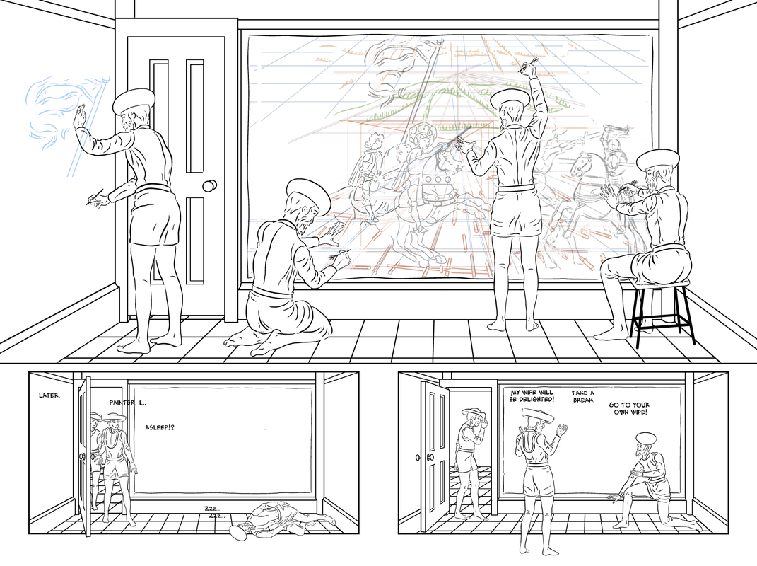 Panels 2 and 3, will of course, have a more finished version of the drawing seen in progress in panel 1. 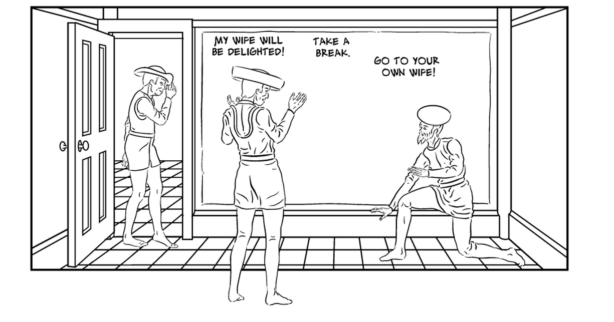 I've now flatted these pages. I've still to complete the drawing for Uccello's painting, for panels 2 and 3. I see in the picture below, I have not finished the hair/beard of theta left Uccello - fixed now! 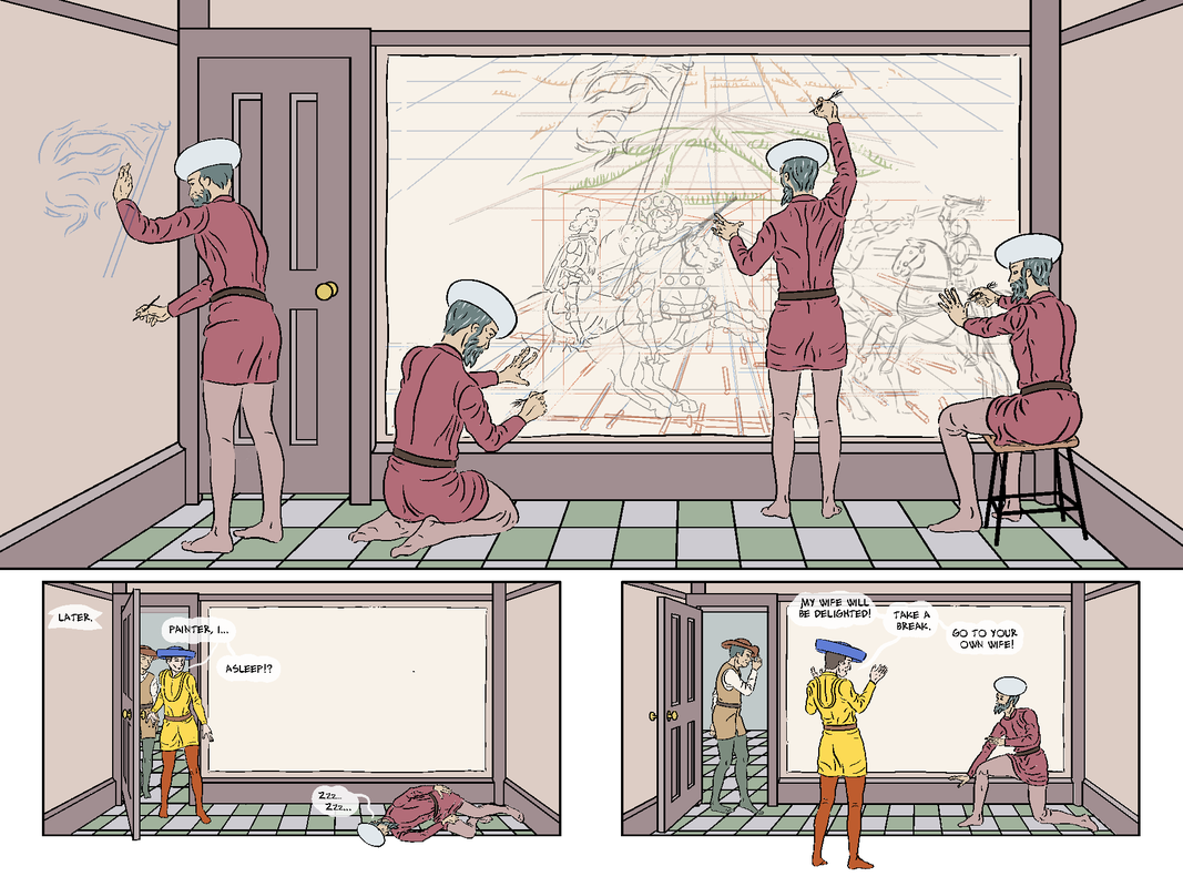 In composing this scene I did think about where to put the vanishing point. There would have been some appeal to making it run along the join of the two pages, - to give a symmetry to the spread, but in the end I decided it was better to align it with the vanishing point in the drawing - just at the raised baton, where I've put Uccello's hand.
Actually, looking now, at this sequence, I wonder if it needs an extra panel (between 2 and 3 as seen here) with the moment of the patron seeing the painting and deciding it is good. the contents of panel 3 were meant to be on the last page, and i moved them forward. This would have given me a large last panel, though if I move the last panel here back, what I lose in visual impact, I may gain in structural elegance,. It will be a three panel page, featuring a key character/set in each panel: Salimbini and Rocco in 1 (moved from panel 3 here), Donatello and Ghiberti in panel 2, and Uccello reunited with his wife in panel 3. I'll keep this in mind as I finalise the next and last page. I have more to do on the double-page spread pages 20-21, however, I'm working from home today (to make it seem like a Sunday off!), and due to delays in files updating to Dropbox, I'm having to work on a different page. By way of context, page 13 comes after the page (below) where his old master tells him he should go and sketch horses and riders in real life. 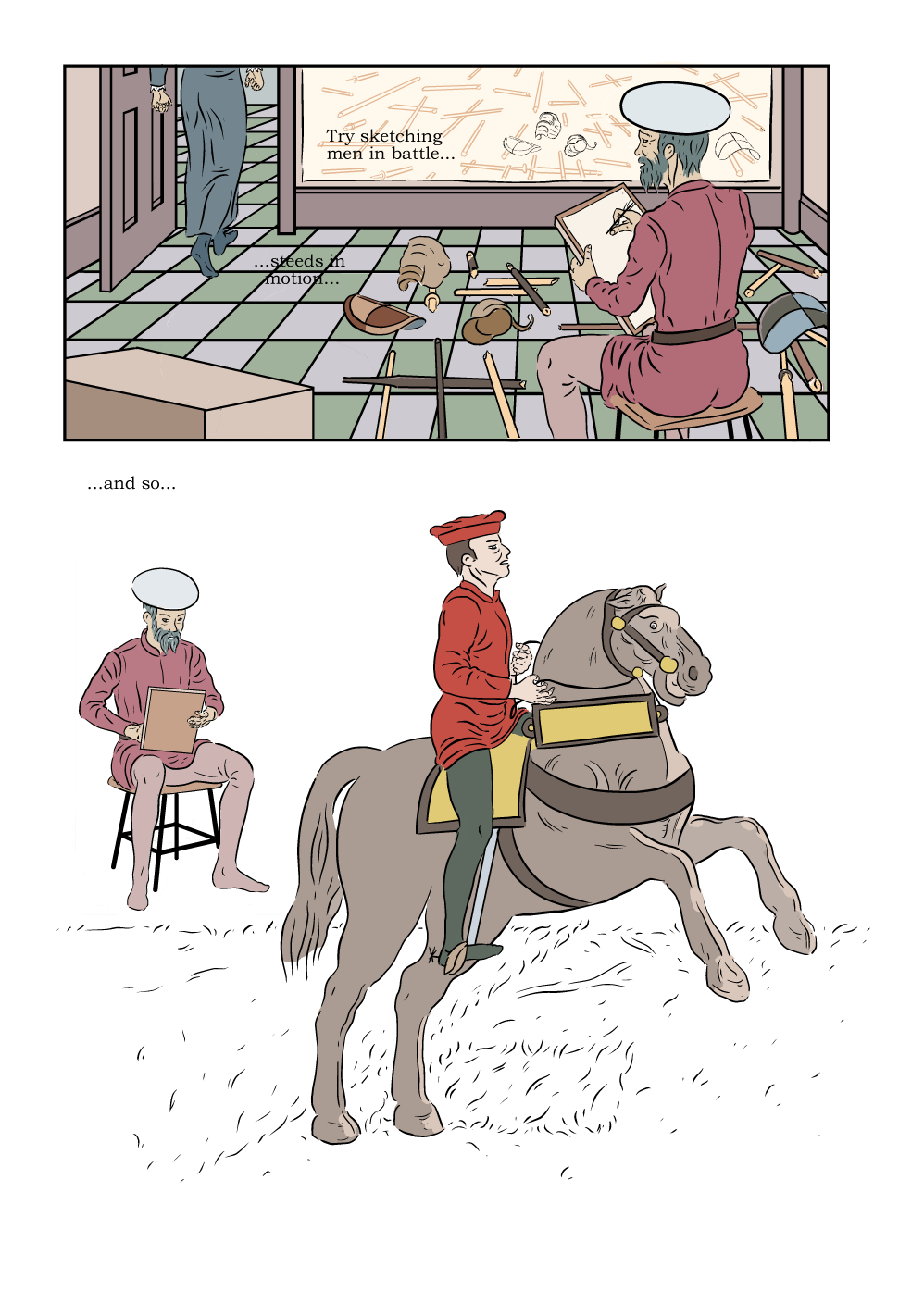 ,My initial idea for page 13, was to simply have six panels of different sketches of horses - to suggest these were Uccello's drawings. However, I felt that I could come up with something that was more interesting (which would inevitably mean more work for myself!). I decided to create a montage effect around a scene of Uccello drawing a horseman. I already had an inked drawing of a horseman, which was originally on page 12. It's a drawing of the same image of a rider with a baton, leading the charge, that we saw imagined on page 1. My intention was to base all the images of horses on the paintings the comic is about - so that for the reader, they will see all these sketches worked into the final painting. The problem with this drawing on page 12 was that while the reader was seeing it the right way round (as it appears in the painting) Uccello was drawing it from the opposite, and so wrong, side. On page 13, the viewpoint is flipped so that we are looking over Uccello's shoulder, and so seeing his subject as he draws it. In short, the drawing makes sense on page 13, which I am working on. I found images of riders in the paintings (that are the subject of my comic). Rather than simply put these in a panel style grid, I decided to have then in a looser arrangement. What I arrived at, was to organise them in an almost circular, clockwise, order. I also arranged the images within that forame, in an escalating fashion, which also reads as a chronological sequence: so the first image shows a rider: then a rider with a raised lance, then a rider with a lowered and aimed lance; a rider falling off his horse (as if hit by a lance - as it will appear in the painting); and then, completing the sequence, two images of fallen horses. The pose the 'real' rider is in, is not included in that sequence, as that seemed redundant, and I had the better idea to have it be the current one on Uccello's drawing board. 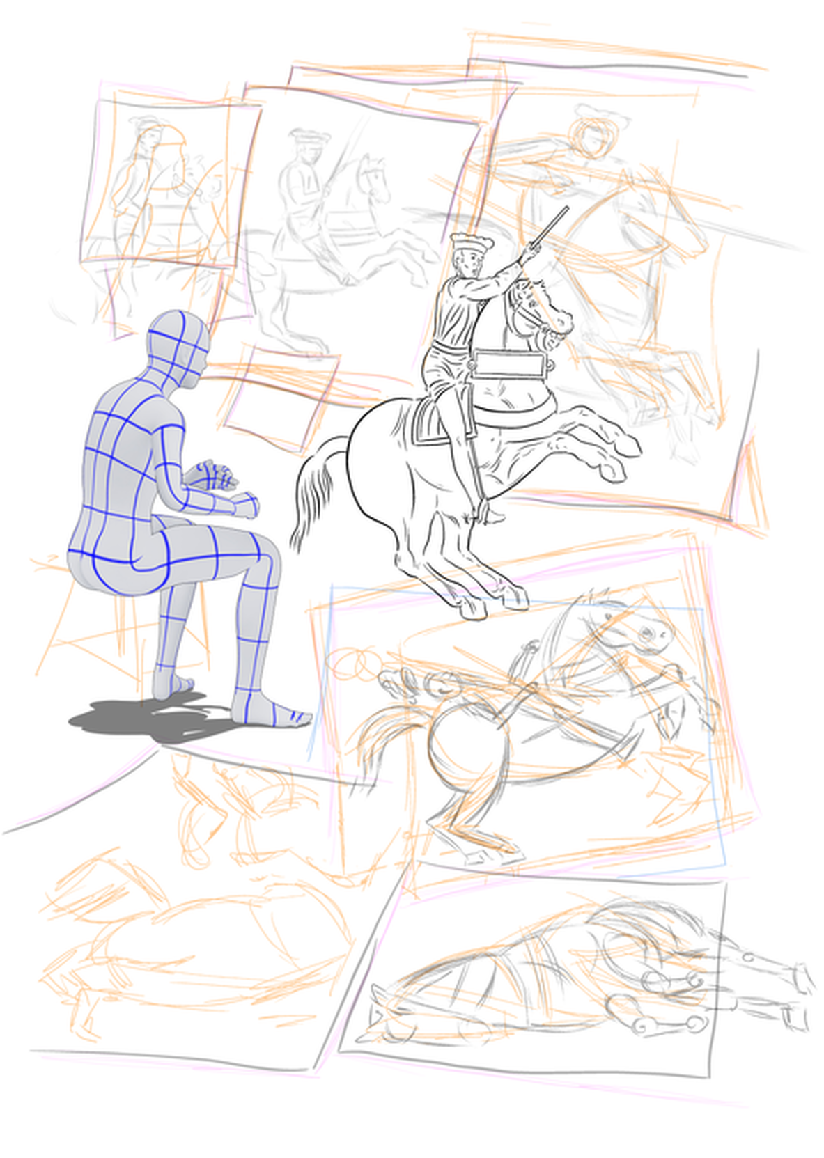 Initially, I tried drawing these to look like rough sketches, but I thought they betrayed a incongruously modern simplification, indeed abstraction. In response to this I redrew them in more finished form, closer to how they appeared in Uccello's paintings, but with the rider as shown, and armoured like most of the figure in the finished painting. Hopefully this is the right amount of information for the reader to ' join the dots'. to the figures in the final design - seen later in the story. 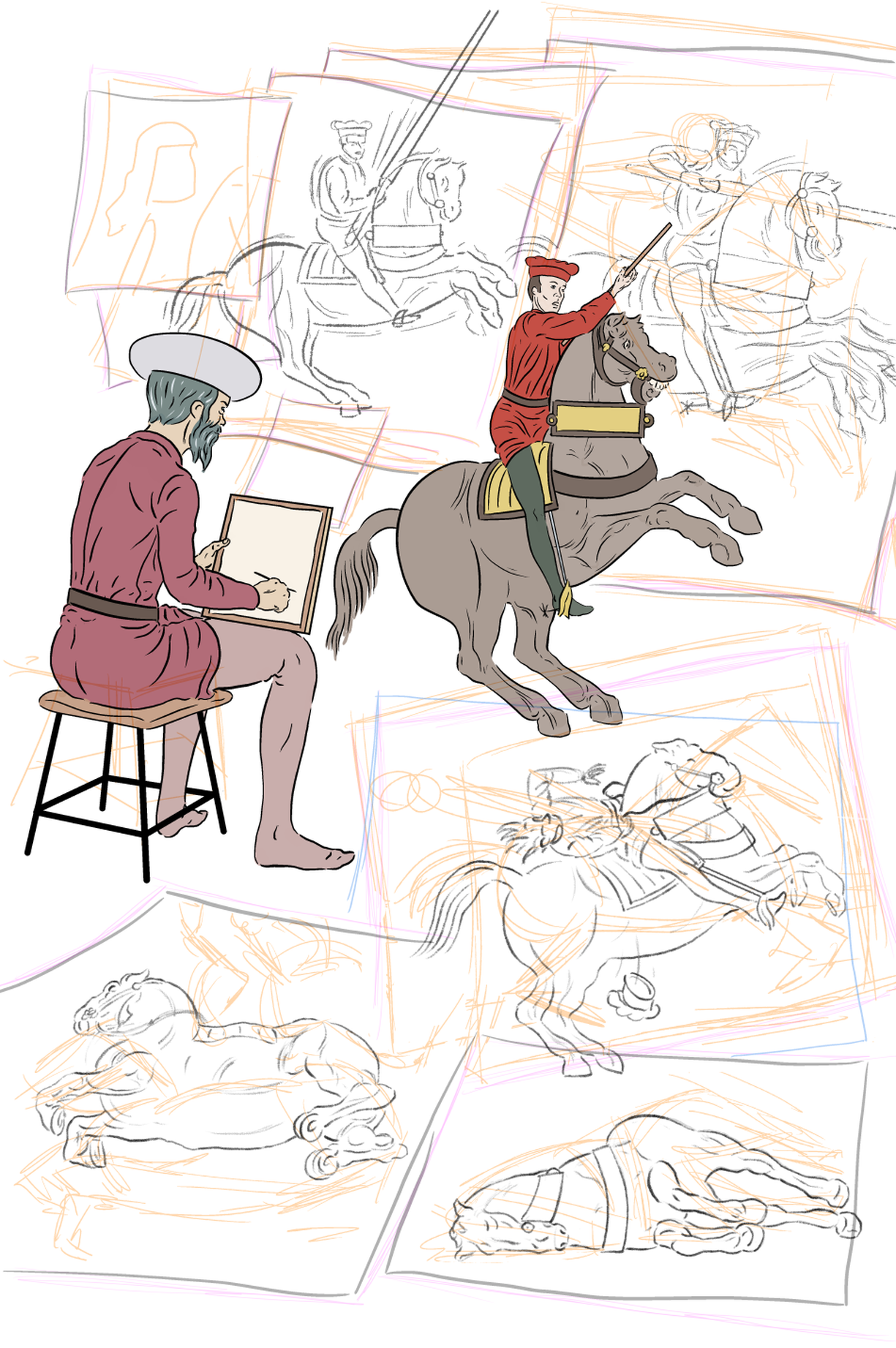 I have a range of pencil tools in Manga Studio, but had to experiment to see what (ironically) was going to read best as pencil on the printed page. I've also had problems before, with finding good techniques, and then when I wanted to replicate them, being unable to remember how! To preempt that, this time I used the text tool within MS to write down what pencils and settings I'd used (and then turned off its visibility).
I made a number of other changes from the previous draft, including changing the drawing board, and Uccello's hand to be more convincing that he is holding it, for support, as it rests on his legs. I also risked, and repositioned the sketched horses to make a better overall composition. When I come to draw in the paper edges, I'll no doubt have to tweak this. It took a few attempts for the stool, even though I have now drawn it a few times. It's necessary to have the legs look correctly angled from the seat, and have the horizontal beams look like a rectangle in perspective. I also made the different legs different thicknesses depending how close they are to the 'camera'. Like other aspects of perspective - it may not be noticeable that I've gone to the bother to get that right, but it might be noticeable if i hadn't! I still think the stool is not perfect, and the legs should probably be proportionately wider (to match other panels) . but I'll wait and see whether it continues to annoy me, or I stop noticing it! It's more usual to hold off any colouring until the pencils/inks are completed, but i was finding to hard to visualise how the whole page would look, and so how well the drawings were working, which I is why I flat coloured the picture of Uccello and the his horseman model. this did do its job and reassured me that the overall effect would be coherent. The drawings won't be coloured in the same way (they're meant to look like drawings!), though I may give the 'sheets of paper' they are on, an off-white paper colour. I won't put them on the bitmap inks layer, as I'll probably want to grey them out a bit, or similar, and it'll be no problem to add the paper colour later to the same flats layer (I make it a multiply layer, so I can bucket fill shapes not on the bitmap inks layer.. A number of elements will be changed from this draft version. The sketches in orange won't appear in that form, but I may have some kind of sketching effect over/underlaid on the more finished looking sketches, to suggest a process, and that they are working drawings rather than finished works of art.The paper edges aren't very good, at present, and I can finesse them. These various changes should improve the finished page. |
AuthorGraham Johnstone ~ Master of Design - Comics and Graphic Novels student 2016-17 Archives
August 2017
Categories |
 RSS Feed