|
I'm undecided about whether to add tones - they might act against the flat quality I wanted to suit my subject's style. Nonetheless I have tried a few attempts. The version below is before application of a tone layer. 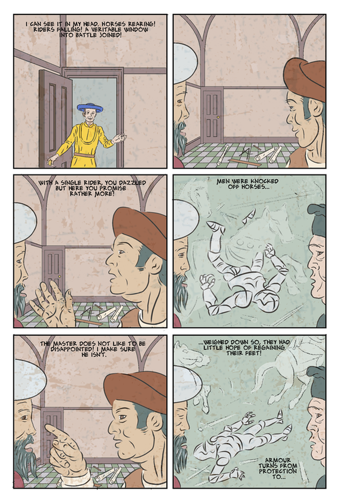 In the version below I used the magic wand tool to select areas and then went over then with a large textured airbrush, and a single colour a lilac/grey. It ended up just looking like airbrush. Also the areas areas that most needed tonal distinction - between the faces and background, were so close in colour and tone as to be not easily selectable by the magic wand. I tried going back over with an erase to define the edge of faces - don't think it worked particularly well. 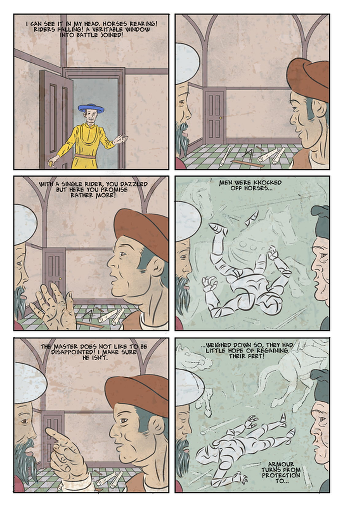 I tried a similar approach, but with a charcoal brush, and it looked much the same. My third attempt used a brush called 'Painterly_02' at 310 size. 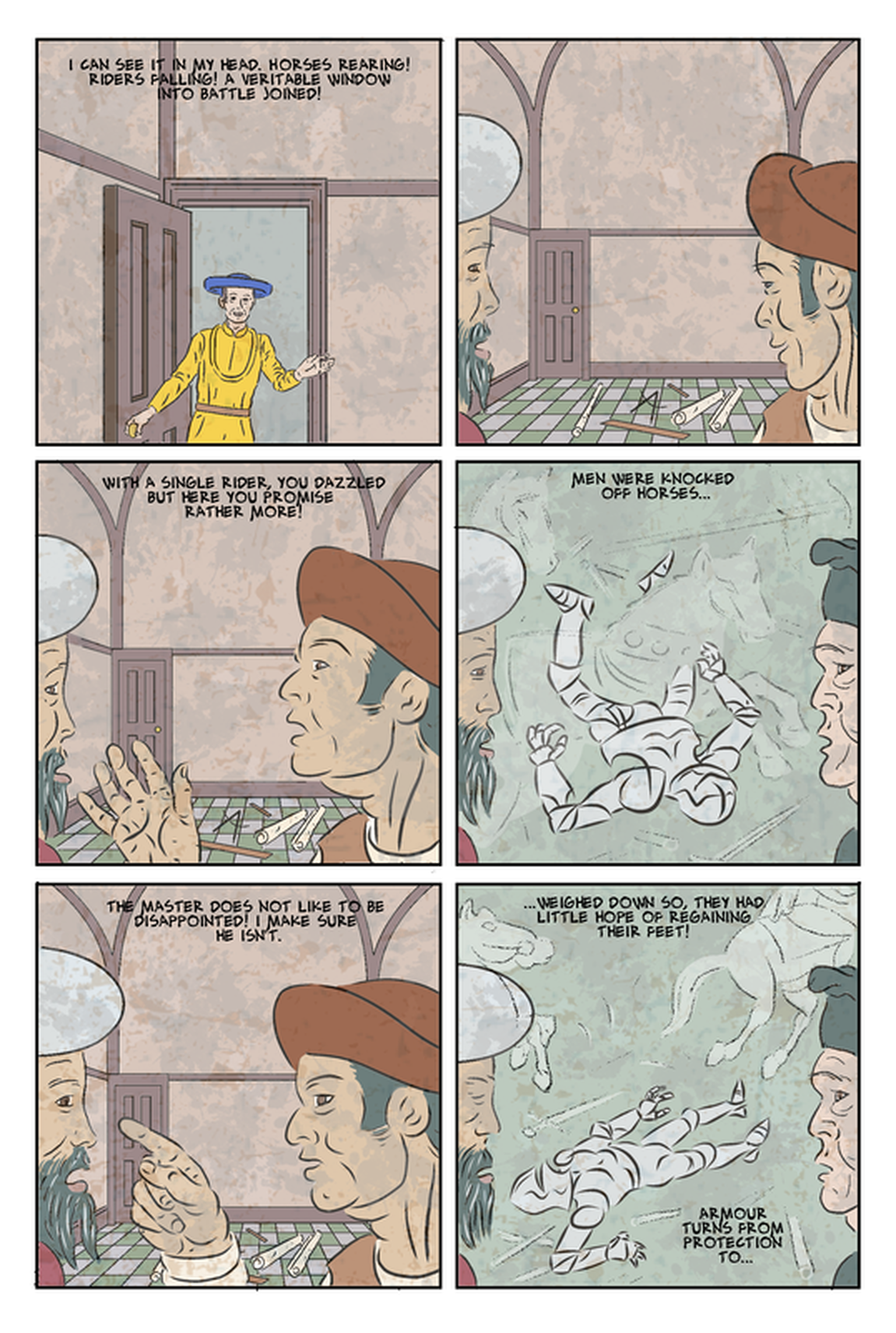 It worked okay on the faces, and on the green backgrounds, where it creates a quite appealing richness - does it really help it as a comic though. The issue may be that there is too much contrast over the hot coloured areas, and they might work with the same brush in a different colour.
0 Comments
Leave a Reply. |
AuthorGraham Johnstone ~ Master of Design - Comics and Graphic Novels student 2016-17 Archives
August 2017
Categories |
 RSS Feed