|
Below are stages in completing a page. These images are pasted in from my original aborted 4 page comic. Panel 1, though has been made into a tall panel, though to show the image of the horseman (an earlier work by Uccello, that may earn him a new commission), conveying it's scale. 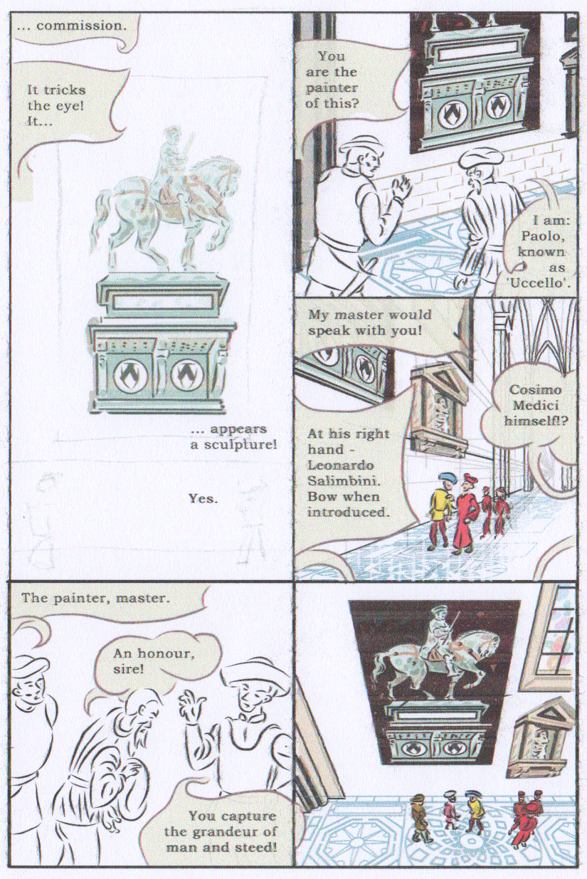 Figure 1 I was pleased with the text aspect of the page/scene transition: on the previous page his wife is telling him what will happen if he doesn't turn his fascination with perspective into...'a commission'. The previous scene was a at Uccello's studio where he had been talking to her about this painting. The problem though, was that I felt, a visual of the changed location was necessary, so I repaginated the panels to accommodate that, resulting in the (still unfinished) version at Figure 2. 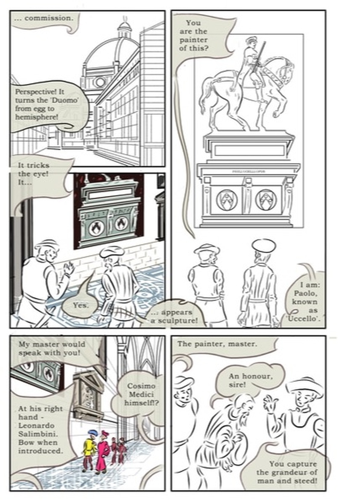 My second version (Figure 2, above) has a new first panel, giving an exterior shot of the location for the interior panels: The Florence Duomo (aka Cathedral). To help the flow, I have added a new dialogue balloon of Uccello relating the Duomo to his earlier 'lecture' to his wife about perspective. The addition of this panel, though created a challenge with the rest of the page, i.e. that I had to move the tall panel over to the right column. I had the same panel layout problem in my Vermeer comic: after the first panel, does the reader then to the right or down...? I want them to read down, ands have positioned the balloons to lead the reader through my intended order.
The amount of text on this page does create a challenge in arranging it on the page. This leads the eye into the bottom of the tall panel, and I deliberately made the balloons lead the eye up to the top of the panel, (and then back down) to have the reader experience the scale of the painting and its height on the wall. I think the balloon styles in my original versions worked well, but I may be able to further finesse the new additions. I have redrawn the wall painting in the tall panel. I had originally drawn a coloured version, and pasted and distorted it into the different panels where it was required, however it was beginning to suffer from being pasted across programmes, and distorted so many times, so I redrew it. I omitted the last panel on my original version, and used a similar image as a large panel on the next page.
0 Comments
Following discussion with the tutors I decided to create gutters between the panels borders. This is cumbersome to do retrospectively. I have already done many of the drawings for (multiples of) and exact panel size. Manga/Clip Studio's processes seem entirely at odds with creating evenly sized gutters while ensuring the panels remain the same size. This is further complicated by the fact that I have already drawn all my panel borders at a particular thickness (13 point): this multiplies the complexity of keeping the gutters and panels equal sizes, because it's hard to accurately place a thick line over a guide.. I made a number of attempts and printed them out check them at actual size, and the gutters always looked uneven.The panel cutter tool won't work unless one has created the panel border, using the frame tool, but if you use this it hides your guidelines (even if you vary the layer order and transparency!} . It may be that when the panels are populated it will be less noticeable, but It would be even more of a headache to fix at that stage. It's another example of the numerous niggles with my upgrades from Manga Studio 4 - things don't work in an analogous way. I did spend some time creating a it's-not-perfect-but-it'll-have-to-do 6 panel template, but the gutters in this mean I have to to manually overdraw it when I need different permutations. My previous gutterless panels enabled me to incorporate the panel grid into each page, and just delete the lines I didn't need on that page. It really was a pain, but that's the first stage over with.
Versions of the same page with and without gutters, can be seen in Figures 2 and 3 of the post below 'Producing a Page'. This post shows the stages in working towards a completed page. This is the first story page, though not the first drawn page. The story was initially begun as a four page story in Semester 1, with the intention of submitting it for the Observer Graphic Short Story Competition, however i decided to put it on hold. There were two reasons for this: firstly, that I decided I did not have time for extra-curricular work; and secondly, that while I felt the narrative worked in four pages, it did not do justice to the depiction of the artist's working processes. Instead I decided to rework the story as part of my Major Project. The first step was a to repaginate the story, with three concerns in mind: to suit the smaller 'Dundee' page size, to elaborate on the story/dialogue where needed, and to incorporate more large images. The panels were mostly a regular square size (initially twelve panels to a page), and I wanted to keep to this format, except where there was a reason to change it. This meant that to make a square panel larger, it needed to take up the space of four panels. For example, the three panels originally comprising the first row of my original version, (Figure 1), would be a whole page in the revised version (Figure 2). 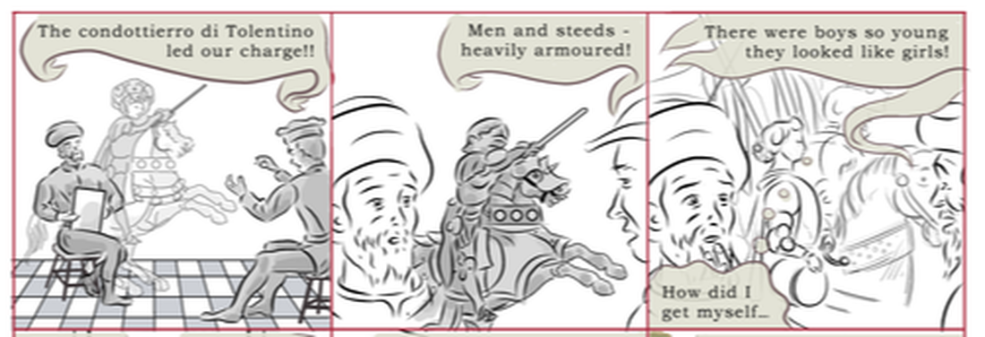 Figure 1 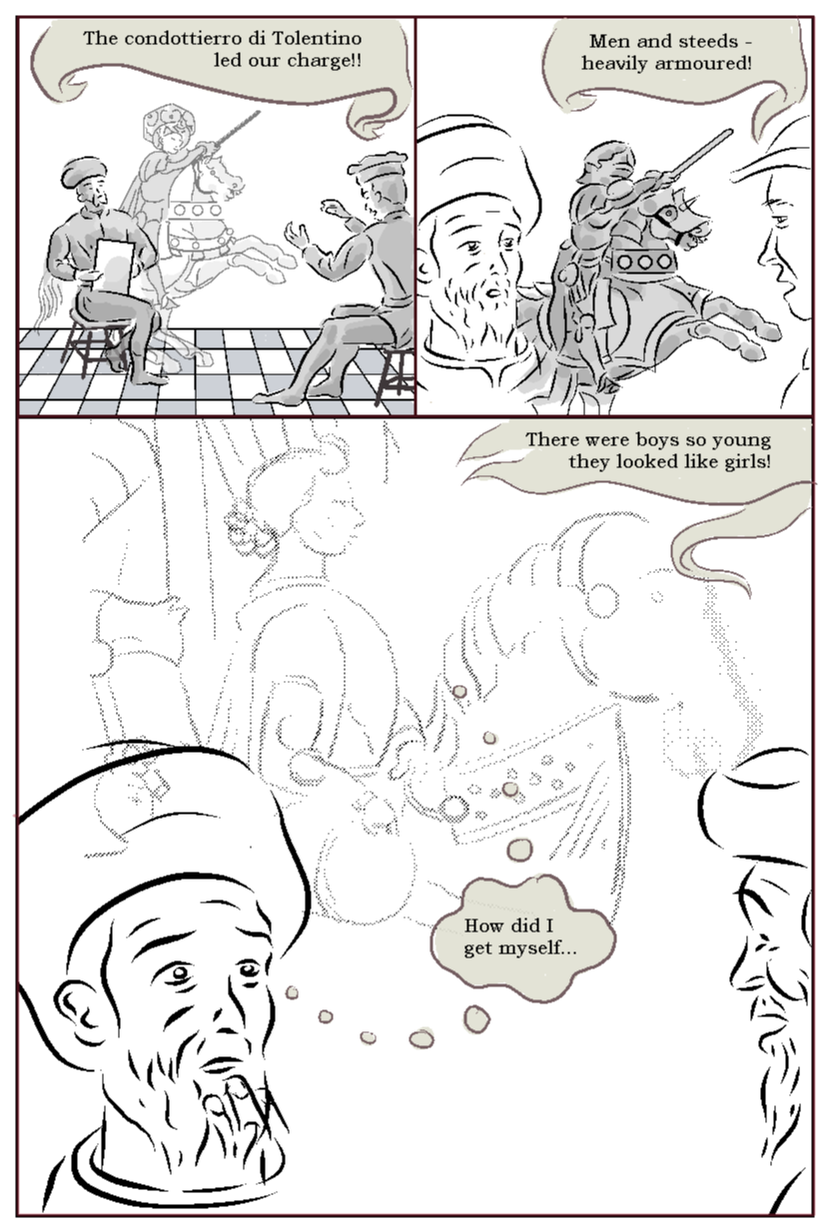 Figure 2 While this seemed like an efficient use of an aborted work, in fact, typically panels blown up to this extent looked weak (compare figures 1 and 2, above), and needed re-rendering or complete redrafts. My recent use of Manga Studio's 3D models, also made most of the initial panels look poor by comparison . The resizing process retained the letter point size, meaning I had to individually resize the balloons. In short, this process was a more work that it initially seemed. 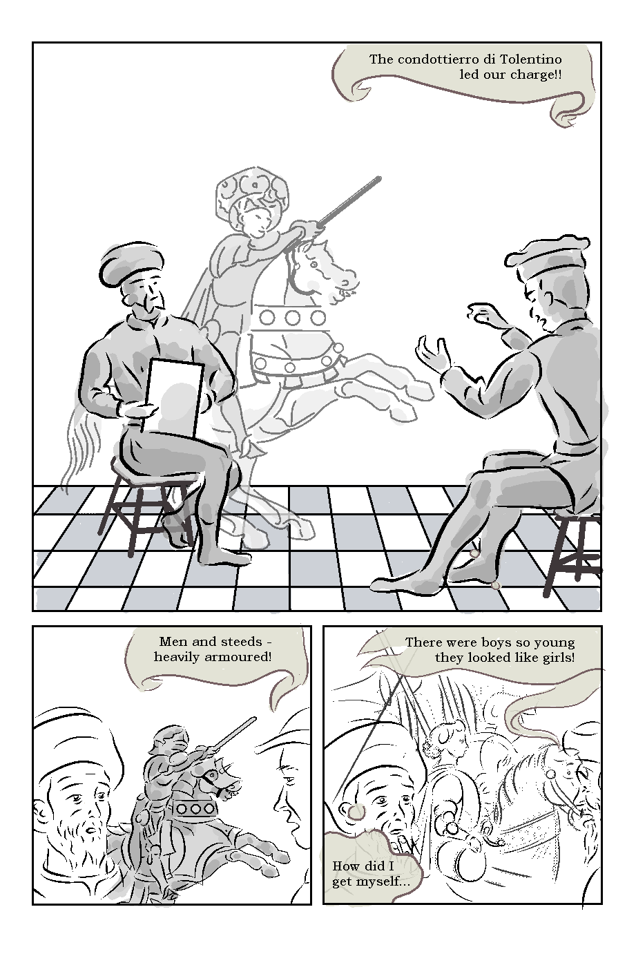 Figure 3 I revised the configuration of the panels (Figure 3), and think this works better. It both seems more fitting to make the first panel the largest, and to give me more space to suggest the idea that the horseman is Uccello's imaging of he scene being described. Panel 1 at this size needs a complete redraw, but that feels a worthwhile investment to impress with the first panel - a splash panel. 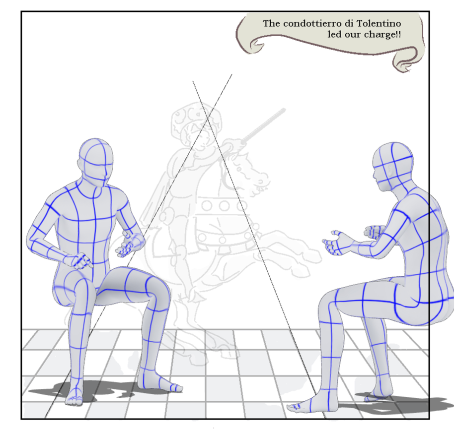 Figure 4 The original figures were only 'acceptable' at the smaller size, so I set about reworking them. Using the original drawings as a guide, I created some figures in approximately the same positions using Manga Studio's 3D models. It has a few figures already in seated poses; one of these 'Taking a Note' was a good starting point for Uccello. In arriving at the version above, I went through multiple tweaks of the poses, size, rotation and position. A key consideration was to create the best composition incorporating the image of the horseman - to suggest he was emanating from Uccello, as the latter tries to imagine the scene described. The version in Figure 4 has the advantage of showing more of the horse and rider, though has the disadvantage of losing the visibility of the tail behind Uccello, which I had thought was a nice feature. I'll keep working on this. I often can draw straight in ink over the 3D models, but here I decided to do some sketching first (the magenta layer in Figure 5, below). I can usually add clothes and character features directly in ink (now that I've done them a few times), but this panel had some more difficult features. The stools are difficult, because they need to look like that are supporting the figure, and in this case (a story about a perspective pioneer!) need to be in believable perspective. It was also some work to correctly place the drawing board to credibly appear that Uccello was both holding it, and drawing on it. My original version where he is holding the board with his left hand, was compositionally better, however I decided to change the hands to be consistent with other panels, where he is drawing with his right hand. This exemplifies tension in this type of 'non-fiction' project between accuracy and aesthetics, that is analogous to the tension in autobiographic between truth-telling and narrative. While the 3D models are helpful, the result is still dependent on the ability to make of them a credible scenes, and a number of decisions around, poses, camera angles, incorporation of key details, interaction between the figures, and with props and sets; and juxtaposition with other pictorial elements. 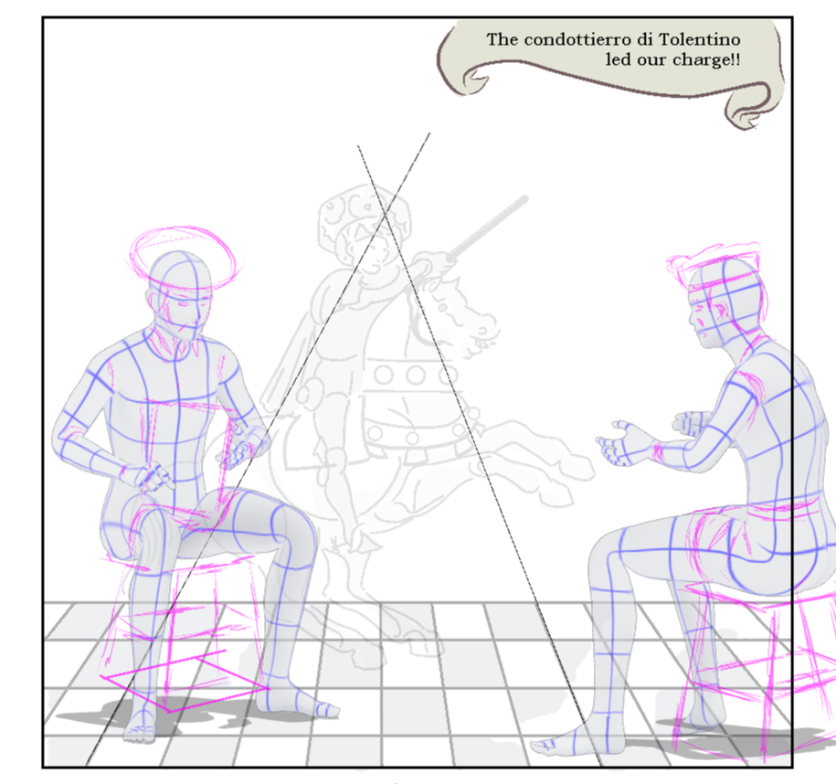 Figure 5 Figure 6, above, shows the final inked figures. It is a challenge on Digital to manage line thickness: for these figures I stuck to pen size 17, but using a 15 for detail like faces and hands. Drawing over reference layers, brings an additional challenge that you can't see your line so clearly: it's tempting to lean harder to get a line you can see, but it can look crude once you hide the reference layers. There is still variation in any line due to the pressure applied, but I'm getting better at this, and a degree of variation is, I think, appealing. A implicit challenge of the art on these comics is they need to sit between comics/illustration and fine art traditions. I think the evidence of the human hans here helps with that. These were some of the concerns in inking this. 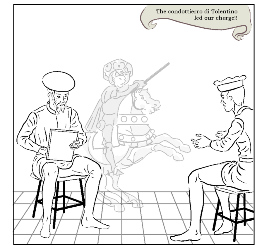 |
AuthorGraham Johnstone ~ Master of Design - Comics and Graphic Novels student 2016-17 Archives
August 2017
Categories |
 RSS Feed