• Landing Page
  • About Me
    • Contact Me
  • Francis Bacon
    • Francis Bacon - Portrait of the Artist
    • Francis Bacon - The Muse.
    • Francis Bacon - The Critic
  • Uccello
  • Vermeer
    • Vermeer - The Fathers of Delft
  • Editor - Dead Trees
    • Dead Trees cover gallery
    • Sample Issue
    • Reviews
    • Reviews - More
    • Dead Trees Lucky Bag
    • Contributors
  • Art Museum
    • Tangled Tales
    • From Dead Trees
    • The Chimera Tree
    • Seen From Here
    • A Different Story
    • Create / Destroy
    • Dead Trees (from 'The Outsider') >
      • More on Dead Trees (from 'The Outsider')
    • More
    • Chemistry
    • Blog Archive
    • Rare >
      • For Films
      • More For Films
      • Realism
      • Links
    • The Curse of The Yellow Booke >
      • The Curse of the Yellow Book >
        • Introduction (1912)
        • More Pages
        • A Found Object
        • The Library (complete)
        • The Intermediate Functionary
        • The Book and the Curse
        • New
  • Reviewer - Graphic Novels
    • Reviewer - Artist Biographies
    • Reviewer - Art Comics
    • Reviewer - Graphic Biographies
    • Reviewer - Underground Comix
    • Reviewer - More
  Graham Johnstone art

Lettering

16/7/2017

0 Comments

 
I had already decided on the 'Alex Toth' hand-lettering font, and as I work through the pages preparing them for flatting, I have been changing the lettering as I go along.

The eagle eyed tutor had spotted in my pages (with the original typeset style font) that some text blocks, even on a single page, had different letter spacing. This is s strange effect of having imported some text to Manga Studio 5, from version 4. This effect remained, when I changed the font to Alex Toth. I previously reduced the font size to 7. partly because it reduced the line weight, which I felt was a bit heavy for my drawn lines, however I wondered if that was getting a bit small. It may be that the wider spacing makes it easier to read. I couldn't find a way in the settings to change the letter spacing, is I had to copy then paste a block of text with the wider spacing, and then change the text - a bit laborious, but worth trying on a couple of pages to see if it looks better.

On page 6 (see post immediately below) the first version shows MS5's regular spacing, and the second and third post the wider spacing.

I had originally in my short version of the story created my own type of balloons, which aimed to look medieval - almost like the scrolls and banners sometimes used in art as photo word balloons. I'd thought os using a different type for each character. I wonder now though if what might have been charming over four pages would become tiring over twenty two pages...?
​
Picture
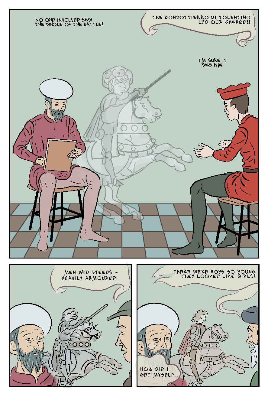
Figure 1 - showing both spacings on Alex Both font, and my original balloons.
I have been leaving the balloons to the end, as I find it easier to do such things all in one go. However,  just to make the text readable on my flatted draft versions I roughly marked underneath the text (where required) with a 150 sized marker, and added some ballon tails - I actually like the look. I have made the wide approx70% opaque so it takes some of the colour below. It works on the examples, but experience suggests that it gets complicated riding this over visually busy areas.  If opting for this particular style. I'm sure I could finesse it better.

​There is a further example of these ad hoc balloons in the post immediately below.
0 Comments


Leave a Reply.

    Author

    Graham Johnstone ~ Master of Design - Comics and Graphic Novels student 2016-17

    Archives

    August 2017
    July 2017
    June 2017
    May 2017
    April 2017
    March 2017
    December 2016
    November 2016
    October 2016
    September 2016

    Categories

    All

    RSS Feed


All original Images copyright Graham Johnstone, or, where applicable, their respective creators. 
  • Landing Page
  • About Me
    • Contact Me
  • Francis Bacon
    • Francis Bacon - Portrait of the Artist
    • Francis Bacon - The Muse.
    • Francis Bacon - The Critic
  • Uccello
  • Vermeer
    • Vermeer - The Fathers of Delft
  • Editor - Dead Trees
    • Dead Trees cover gallery
    • Sample Issue
    • Reviews
    • Reviews - More
    • Dead Trees Lucky Bag
    • Contributors
  • Art Museum
    • Tangled Tales
    • From Dead Trees
    • The Chimera Tree
    • Seen From Here
    • A Different Story
    • Create / Destroy
    • Dead Trees (from 'The Outsider') >
      • More on Dead Trees (from 'The Outsider')
    • More
    • Chemistry
    • Blog Archive
    • Rare >
      • For Films
      • More For Films
      • Realism
      • Links
    • The Curse of The Yellow Booke >
      • The Curse of the Yellow Book >
        • Introduction (1912)
        • More Pages
        • A Found Object
        • The Library (complete)
        • The Intermediate Functionary
        • The Book and the Curse
        • New
  • Reviewer - Graphic Novels
    • Reviewer - Artist Biographies
    • Reviewer - Art Comics
    • Reviewer - Graphic Biographies
    • Reviewer - Underground Comix
    • Reviewer - More