|
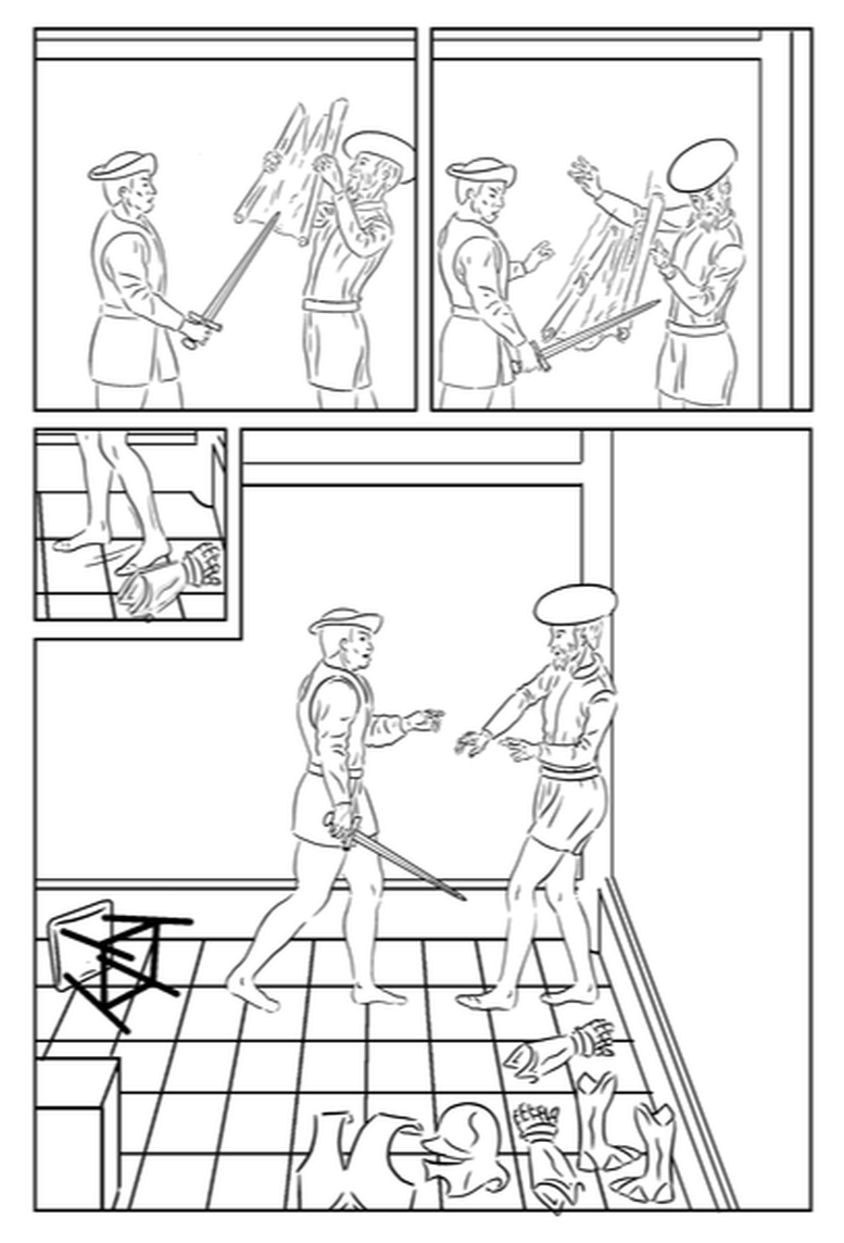
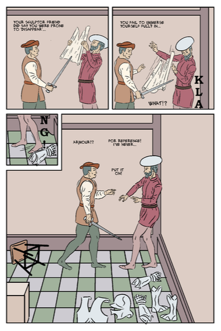
without any confusing tangentsI had this page inked a few weeks ago, and needed to do some further work before it was ready to colour.
Most obviously, it needed the paper falling from Uccello's hands, that I have now added in panel 2. It took some work to both get this aesthetically composed in relation to the figures, to follow the continuity of the previous panel, and also suggest that it was dropped on hearing the klang. Also I wasn't sure if a key action was clear - that Uccello, (while backing away from the threatening Rocco), bumps the armour, so alerting Rocco to its presence, and giving him a crucial idea.. I had discussed this with the tutor, and suggested I add a small inset panel, giving the detail of the foot hitting the armour. While the addition of this inset made storytelling sense, I was worried it would look incongruous. I have based every page on permutations of a three rows / two columns configuration, and this was going to be the only exception. I decided to make sure the inset panel was exactly a quarter (by area - half of each dimension) of the otherwise smallest panel. This size also seemed just right for showing the key detail on the same scale as all the other panels on the page, The 'L' shaped gutter might I thought be too much of a solid, distracting shape, so I looked at angling this slightly, to offset this. In fact it took some time getting it right. There were several things I had to get right in this small panel:
For example it would have meant sense for him to kick a large item like the helmet, which could roll, but on its side it would not read well in the next (big) panel, I opted for one of the armoured gloves, which was nearest to him in the panel next, which I had already drawn. I superimposed a ghost image of this to suggest it moving, and added motion lines to show the movement of his foot and leg. I also made the moved glove move slightly out of the panel border. I also wanted to include the 'KLANG!' sound effect. To include all that, and get a pleasing composition, without any confusing tangents, took a fair bit of time moving the image within the border in all directions in increments of a millimetre or less. I initially had the complete 'KLANG!' in panel two and just 'NG!' in the inset, however, I was quite pleased with my solution of putting only 'KLA' in panel two. It makes the relationship between the two panels clear - the inset is showing us the cause of the klang. Part of why it works is that the word reads vertically so implying a movement down to the character's feet. This is supported by the character (in panel 2) looking down to see the source of the klang. I also had to redraw the armour breastplate, to be consistent with a more exact rendering in a later (drawn) scene. The placement of the box and tipped over stool (its legs pointing towards Uccello) emphasise that there is literally (as well as metaphorically) no easy way out of this. I have previously mentioned that I have been looking at the addition of texture/distressed effects over the pages, and I think that would help on this page. I may distort a texture to emphasise the perspective on the call to the right. These various examples highlight the number of challenges in what might seem a straightforward page, and the effort and creativity in achieving elegant solutions. There are some further tweaks I might make: addition of Uccello's drawing on the wall - for continuity (seen on the previous page), and this would also indicate movement between panels 1 and 2
0 Comments
Leave a Reply. |
AuthorGraham Johnstone ~ Master of Design - Comics and Graphic Novels student 2016-17 Archives
August 2017
Categories |


 RSS Feed