|
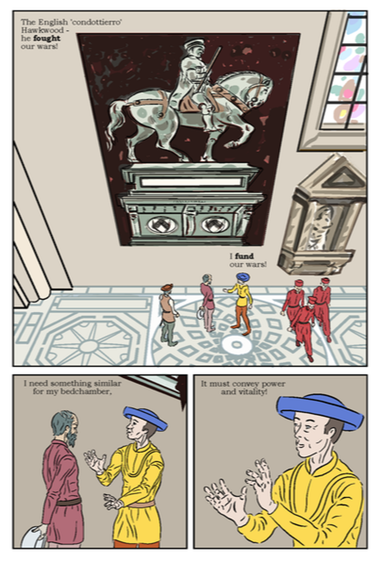
This page incorporates a fair amount of work done for the aborted first version of this story - essentially all the location details in panel 1, which are based on photos I took at the actual location - The 'Duomo' (cathedral) in Florence, where the Uccello painting (recreated by me below) can still be seen. This was done before I learnt how to do colour flats, so was created with multiple coloured layers, which I would often copy and distort (i.e. I added the perspective seen here after creating the image) to use in different panels. While these elements are in a visibly different style, I think it works okay here, simply because it is location details - whereas it more i portent to have consistency to e.g. the characters. Also the setting details are not the main focus of attention here, which is why I like the slight out-of-focus effect on this version of the horseman image. The tile pattern on the floor is (a simplified version of) the real floor. I created it in straight plan view, and then distorted it for perspective effects in this and another panel. I put this on it's own layer in that teal colour, and then bucket filled with an off white to take the pattern down a bit. I then turned areas around the central circle back to white to focus on the figures - reading the in the traditional (Western) direction from left to right, it seems to lead us round the first three figures, and then follow the second three exiting the scene via the bottom of the panel. ,I've been working, over this story (and following feedback on the previous one) on keeping my ink lines consistent in thickness. This is another thing that was easy in MS4, seems to me bizarre in MS5. I normally ink on vector layers, apart from anything else it makes it easier to erase whole lines, which I often need to do, as I work over sketches in ink without doing finished pencils. Unless there is some obscure route that has escaped me, MS5 will only allow the 'Correct Drawing Line' function on Raster layers. Apart from not suiting my approach, that seems counter-intuitive as it would logically seem easier to adjust a line that is already a mathematical (i.e. Vector) formula, and it worked on the earlier version, so why not here!? The control of how to adjust the line is also less user friendly. I felt my lines in the lower left panel were perhaps too thin, so I duplicated the relevant image and rasterised it, however even choosing what seemed to the most minimal 'Thicken' setting of 1.1, it seemed to almost double the weight of my lines, to the pint that they look almost to heavy. It works okay on the left figure because of the relatively dark colouring, but is more noticeable on the right, yellow figure. It may be I can go back and revert to my original lines for that figure only.
In the lower panels I made the background slightly darker to contrast with the pale skin and clothes, so it doesn't quite match the main panel, however I am proposing to add some lighting and toning effects, perhaps light coming from the window, that should mitigate this. I've still to update the lettering on this page.
0 Comments
Leave a Reply. |
AuthorGraham Johnstone ~ Master of Design - Comics and Graphic Novels student 2016-17 Archives
August 2017
Categories |

 RSS Feed