|
These four pages are in introduction in comics form to my graphic novel about Vermeer. 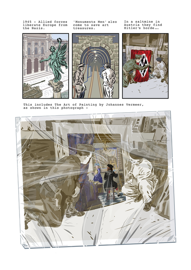 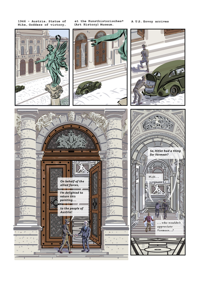 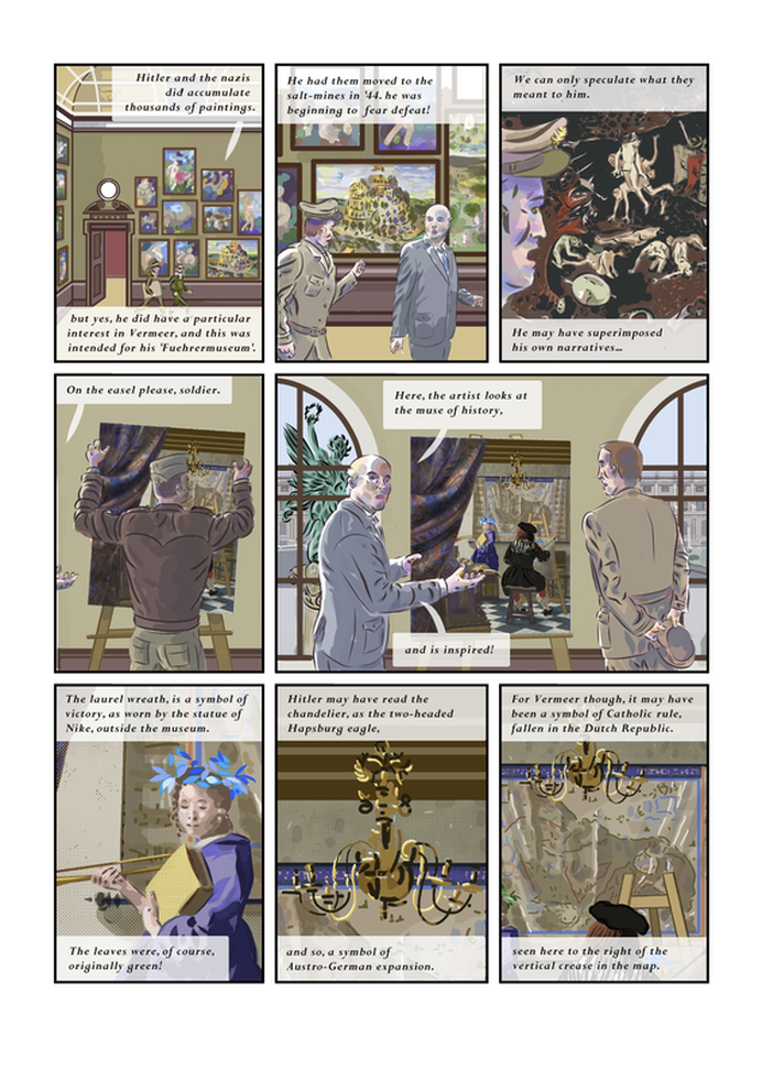 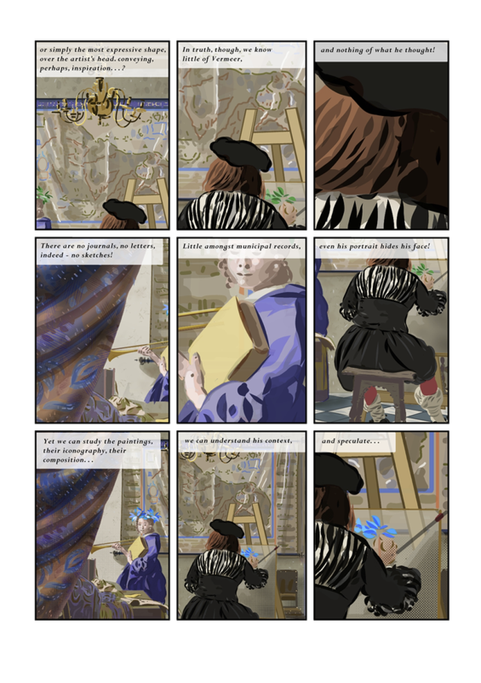 My comments on these:
I'm pleased with some of the images, but not others. This painted style is new for me. I feel traditional comics lettering and solid white balloons wouldn't work here: not sure this is 100% though. I think it works okay for the curator. I tried to use a more of tabloid font for the American officer - but it doesn't work as I have it: maybe the American could have standard comic balloons...? The fourth page is a selection of details of a Vermeer painting (that I have recreated in vector layers) zoomed in to reflect the text of each panel as far as possible.
0 Comments
Leave a Reply. |
AuthorGraham Johnstone ~ Master of Design - Comics and Graphic Novels student 2016-17 Archives
August 2017
Categories |
 RSS Feed