|
The semester 1 project required 8 pages minimum of a comic, which left me some pages to complete. One of the pages I had to complete was the front page of the story incorporating a cityscape referencing Vermeer's 'View of Delft' a creative challenge here was to locate the appropriate style between the painted look of Vermeer's original, and the more comics style (flat colours within black outlines) of the other pages. I think I achieved an effective balance: the slightly more painted style of the splash page mirroring the ‘higher modality’ rendering of e.g. 1960s Marvel comic covers, relative to the interior pages 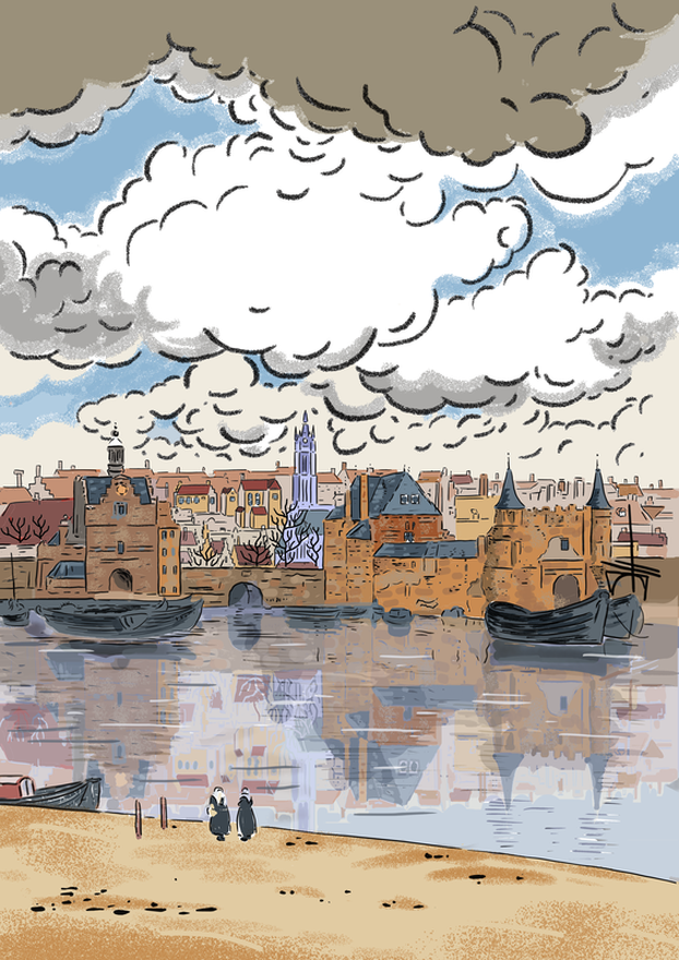 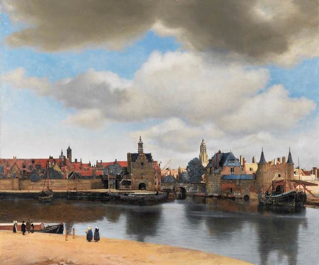
0 Comments
Leave a Reply. |
AuthorGraham Johnstone ~ Master of Design - Comics and Graphic Novels student 2016-17 Archives
August 2017
Categories |
 RSS Feed