|
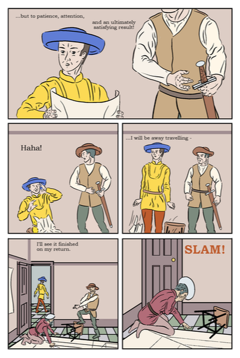
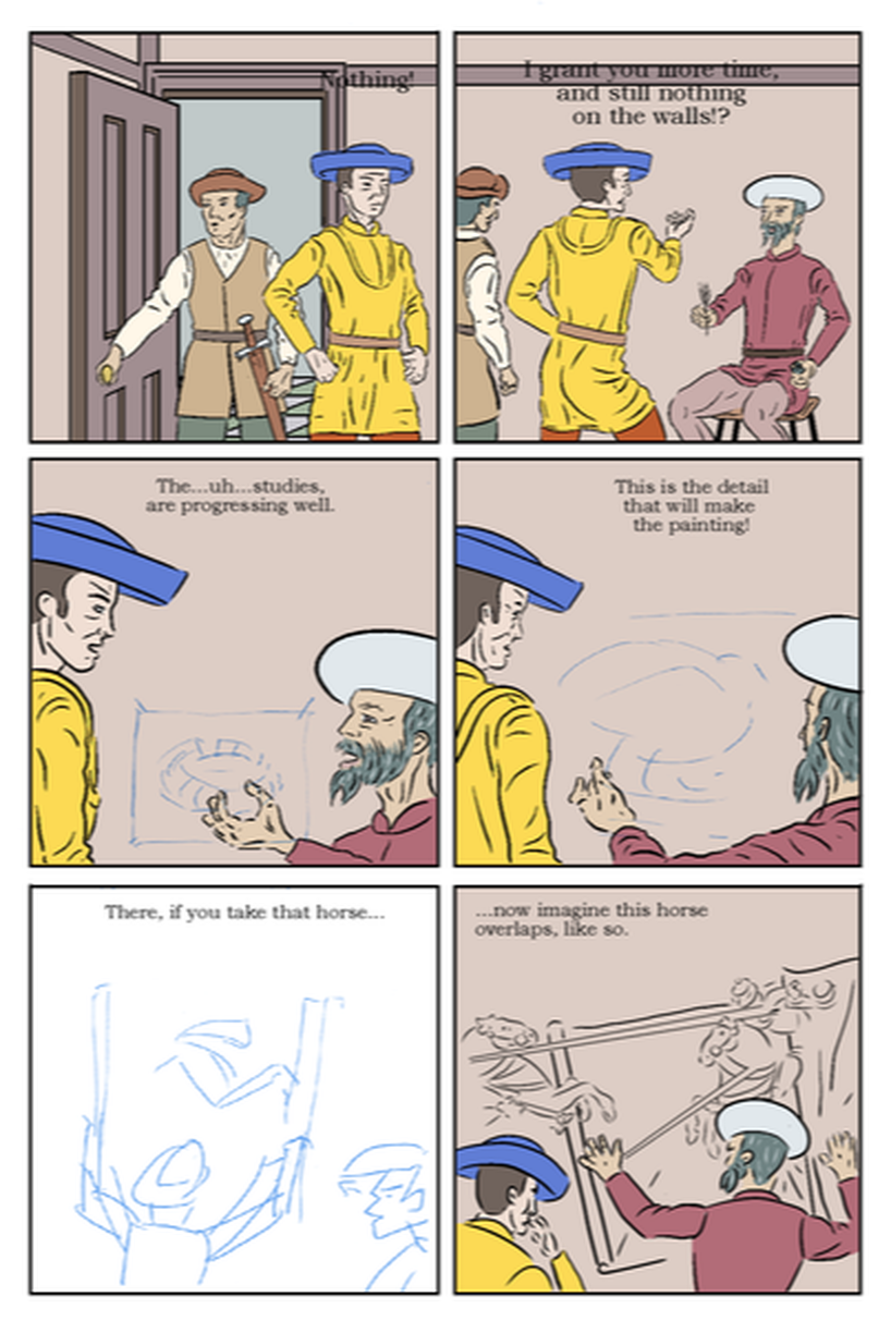
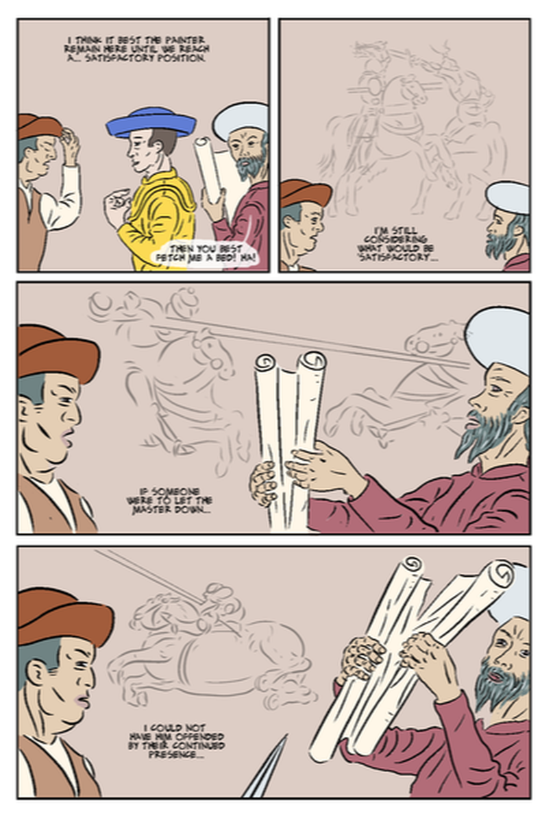
Feeling unwell, with a virus, I’ve been at home much of the past week, and working on colour flatting, as it seemed the least demanding thing to do. After discussion with the tutor, I had planned to concentrate on getting the last few pages drawn and inked, and to do all the colour in a block, but I don’t feel up to doing anything else, and in any case, I prefer drawing in my studio, which helps me ‘get into the zone.’ I had previously coloured one page (see post below about lettering), and established a coherent colour palette, though that was in a single location, with only two characters, so different colours would be required to make other characters and locations clearly identifiable.. I aimed to make my process more efficient, and so faster. I googled to see if there was a way to save colour palettes, on Manga Studio, and found that there is. At first I tried saving all the colours in a single palette, but after doing a few pages there were too many colours, and in particular similar ones, that it became unworkable. Then I started creating separate palettes: for a specific location, then one for characters' clothing, etc. This helped, though I can still have to move between palettes, even within a single panel. It has proved a slower process than I’d hoped. I was regretting putting tiled floors in so many panels, thinking that would make it time-consuming to colour, but in fact those were the easiest bits. What proved far more time-consuming and generally troublesome were the freehand drawings. In the interest of creating smooth, lively lines, I often don’t join them up - I simply think it looks better (at least on the inked pages). However, this does create issues when using the bucket fill tool, whatever the close gap setting: at best you get a slight bulge through the gaps in the outline, that requires erasing. I have started trying to fill any gaps in outlines with a marker of the fill colour, before using the bucket fill tool, however even this is rarely 100% effective, so I have to go round erasing the leakage. Unfortunately, when I add an adjacent colour it often leaks in the opposite direction, so I have to do much of this over again. I have tended to start with the figures, though I’m thinking now it might be easier to do the backgrounds first, and just fix any bleed when colouring the figures. In tends to be the earlier drawings, done in Manga Studio 4 and the Wacom Intuos, and with a fair amount of vector correction on the pen lines that are the most difficult. The later ones done in MS 5, an using my iPad and Apple Pencil, are generally more joined-up - I think because it’s easier to lean into (and so better control) the line with the iPad. In any case, the later drawings are easier to bucket fill, and it’s useful lesson for future projects. Having used green/blues for the walls in the first scene (Uccello’s home studio), I wanted to find a different colour for Salimbini’s room where Uccello is working on the commission. Another consideration is to avoid using anachronistic colours: certain blues, for example, were so expensive, that even an extremely rich man would not use them to paint a room. I thought of crimson or fuschia to suggest passion, as it’s a bedroom for newlyweds, however, both of these would be too close to Uccello’s jacket colour, which is taken from the only known portrait of him. Initially I used a pale peachy colour intended to look like fresh plaster, however it was too close to adjacent colours, particularly the off-white of Rocco’s shirt, and faces (Figure 1), so I toned this with a little black, to be darker than faces, which I think is an improvement. Figure 2 (above) and Figure (below), are two consecutive pages, which actually take place much later, that Figure 1 (top), though are in the same location, and mirror the earlier page. Although it may be improbable, I kept all the characters in the same clothes (and so colours) for recognisability. The sticking to relatively flat colours, is part of reflecting my subject's style, though I will be judiciously adding some tone, and am exploring the addition of found/treated textures - which will be the subject of a separate post. The battle scenes in the background, are 'imaginary' (and in this case metaphorical of the conflict between the characters). These are probably not the final versions. I hid them when creating the inks layer, so I can separately change them later. I thought it was easier to focus on the main drawings and work on the imaginary parts as a set, in order to ensure consistency of style. This is important when I have so many brush and pencils options - I have used methods, e.g. for Uccello's pencil drawings in pages 11 and 12, and can't now remember what tools and settings I used.
It's worth noting that when I open pages to colour them, I also doing any necessary completions and corrections. For example, half of this page was originally done in MS4, where I had mastered a certain way with the vector line correction. It's noticeable here on the large images of Rocco (on the left) - I liked it there and wanted to keep it - this is the first time we see Rocco in close up, whereas the images of Uccello were too different from other pages. To ensure consistency, I completely re-inked panels 1 and 2, and Uccello from panel 3. This then provides an example of how I am refining pages as i come to colour them. I'll post in ore detail about this for page 17, a few posts above.
0 Comments
Leave a Reply. |
AuthorGraham Johnstone ~ Master of Design - Comics and Graphic Novels student 2016-17 Archives
August 2017
Categories |


 RSS Feed