• Landing Page
  • About Me
    • Contact Me
  • Francis Bacon
    • Francis Bacon - Portrait of the Artist
    • Francis Bacon - The Muse.
    • Francis Bacon - The Critic
  • Uccello
  • Vermeer
    • Vermeer - The Fathers of Delft
  • Editor - Dead Trees
    • Dead Trees cover gallery
    • Sample Issue
    • Reviews
    • Reviews - More
    • Dead Trees Lucky Bag
    • Contributors
  • Art Museum
    • Tangled Tales
    • From Dead Trees
    • The Chimera Tree
    • Seen From Here
    • A Different Story
    • Create / Destroy
    • Dead Trees (from 'The Outsider') >
      • More on Dead Trees (from 'The Outsider')
    • More
    • Chemistry
    • Blog Archive
    • Rare >
      • For Films
      • More For Films
      • Realism
      • Links
    • The Curse of The Yellow Booke >
      • The Curse of the Yellow Book >
        • Introduction (1912)
        • More Pages
        • A Found Object
        • The Library (complete)
        • The Intermediate Functionary
        • The Book and the Curse
        • New
  • Reviewer - Graphic Novels
    • Reviewer - Artist Biographies
    • Reviewer - Art Comics
    • Reviewer - Graphic Biographies
    • Reviewer - Underground Comix
    • Reviewer - More
  Graham Johnstone art

Texturing and 'distressed effects'

16/7/2017

0 Comments

 
I think I've said elsewhere that i was trying to stay fairly close to flay colour, in keeping with the work of my subject. I had discussed with the tutor applying and aged or distressed overlay to the pages, and I've begun experimenting with this.

​First of all I searched online for free to use textures. I found this plaster effect, which I thought would work because of the number of interior scenes with relatively blank space.
Picture
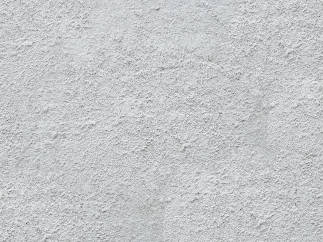
In the page below I tried two different things: the top panel has the plaster texture over the rear wall in straight greyscale. I would need to choose between approaches here - either make it the texture of the wall, and so remove it from the figures, or just use it as a texture over everything. I've done the latter on the lower two panels, where I also changed the plaster image to a brown colour. This works fairly well over everything - it's quite subtle, and adds a bit of visual variety. The brown works here as a contrast to the green of the background, it might not works so well on the (majority of) scenes with brownish walls. I could probably change the colour of the plaster texture for individual scenes, without it being noticeable to the average reader. In each case the plaster texture is at 30% opacity

The next question this raise is - should the texture be over the gutters and page borders? If so would it need a subtle flat colour over all the white areas?

Picture

​


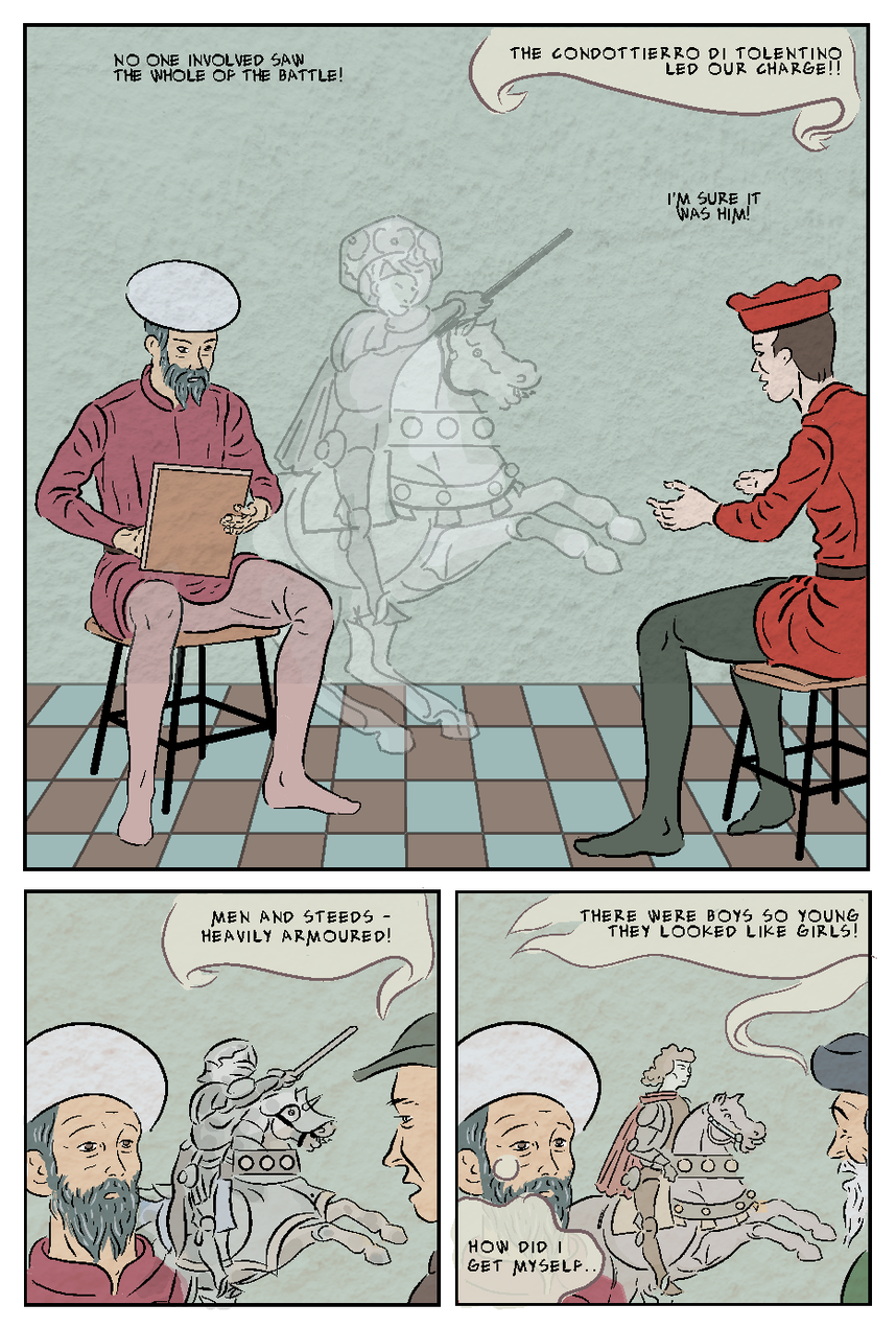
I then tried a 'distressed' texture, as seen below. This, in contrast to the subtle tones of the plaster texture, was more high contrast black and white. ​

Picture
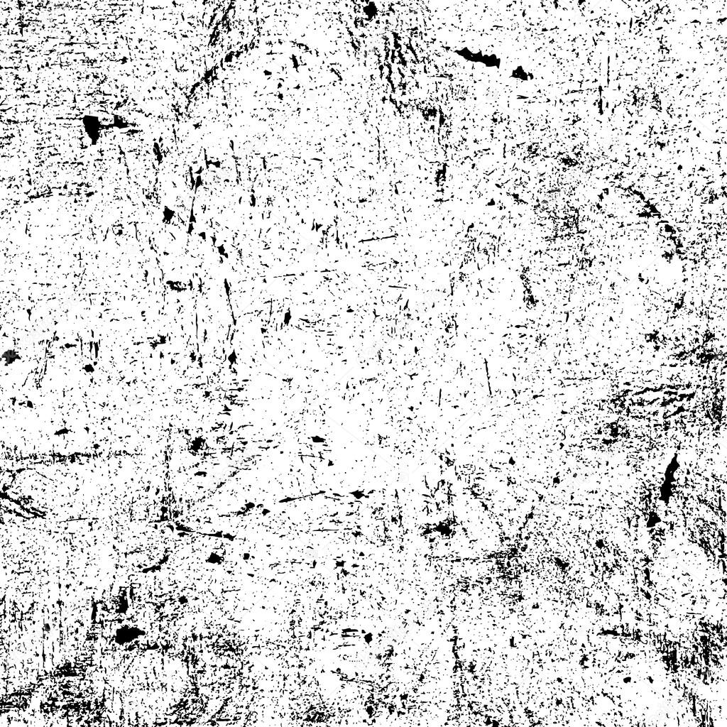
I converted this into an ochre colour, and overlaid it on the page below at about 10% opacity. Here I extended it over the white border and gutters. This scene is a the bedroom of a very rich man with a new young wife, so it won't make sense if it looks like the room is shabby - it needs to be clear it's the picture.


Picture


Here's a further version, which adds a high contrast version of the plaster image, and a cream/paper colour underneath the colour flats layer. I think the cream improves the effect on the 'white' areas, and the extra texture softemns the overall effect

Picture

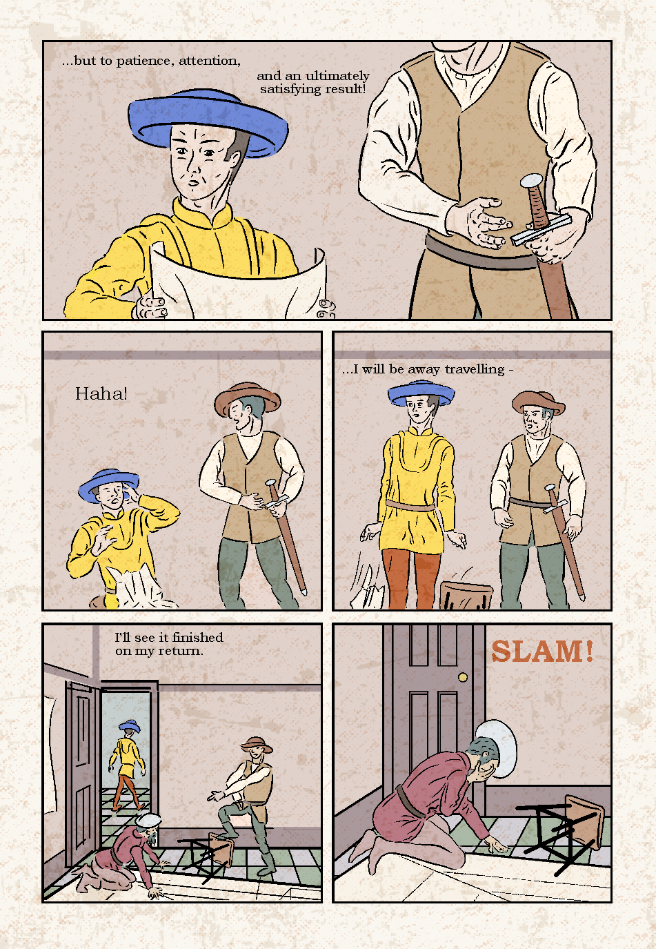
I also worked with the distressed image, using the magic wand an fill tools, to add a cream/ochre overly, that omitted areas, leaving some useful whites, as below.

Picture

I the overlaid this on a page, as shown below.

Picture

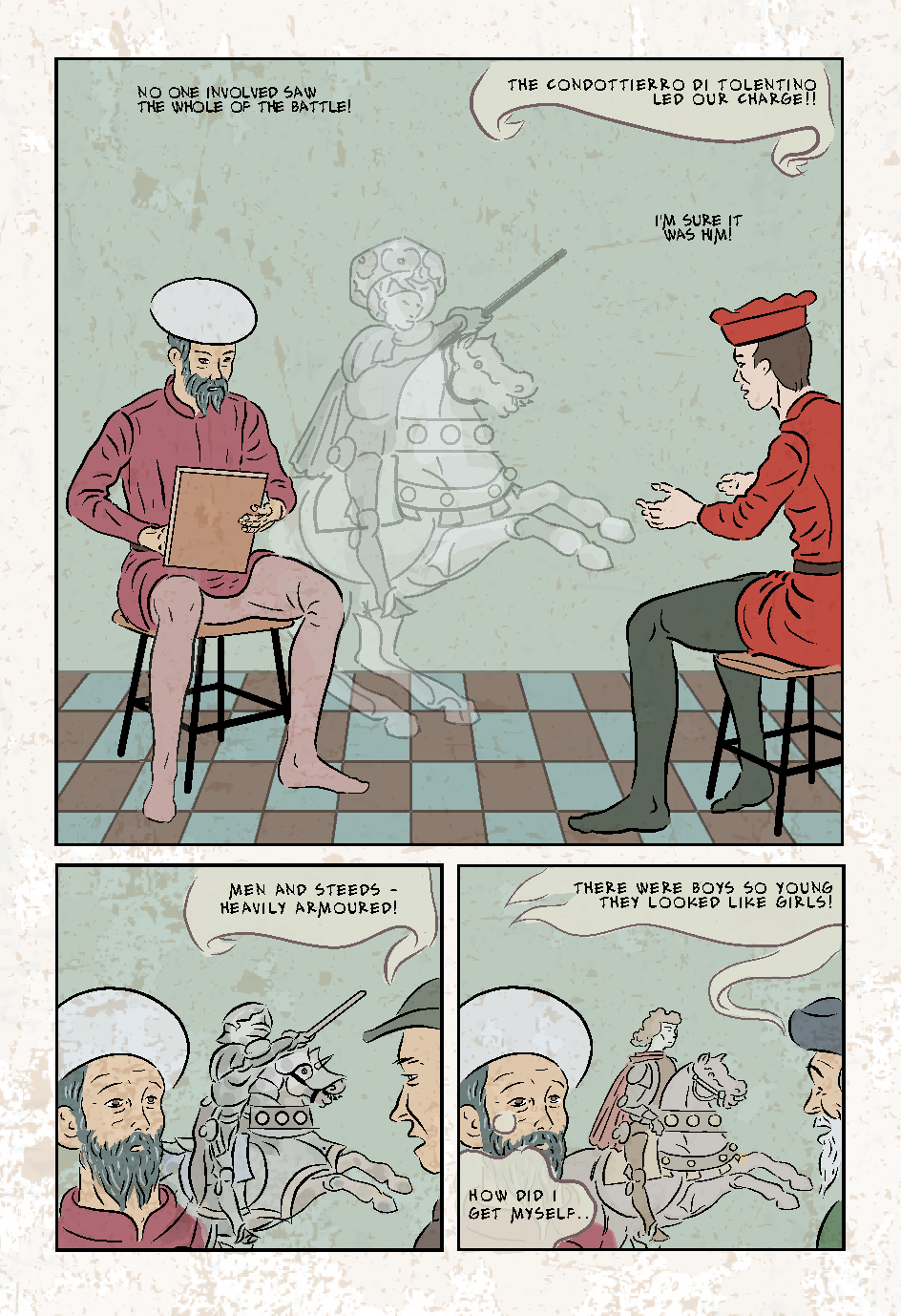
I'm undecided about the one above: the texture layer on it's own looks aesthetic, but overlaid on a page the distressed marks are perhaps too noticeable in places and too subtle in others. It looks like marble though - which would make it work well on the tiled floors.
0 Comments


Leave a Reply.

    Author

    Graham Johnstone ~ Master of Design - Comics and Graphic Novels student 2016-17

    Archives

    August 2017
    July 2017
    June 2017
    May 2017
    April 2017
    March 2017
    December 2016
    November 2016
    October 2016
    September 2016

    Categories

    All

    RSS Feed


All original Images copyright Graham Johnstone, or, where applicable, their respective creators. 
  • Landing Page
  • About Me
    • Contact Me
  • Francis Bacon
    • Francis Bacon - Portrait of the Artist
    • Francis Bacon - The Muse.
    • Francis Bacon - The Critic
  • Uccello
  • Vermeer
    • Vermeer - The Fathers of Delft
  • Editor - Dead Trees
    • Dead Trees cover gallery
    • Sample Issue
    • Reviews
    • Reviews - More
    • Dead Trees Lucky Bag
    • Contributors
  • Art Museum
    • Tangled Tales
    • From Dead Trees
    • The Chimera Tree
    • Seen From Here
    • A Different Story
    • Create / Destroy
    • Dead Trees (from 'The Outsider') >
      • More on Dead Trees (from 'The Outsider')
    • More
    • Chemistry
    • Blog Archive
    • Rare >
      • For Films
      • More For Films
      • Realism
      • Links
    • The Curse of The Yellow Booke >
      • The Curse of the Yellow Book >
        • Introduction (1912)
        • More Pages
        • A Found Object
        • The Library (complete)
        • The Intermediate Functionary
        • The Book and the Curse
        • New
  • Reviewer - Graphic Novels
    • Reviewer - Artist Biographies
    • Reviewer - Art Comics
    • Reviewer - Graphic Biographies
    • Reviewer - Underground Comix
    • Reviewer - More