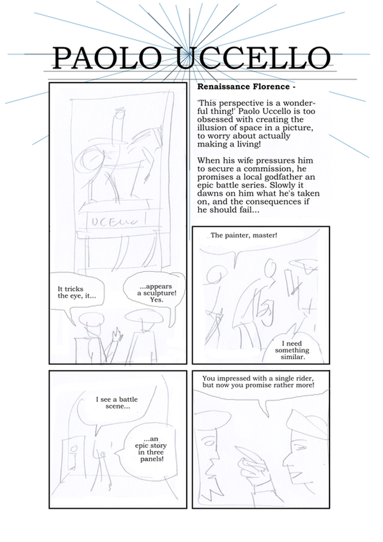
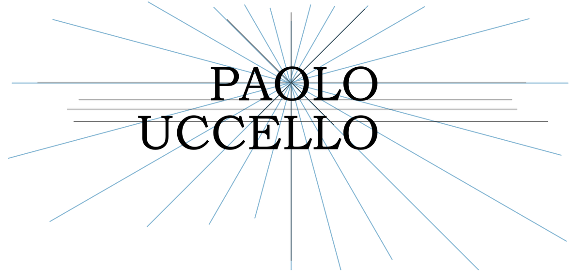
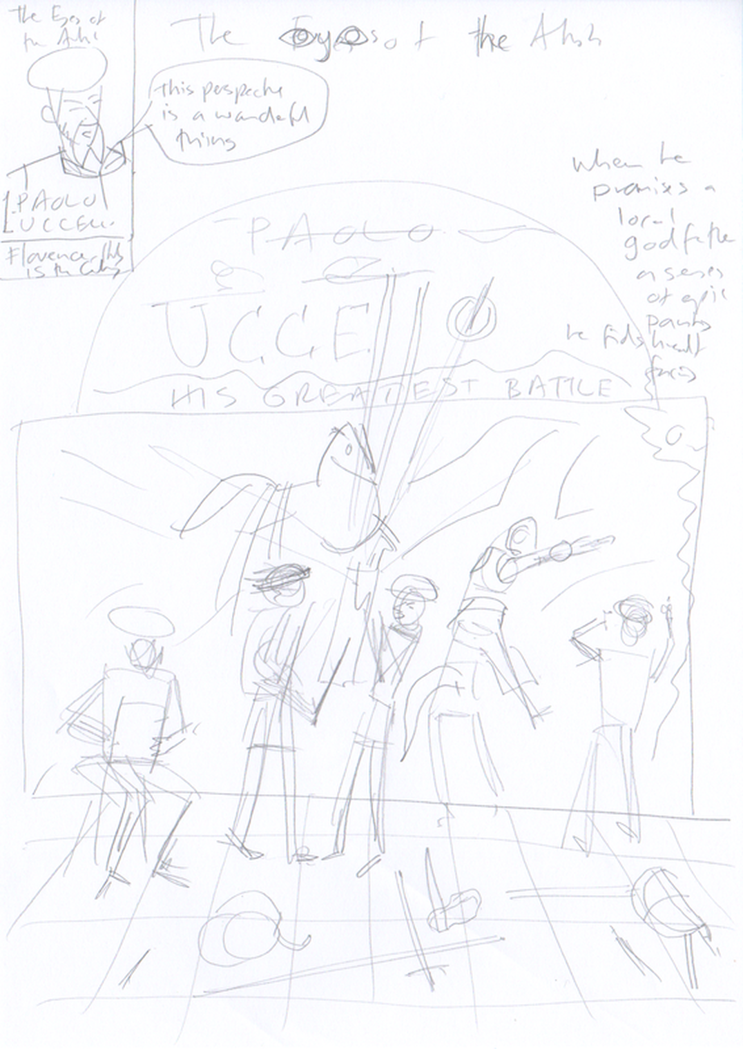
Front CoverThe branding work I did in the Semester 2 Production module, focussed on my initial proposal for a an extended comic about 16th Century painter Vermeer, however since working on that my focus shifted to an anthology of shorter pieces about different artists. The main story for my semester 3 Major Project is the Uccello story which should be 20 pages. I've therefore started work on a cover design. The shape like a rectangle with a curved area at the top, is one versiosn of the shape Uccello's san Romano paintings are thought to be. While I think it works well as a design, it doesn't quite align with how I have drawn the room they were made for, so I will probably have to change it. This scene acts as a capsule version of the story: Ucello (left) making initial sketches; Uccello (centre) being threatened by sword wielding Rocco, and finally (right) at work on the painting. The painting will be at various stages of development, again moving (in traditional reading order) from perspective grids at the left to more resolved drawing or painting towards the right. I will have some 'drawn' scenes of conflict behind Rocco and centre Uccello, matching scenes in the comic. EndpapersI propose a variant of the front cover for the endpapers/inside covers which will be a done as a double page spread (though the reader will have to create closure on that by imagining the two separate inside cover pages as a continuos spread. This will let the painting in progress be seen on a larger scale without the figures in the way. Back Cover I also have an initial draft of a back cover (below), which combines the pitch for the story with a few key panels cut and pasted from the story, setting up what's at stake.  Logo The back cover also has, I think, the beginnings of a logo,with the perspective lines behind the lettering. For the front cover, it will look better with the Paolo above the Uccello, and both aligned right do that the 'LO' of both words are aligned, as shown below.  This definitely needs more work, but I think it is promising. In this version the perspective lines distract less from the more important word 'Uccello', and this design lets the vanishing point be more aesthetically placed with the first 'O' of 'Paolo', while still retaining a sense of symmetry, by being the centre of 'Paolo'. The word 'Uccello' needs to have greater emphasis - so I may try making 'Paolo' less opaque, or an outline. I will try different approaches with the perspective lines - making them white on the black of the lettering might work. I will try putting in the top left space a silhouette of a horseman - one of the most recognisable symbols of Ucello, being in not just the battle sequence, but perhaps his other most famous painting the equestrian portrait of Sir John Hawkwood, as seen in page 5 of my comic, below. Alternately I could put in that space his birth and death years, as in versions of my Vermeer logo.
0 Comments
Leave a Reply. |
AuthorGraham Johnstone ~ Master of Design - Comics and Graphic Novels student 2016-17 Archives
August 2017
Categories |

 RSS Feed