|
I redesigned the cover image, however I had problems deleting the previous version, and also there were possible issues with the links to the comics pages, so I have set up a new document, and started afresh. The cover image is based on elements of Vermeer paintings that I have redrawn, and composed in a new arrangement for this cover. I think the logo looks better here than just in white space, as on the previous version. I had some problems getting this from Clip Studio; although I had set the same proportions and bleed in each, it seemed that the overall paper was a different proportion in Clip Studio, giving an inelegant cropping that lost e.g. the edge of the easel. I was able to fix this by resizing some of the elements in Clip Studio. 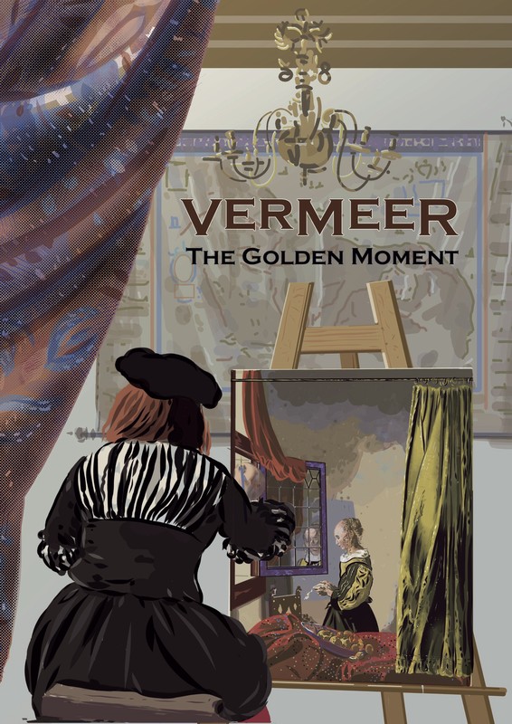
0 Comments
In trying finalise my logo, I have changed the title from 'Vermeer's Golden Moment" to 'Vermeer - The Golden Moment': this allows the main logo to be 'Vermeer' without the apostrophe 's' making it untidy. The lower case letters in the Copperplate Gothic font are simply smaller capitals, and I have moved these from aligned to the bottom of the upper case letters to aligned with the top. In doing this, I ensured that they aligned with with main horizontal strokes of the letters and not the top of the vertical serifs. I have made the main title 'Vermeer' in brown, leaving the smaller subtitle in black to ensure readability. As the logo will be placed (on the front cover at least) over an image, I have put a thin white outline around it (after trying various, decided on 2mm), which improves its readability. |
AuthorGraham Johnstone ~ Master of Design - Comics and Graphic Novels student 2016-17 Archives
August 2017
Categories |
 RSS Feed