|
This page incorporates a fair amount of work done for the aborted first version of this story - essentially all the location details in panel 1, which are based on photos I took at the actual location - The 'Duomo' (cathedral) in Florence, where the Uccello painting (recreated by me below) can still be seen. This was done before I learnt how to do colour flats, so was created with multiple coloured layers, which I would often copy and distort (i.e. I added the perspective seen here after creating the image) to use in different panels. While these elements are in a visibly different style, I think it works okay here, simply because it is location details - whereas it more i portent to have consistency to e.g. the characters. Also the setting details are not the main focus of attention here, which is why I like the slight out-of-focus effect on this version of the horseman image. The tile pattern on the floor is (a simplified version of) the real floor. I created it in straight plan view, and then distorted it for perspective effects in this and another panel. I put this on it's own layer in that teal colour, and then bucket filled with an off white to take the pattern down a bit. I then turned areas around the central circle back to white to focus on the figures - reading the in the traditional (Western) direction from left to right, it seems to lead us round the first three figures, and then follow the second three exiting the scene via the bottom of the panel. 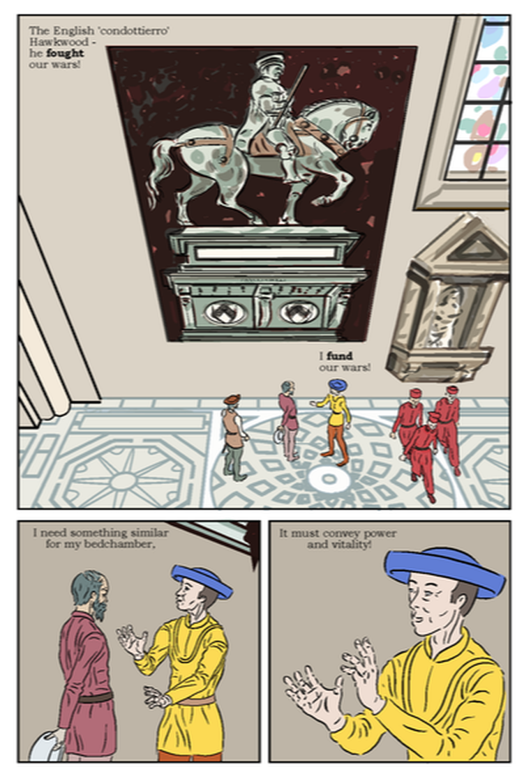 ,I've been working, over this story (and following feedback on the previous one) on keeping my ink lines consistent in thickness. This is another thing that was easy in MS4, seems to me bizarre in MS5. I normally ink on vector layers, apart from anything else it makes it easier to erase whole lines, which I often need to do, as I work over sketches in ink without doing finished pencils. Unless there is some obscure route that has escaped me, MS5 will only allow the 'Correct Drawing Line' function on Raster layers. Apart from not suiting my approach, that seems counter-intuitive as it would logically seem easier to adjust a line that is already a mathematical (i.e. Vector) formula, and it worked on the earlier version, so why not here!? The control of how to adjust the line is also less user friendly. I felt my lines in the lower left panel were perhaps too thin, so I duplicated the relevant image and rasterised it, however even choosing what seemed to the most minimal 'Thicken' setting of 1.1, it seemed to almost double the weight of my lines, to the pint that they look almost to heavy. It works okay on the left figure because of the relatively dark colouring, but is more noticeable on the right, yellow figure. It may be I can go back and revert to my original lines for that figure only.
In the lower panels I made the background slightly darker to contrast with the pale skin and clothes, so it doesn't quite match the main panel, however I am proposing to add some lighting and toning effects, perhaps light coming from the window, that should mitigate this. I've still to update the lettering on this page.
0 Comments
This first page of the story, is useful to examine in progress, as it captures a number of the aesthetic/process decisions. 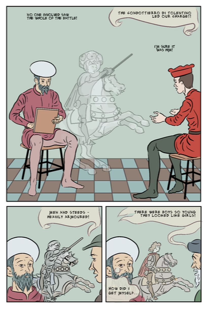 Figure 1 - Page 1 draft working through colour and lettering issues. I'm fairly pleased with the colour palette on this - it's set in the same location, so it was easy to stick to the palette I created for page 2 (the first I coloured). A number of bit part characters appear on this page, and I had to give them distinctive hats and colour schemes. I wondered at first if the bright red of the first character was too attention grabbing, as I want people to focus on the character, who is the protagonist.I would have changed it, but his clothes denote a military officer, which I thought made sense as the first witness of the battle Uccello is about to paint. Hopefully that fact that we are seeing the protagonist face-on, and his reappearance with different witnesses in the other two panels, establishes that he is the one we are more interested in.
This page introduces the idea of imagined images from the battle scene and Uccello's portrayal of it. I think it is helped here by the fact that the witness is describing events that the artists is trying to visualise, and hopefully this will let readers accept this device in subsequent pages. I made the imagine image fairly translucent in the first panel (this still needs some tweaking, then mores solid in the second panel, and more clearly in colour in the third (though still paler than the colours of the 'real' scene). I will probably want to put some texture over this scene, and possibly the whole comic, but I'll make that a separate post. I have changed the lettering from my initial historic looking typed serif font to the hand-lettering style Alex Toth font. It was the least jarring hand-lettered font I could find, although when I first tried it it seemed a bit heavy for my relatively fine drawn lines, however here I have dropped it down a font size to &, which seems to help that. One issue visible on this page, before and after changing font is different spacing on different bits of text. This appeared to be a result of importing text from my earlier attempt at this story in Manga Studio 4, which seems to have wider spacing between the letters (seen in the top right text in panel 1). The seeing the two styles side-by-side, the wider spaced version looks to me better and easier to read - however I haven't as yet worked out how to change the other text to match that. The medieval style of balloons are from my first version. I haven't decided how to do the final balloons, but I think this style works with the new font. I don't think the placing of the thought bubble in the last panel works - it may just need to block less of his face - though this could be helped by using a rectangular caption box. Feeling unwell, with a virus, I’ve been at home much of the past week, and working on colour flatting, as it seemed the least demanding thing to do. After discussion with the tutor, I had planned to concentrate on getting the last few pages drawn and inked, and to do all the colour in a block, but I don’t feel up to doing anything else, and in any case, I prefer drawing in my studio, which helps me ‘get into the zone.’ I had previously coloured one page (see post below about lettering), and established a coherent colour palette, though that was in a single location, with only two characters, so different colours would be required to make other characters and locations clearly identifiable.. I aimed to make my process more efficient, and so faster. I googled to see if there was a way to save colour palettes, on Manga Studio, and found that there is. At first I tried saving all the colours in a single palette, but after doing a few pages there were too many colours, and in particular similar ones, that it became unworkable. Then I started creating separate palettes: for a specific location, then one for characters' clothing, etc. This helped, though I can still have to move between palettes, even within a single panel. It has proved a slower process than I’d hoped. I was regretting putting tiled floors in so many panels, thinking that would make it time-consuming to colour, but in fact those were the easiest bits. What proved far more time-consuming and generally troublesome were the freehand drawings. In the interest of creating smooth, lively lines, I often don’t join them up - I simply think it looks better (at least on the inked pages). However, this does create issues when using the bucket fill tool, whatever the close gap setting: at best you get a slight bulge through the gaps in the outline, that requires erasing. I have started trying to fill any gaps in outlines with a marker of the fill colour, before using the bucket fill tool, however even this is rarely 100% effective, so I have to go round erasing the leakage. Unfortunately, when I add an adjacent colour it often leaks in the opposite direction, so I have to do much of this over again. I have tended to start with the figures, though I’m thinking now it might be easier to do the backgrounds first, and just fix any bleed when colouring the figures. In tends to be the earlier drawings, done in Manga Studio 4 and the Wacom Intuos, and with a fair amount of vector correction on the pen lines that are the most difficult. The later ones done in MS 5, an using my iPad and Apple Pencil, are generally more joined-up - I think because it’s easier to lean into (and so better control) the line with the iPad. In any case, the later drawings are easier to bucket fill, and it’s useful lesson for future projects. Having used green/blues for the walls in the first scene (Uccello’s home studio), I wanted to find a different colour for Salimbini’s room where Uccello is working on the commission. Another consideration is to avoid using anachronistic colours: certain blues, for example, were so expensive, that even an extremely rich man would not use them to paint a room. I thought of crimson or fuschia to suggest passion, as it’s a bedroom for newlyweds, however, both of these would be too close to Uccello’s jacket colour, which is taken from the only known portrait of him. Initially I used a pale peachy colour intended to look like fresh plaster, however it was too close to adjacent colours, particularly the off-white of Rocco’s shirt, and faces (Figure 1), so I toned this with a little black, to be darker than faces, which I think is an improvement. 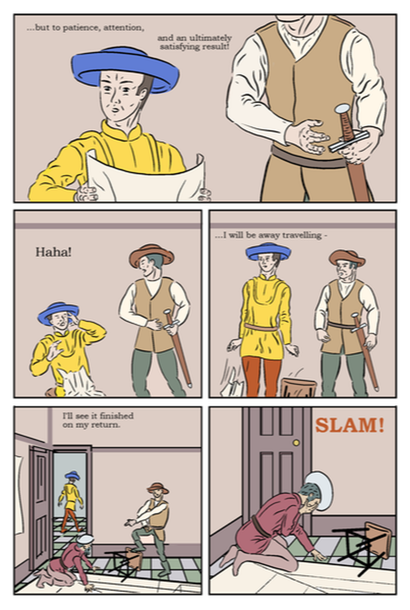 Figure 1 - Page 10, flatting complete. 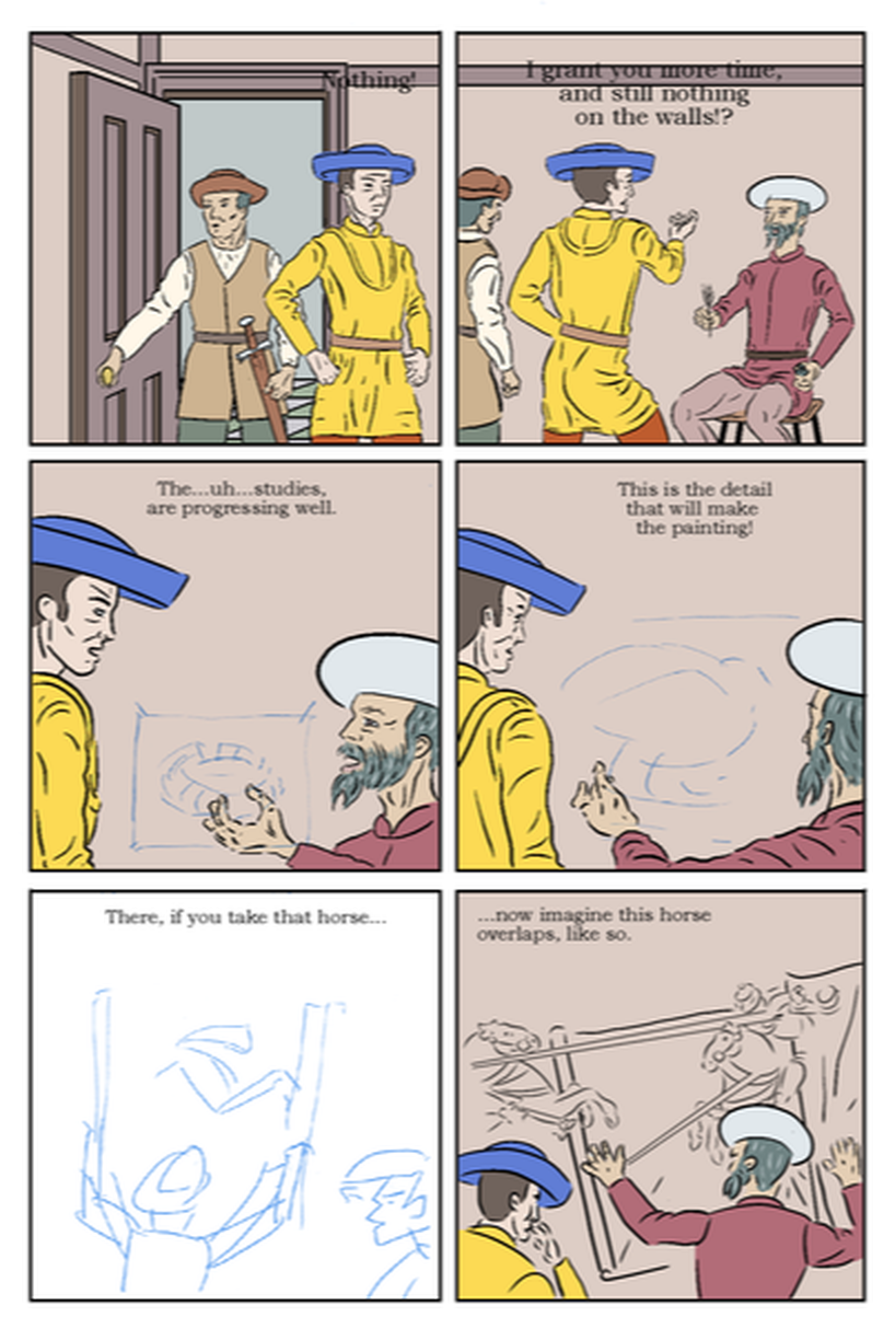 Figure 2 - Page 15 in progress. Figure 2 (above) and Figure (below), are two consecutive pages, which actually take place much later, that Figure 1 (top), though are in the same location, and mirror the earlier page. Although it may be improbable, I kept all the characters in the same clothes (and so colours) for recognisability. The sticking to relatively flat colours, is part of reflecting my subject's style, though I will be judiciously adding some tone, and am exploring the addition of found/treated textures - which will be the subject of a separate post. 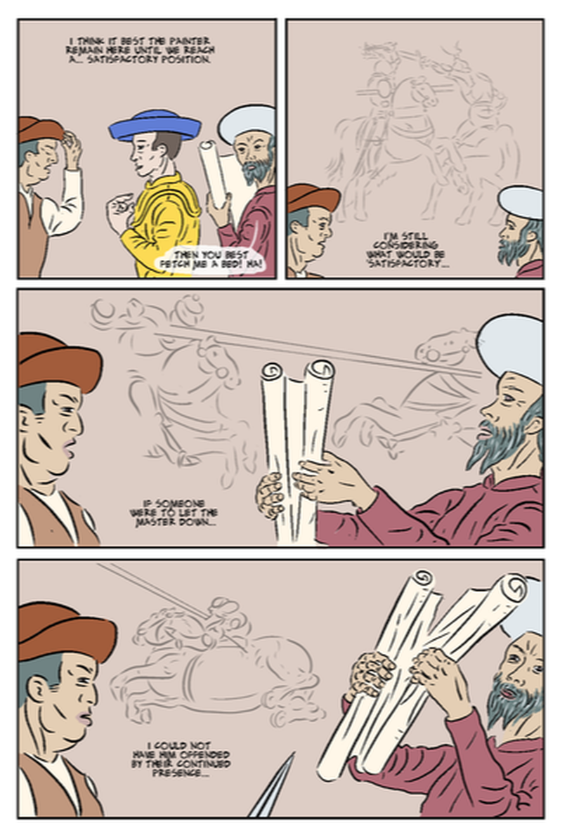 The battle scenes in the background, are 'imaginary' (and in this case metaphorical of the conflict between the characters). These are probably not the final versions. I hid them when creating the inks layer, so I can separately change them later. I thought it was easier to focus on the main drawings and work on the imaginary parts as a set, in order to ensure consistency of style. This is important when I have so many brush and pencils options - I have used methods, e.g. for Uccello's pencil drawings in pages 11 and 12, and can't now remember what tools and settings I used.
It's worth noting that when I open pages to colour them, I also doing any necessary completions and corrections. For example, half of this page was originally done in MS4, where I had mastered a certain way with the vector line correction. It's noticeable here on the large images of Rocco (on the left) - I liked it there and wanted to keep it - this is the first time we see Rocco in close up, whereas the images of Uccello were too different from other pages. To ensure consistency, I completely re-inked panels 1 and 2, and Uccello from panel 3. This then provides an example of how I am refining pages as i come to colour them. I'll post in ore detail about this for page 17, a few posts above. I've been trawling through fonts, and shortlisted these ones. They may have their uses, but having tried them, I don't think they'll work for comics lettering.      I've tried a few different fonts in one of the most finished pages. 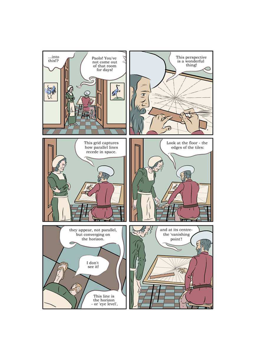    Page 12 needs to show Uccello drawing a rider on a horse (his old master Ghiberti has advised him to do this to help with the commission). Initially I drew the horse in the foreground and Uccello in the background (Figure 1). This was quite a strong composition the horse in the foreground emphasising it's scale, with Uccello drawing from a safe distance. It also referred back helpfully to the scene on page 1 (Figure 2) where we see Uccello drawing, and an imagined image of a horseman (in the same pose). I like the blank space around the key figures and would be inclined to sketch in only minimal background at most. The image of the rider is based on the central figure in the first Uccello panel (Figure 3), although in this instance I have drawn it with a 'civilian' rider,in the same pose, to suggest that Uccello will turn this into an image of a soldier. There were two slight problems with this: firstly that Uccello would be drawing the horse from the other side to what we see in the painting; and secondly that we would have to do a 18o degree flip to the next page's images of the drawings - this seems to be considered confusing though given what we will be looking at on the next page will look like drawings it may not be a problem (and I could perhaps add Uccello seen from behind). In any case I tried an alternative version with Uccello in the foreground, so he is drawing the horse the right way round (Figure 4). I had saved my posed 3D figure (adapted from the provided 'take a note'), so I just needed to change the angle. The problem with this version is that we lose the scale of the horse, and also the composition is generally less elegant. An further alternative might be to use the rear view figure of Uccello on the following page. The 180 degree flip perhaps won't be an issue, as the reader presumably needs to reorient to the scene when they turn a page. 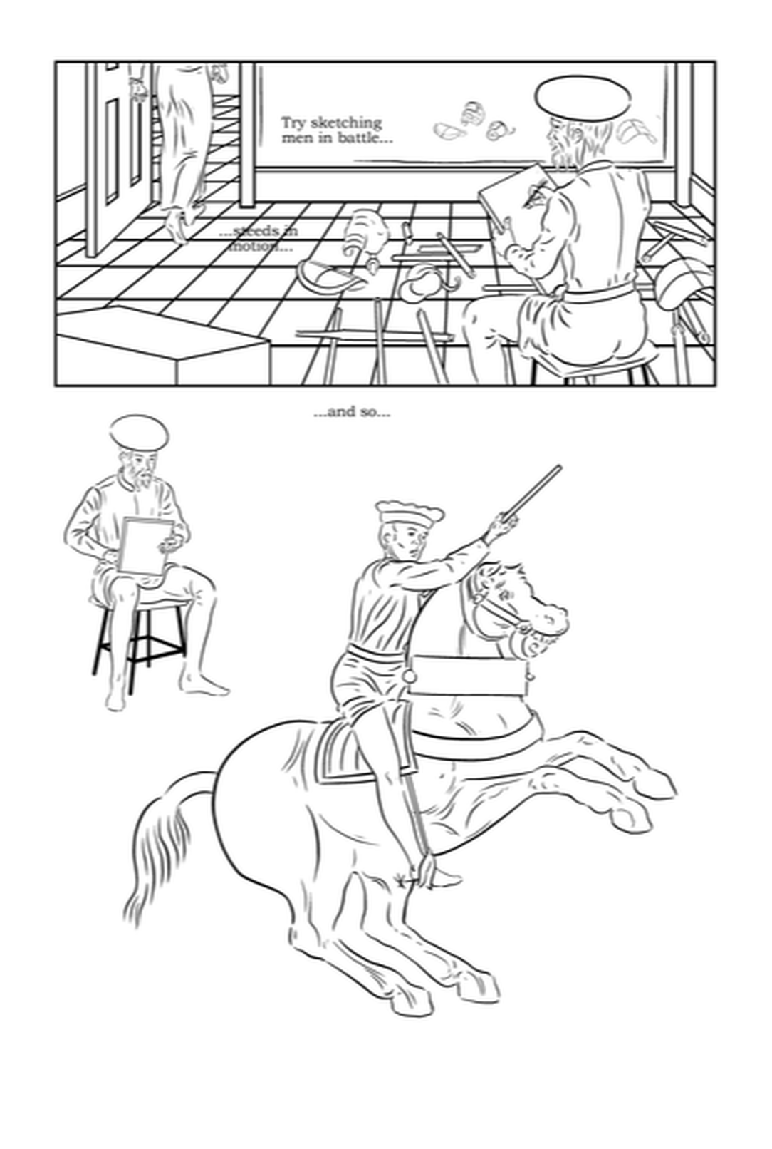 Figure 1 (above) - Page 12 draft version 1 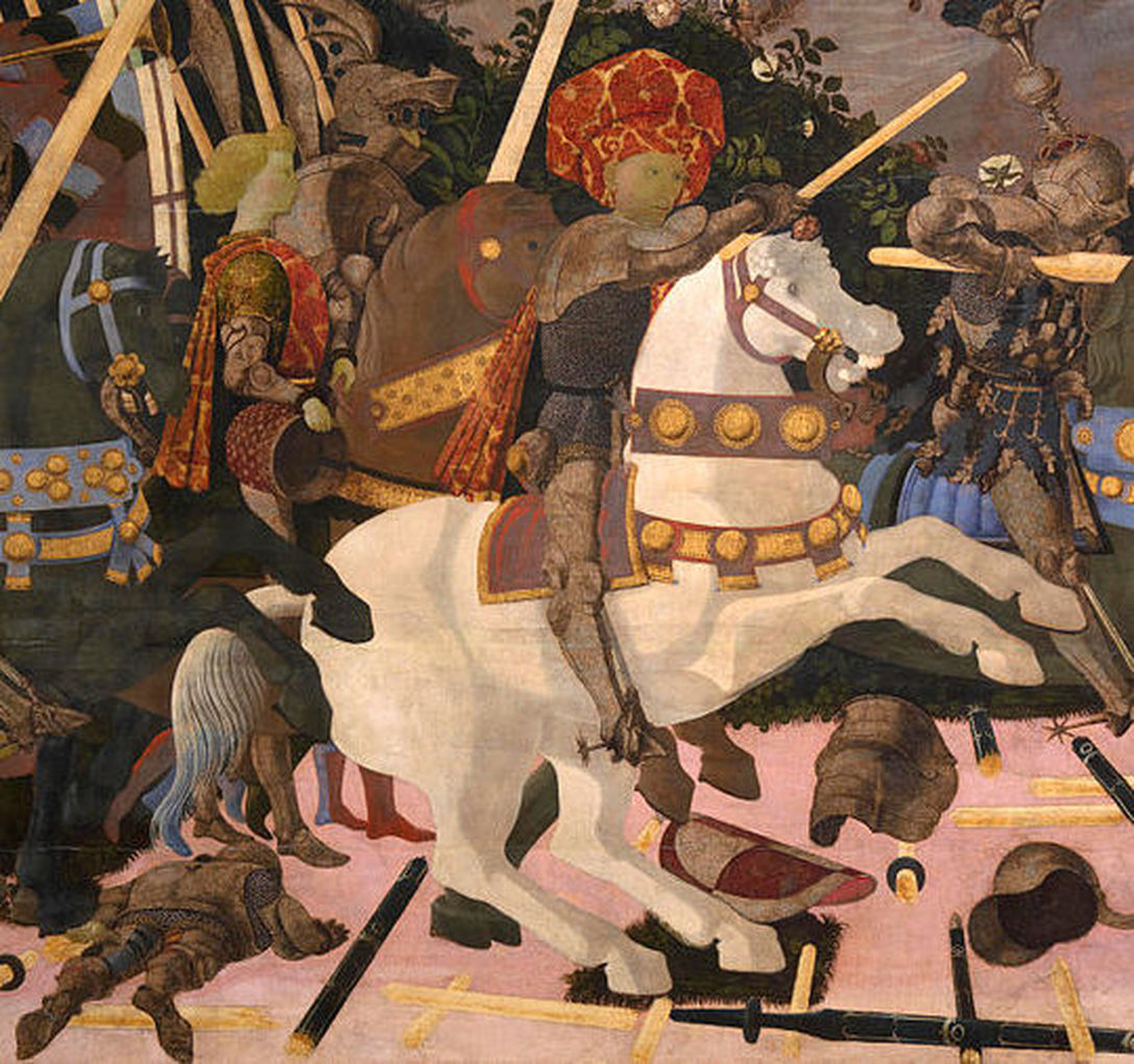 Figure 2 (above) - Uccello, The Battle of san Romano (London) detail. 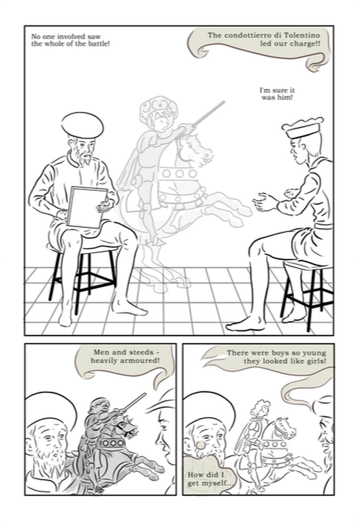 Figure 3 (above) - Page 1 showing Uccello drawing, and variants on the same image of the rider. 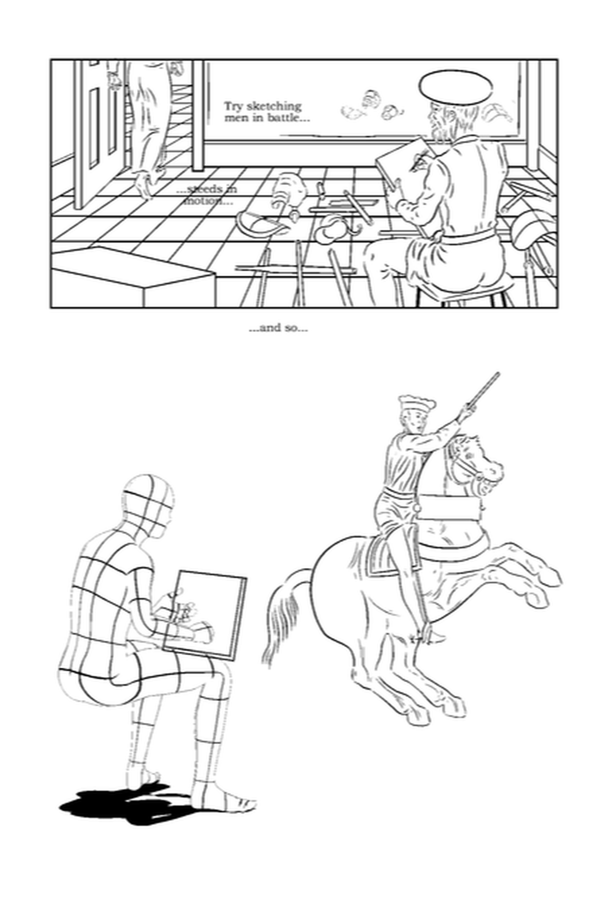 Figure 4 (above) - alternative composition for page 12. This was originally created in paper form (long!) before starting the course, but I wanted to create an ebook version, and tied this in with the Production module. I hired a web designer to do the technicalities but supervised this closely, to ensure, e.g. it matched the functionality of the original where each panel is a page that can be turned individually for full control, rather than just random variations. It really was a tortuous process to get in uploaded, as I've written about in earlier posts. iTunes producer kept demanding I set up new passwords (which Apple's Keychain utility appears not to remember), and overtime, it would lose my saved project. It kept failing to upload claiming screenshots were unacceptable proportions, and so on. It did drag, but I'm pleased to have it available. Apple don't seem to let you post a link: but it's front of the pile on a search of books for 'Graham Johnstone'. The next struggle will be taking time away from my major project to promote it! 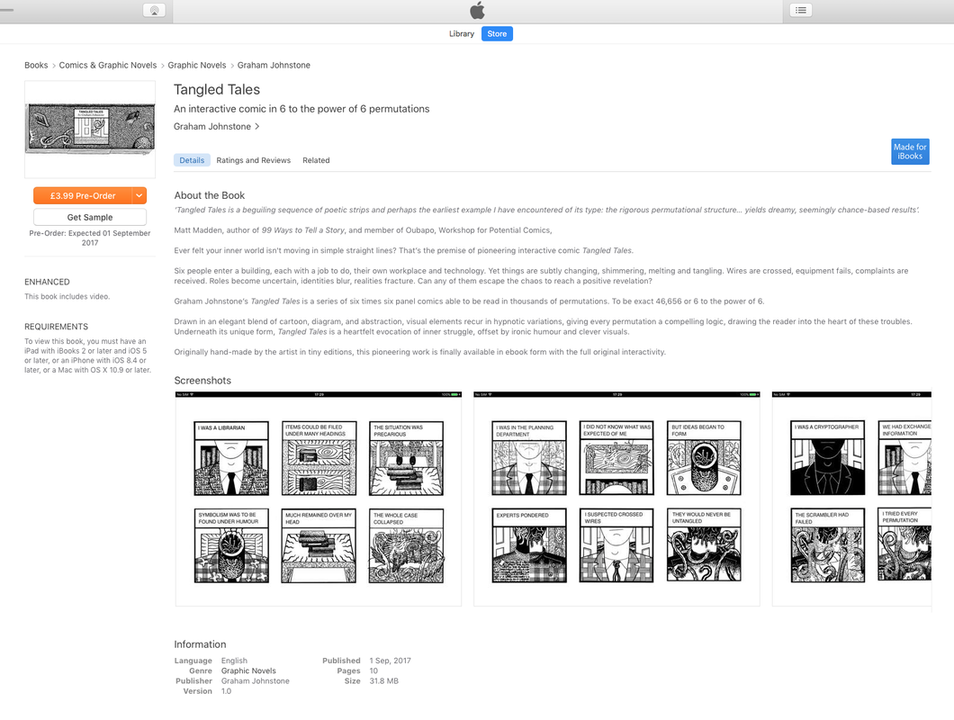 I've probably had a tendency to fit too much into little drawings, and too many panels on a page. It's probably a legacy of doing work for anthologies, and the Observer Graphic Short Story Competition, where one has a limited/fixed page count. A panel that was a single row in my original four-page version, had ended up still a single row: it's the equivalent of a film montage or time-lapse - it shows multiple Uccello's in the room drawing: it was going to be a lot of work, so I thought it made sense to make it bigger and get the full impact. The scene, as shown here has Uccello drawing on all the walls, apparently including the invisible fourth wall - which makes compositional sense as we see Uccello's face, but perhaps not logical sense - as there are only three panels of his (real-life) painting, and the unseen 'fourth wall' would surely need some windows on it! I like the 3D 'whole room effect', but now that the story is more developed it may make more sense to have him just drawing a single panel - I could have him working on, and drawing from studies on the other walls perhaps...? 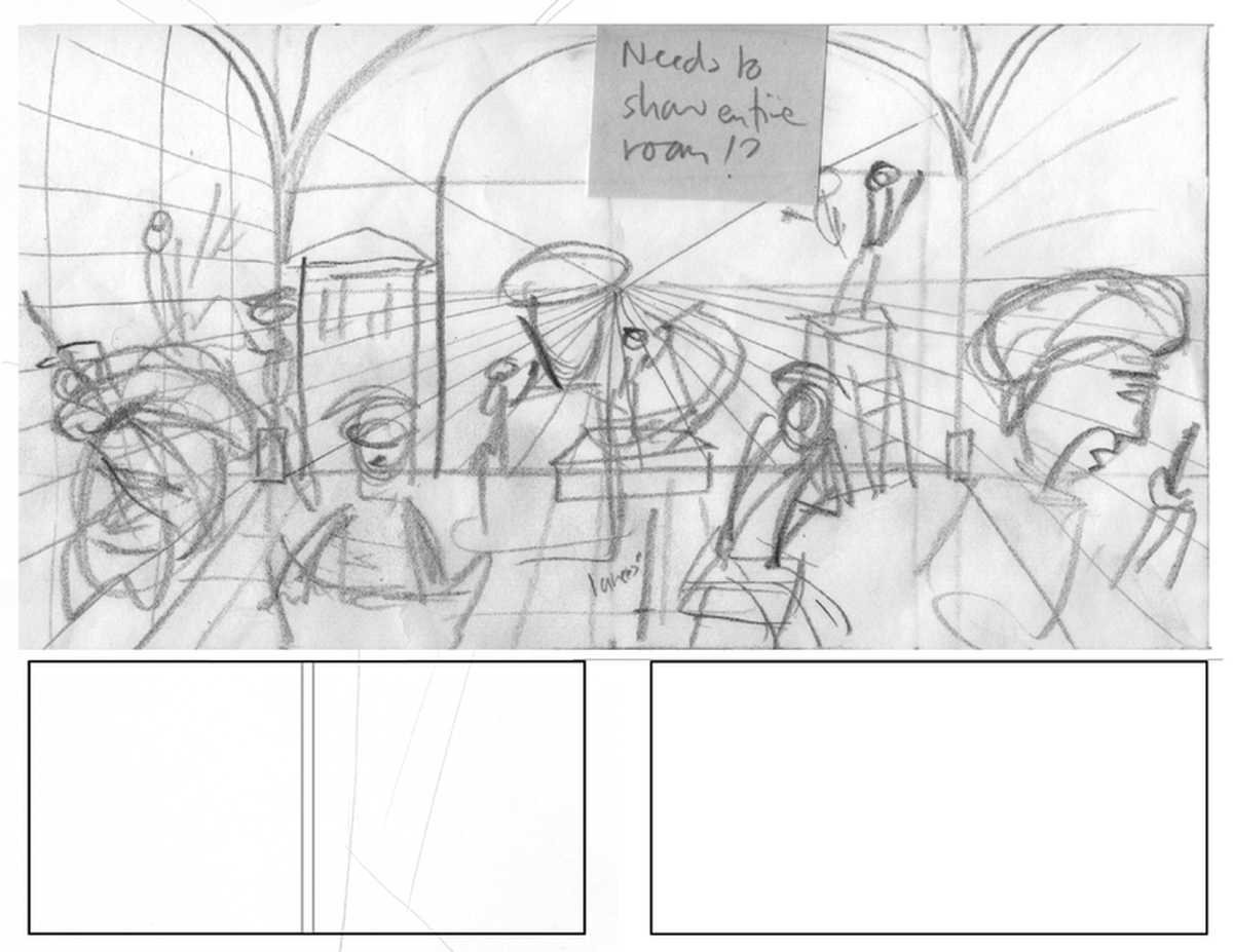 Figure 1 - Scene expanded from a single row on (what was) page 19 to a spread on pages 20 and 21. The bottom row on the left hand page will be an in-progress drawing for one of the panels. In the right bottom row I could bring forward the dialogue with the patron, currently on the final page (Figure 2, below). That in turn would allow a larger scene of Uccello being reunited with his wife on the final page. 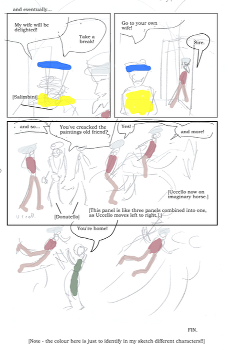 Figure 2 - Thumbnails for last page (previously 20, now 22). The last page (thumbnail, Figure 2, above) may look unresolved, although I do have a concept. In row 1 his patron approves progress and releases Uccello from his effective incarceration at the former's house, i.e. site of the work. As noted above I may move this to the previous page. In row 2 we see him on his way home and he meets his friend/rival Donatello in the street. This is like three panels without borders (and a bit like the quasi motion effects we will see in his drawing/painting). Donatello has gently mocked Uccello for being too caught in his perspective grids, so this row aims to be quite free-flowing in contrast, to suggest Uccello has gone through a catharsis. To the right of this row we see him on an imaginary horse - mirroring the one he is imagining on page 1 - but now he is not only a rider, but leading the charge. The final row sees him re-united with his wife. As it stands just now, he appears on the (imaginary) horse - this mirrors his neglected wife's frustrated desire seen on page 3 as she imagines Uccello's earlier equestrian monument to the dead hero. In the final (un-bordered) panel Uccelo is floating above a landscape in the shape of his wife (her name is unknown) - this is meant to suggest both a rekindling of their relationship, and the Uccello is cut loose from the constricting grids of his worldview. Thought I may still use some kind of looser visible construction framework. I had initially thought to overlay on an image of the wife early in the story, Uccello's drawing of a chalice - this seems to evoke the female form, and humorously suggest his vision of her as simply a set of mathematical shapes. I wasn't sure it fitted at the beginning, but I'll see if it fits at the end. 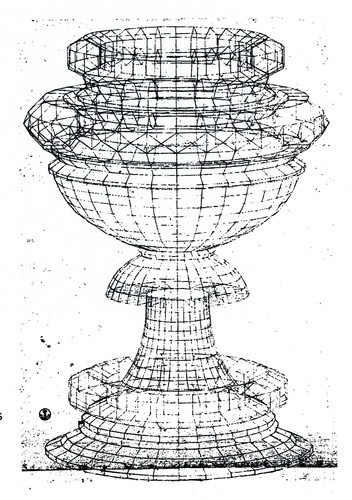 Although I have drawn later pages, I still haven't drawn page 12 where Uccello sketches horses. This is partly because I thought there was some benefit in drawing/revising all the 'drawings of drawings' at the same time for consistency. The first panel was to show a horseman in the foreground, with Uccello drawing in the background (reprising the very first panel), but I thought this would benefit from being bigger. That panel will now better mirror the first page, by being the same size, also it lets me extend (his old master) Ghiberti's comments from the previous page (Figure 2), onto the added page (Figure 3). 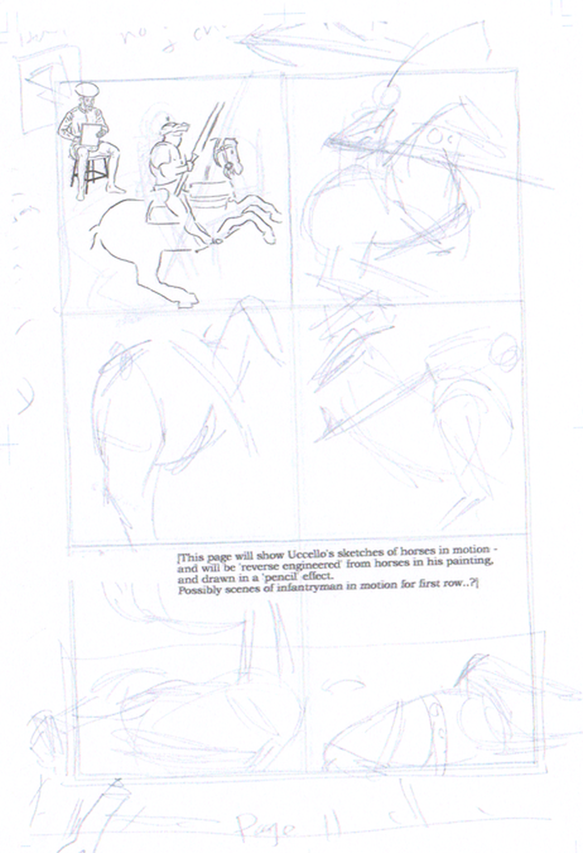  Figure 2 - Amended previous page, with Ghiberti's dialogued edited to continue onto the next page (Figure 3, below). 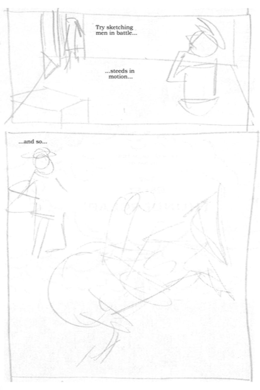 Figure 3 - Thumbnail of what will now be page 12. Panel 1 shows Ghiberti talking, while leaving Uccello to ponder the advice. Panel 2 shows Uccello in the background drawing a horseman. 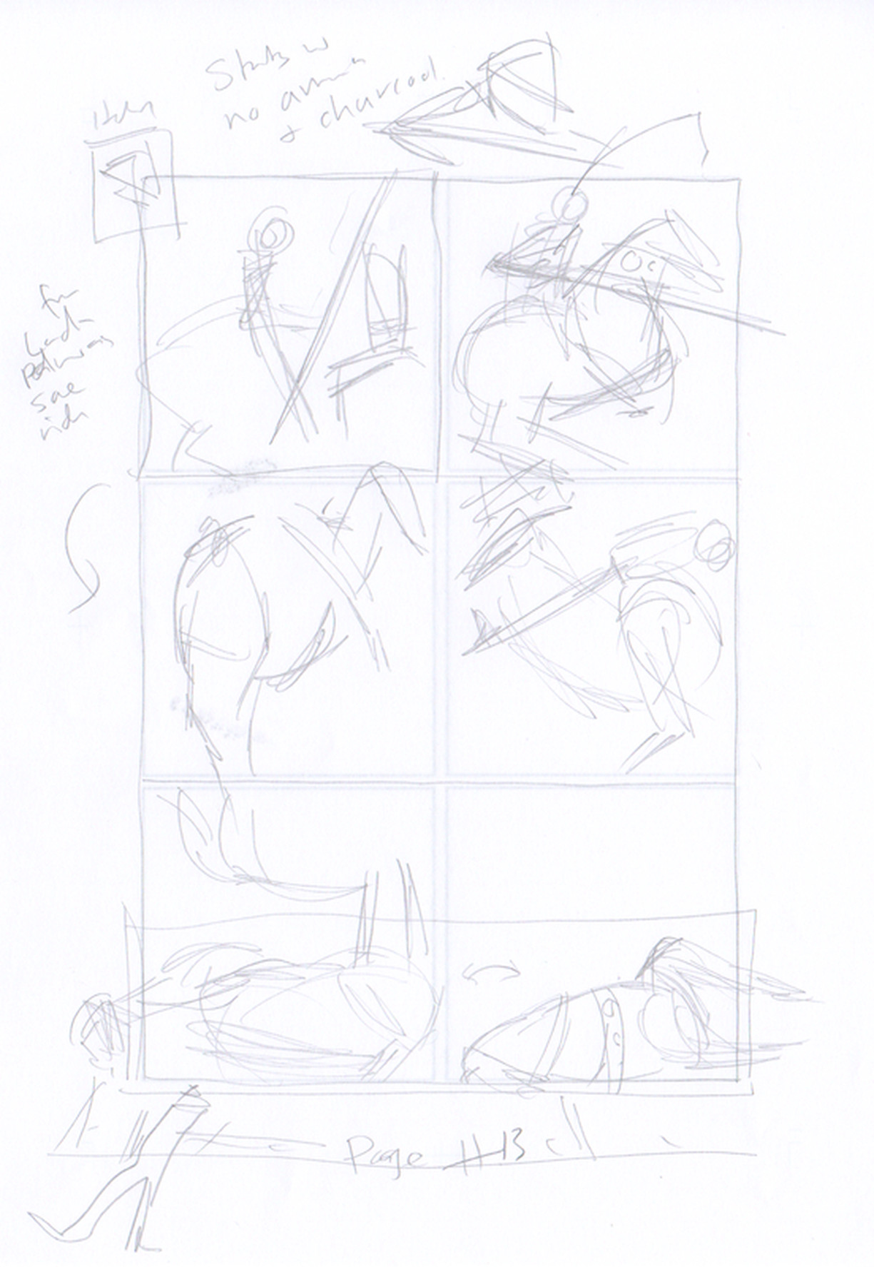 Figure 4 - This was page 12, now page 13. It's mostly (drawings of) drawings of horses, Thought I might include some 'real horses' on the top row. I've now drawn the figures for rows 2 and 3 (Figure 1). I'm quite pleased with the drawing of the armour, though I may go back and change panel 1 if time permits. I had t do some investigation of armour and how it works, re the helmet; as I suspected, it is split into a neck section or bevor (as Uccello is wearing in panel 3), and a top section, or sallet (as Rocco is putting on him. I think this makes better comics, in that there has been a further action happened between the panels (i.e. putting on the bevor), and it adds up better to a staged process of putting the armour and helmet on. I still need to remove the helmet from panel 1, and have Rocco holding something - perhaps the left gauntlet. It was quite difficult to get the two figure posed suitably in relation to each other (even making use of the 3D models). This also required getting both figures correct in relation to the stool, lacing rococo's hand so that the shape of the helmet read clearly, and capturing the moment as Rocco is putting it on. I was quite please with my solution of angling the helmet, as it both shows Uccello's head complete and emphasises the aperture at the bottom of the helmet. I had thought it was good idea in a story about perspective to use tiled floors, but had underestimated quite how difficult it makes it to place items without unsightly and confusing tangents. It's doubly hard when there's a stool involved - you've got to try and neither have any of its legs confusingly hidden, or have then line up with the lines of the tiles. I put the figures and stool in a folder together, and 'under drew' them in white (i.e. instead of deleting parts of the tiled floor) and spent some time moving hem around slightly to get the best placing. I could only move it small amounts, as i think this story (being so focussed on the accurate depiction of space) need proper continuity in the proportions and perspective of the room, and in particular, the placing of the stool. It's only Rocco's right leg that ends up with awkward tangents. It may be that it will be less of an issue once it's coloured, as the tiles will be similar tones and he lines between them less noticeable. I might be able to redraw/move the leg slightly, but having established an expectation of relatively believable figures, it might involve having to redraw the whole figure. I had originally intended that in panels 3 and 4 we would see Uccello's imagining of the battle scene around him instead of the room (Figure 2 shows my sketches in blue), however I felt this was a bit rushed on the page: it needed an element of time as Rocco talks him into the scene, and also I thought we needed to see Ucello on the stool in the room, before fading to himself on a horse in the battle. At the same time, I was thinking about making a wide panel later in the story into a double page spread, and this required an extra page before it to have the right pages facing, so it made sense to add an extra page to extend this sequence. I also removed some text from my original version (Figure 3) onto the following page. In panel 4, I logically need to add Rocco to the scene, which is a shame, as I think there is something powerful and poignant about the armoured figure alone on the stool in the room. I will add to this panel, the beginnings of Uccello's imaging of the scene at the battlefield (with no figures at this stage): this will reference, but not quite match the final painting. 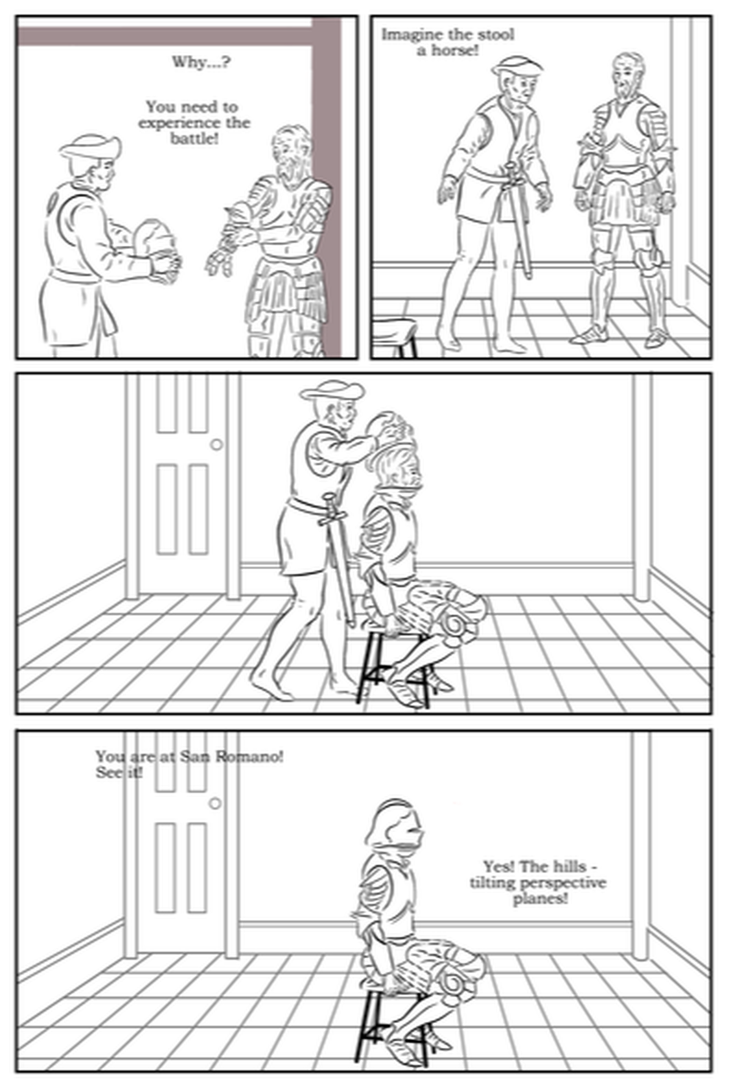 Figure 1 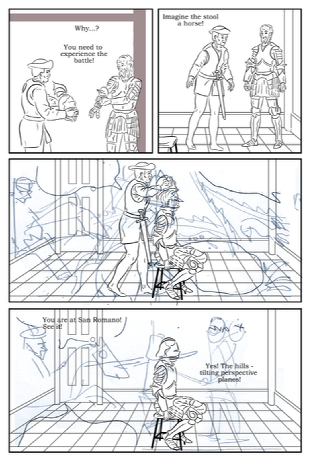 Figure 2 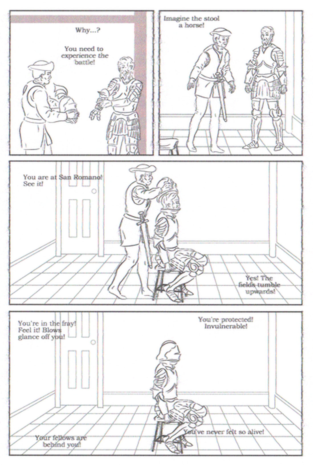 Figure 3 |
AuthorGraham Johnstone ~ Master of Design - Comics and Graphic Novels student 2016-17 Archives
August 2017
Categories |
 RSS Feed