|
the This is the biggest panel in the story - the full width of two pages, and elegantly reflecting the 5' high by 10' wide proportion of the paintings that are the subject of the story. The panel below is meant to suggest multiple depictions of the artist in a single room, working on the paintings, as such it reprises a scene on page 14 (previously posted about when it was page 13), that uses a similar effect, so this panel reprises, but also escalates that by: including more figures of Uccello; showing a bigger area of the room, and being actually bigger (double the size) on the page. I had proposed to make this almost a cutaway view of room, but wonder if it's better just to focus on him drawing on wall what will be the first painting. This will also give me an image I can use adapt for the cover and end-papers. 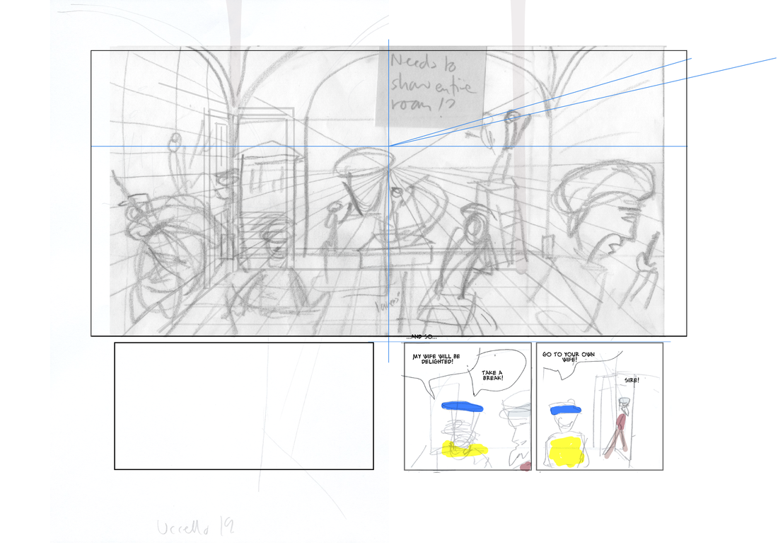
0 Comments
My web platform Weebly is doing some really annoying things! On the post below all the images are full width on the edit version, but then it publishes with some of them really small. That's particularly useless for this post where it's about texture overlays, that are invisible at that size! I've tried 'fixing' it and reposting, but whenever I refresh the public page of the blog it has the same problem. I don't know if it doesn't like me having so many bits of text between the pictures.
It's very frustrating! it's taken me about 90 mins for this post (and I had all the textures already in the pages). The textures must be really large files - it was freezing my (brand new) iMac for up to ten minutes just to import a page from Manga Studio! I'll have one more try just now, and then I'll leave it and try and fix tomorrow. UPDATE I've put horizontal dividers between the pictures and blocks of text, and that seems to have fixed it. I think I've said elsewhere that i was trying to stay fairly close to flay colour, in keeping with the work of my subject. I had discussed with the tutor applying and aged or distressed overlay to the pages, and I've begun experimenting with this. First of all I searched online for free to use textures. I found this plaster effect, which I thought would work because of the number of interior scenes with relatively blank space.  In the page below I tried two different things: the top panel has the plaster texture over the rear wall in straight greyscale. I would need to choose between approaches here - either make it the texture of the wall, and so remove it from the figures, or just use it as a texture over everything. I've done the latter on the lower two panels, where I also changed the plaster image to a brown colour. This works fairly well over everything - it's quite subtle, and adds a bit of visual variety. The brown works here as a contrast to the green of the background, it might not works so well on the (majority of) scenes with brownish walls. I could probably change the colour of the plaster texture for individual scenes, without it being noticeable to the average reader. In each case the plaster texture is at 30% opacity The next question this raise is - should the texture be over the gutters and page borders? If so would it need a subtle flat colour over all the white areas?  I then tried a 'distressed' texture, as seen below. This, in contrast to the subtle tones of the plaster texture, was more high contrast black and white. 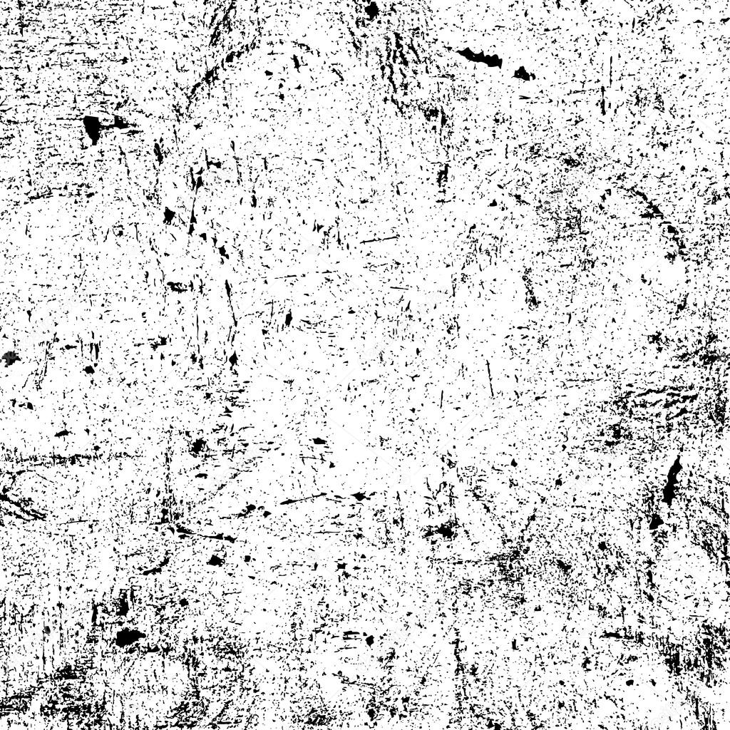 I converted this into an ochre colour, and overlaid it on the page below at about 10% opacity. Here I extended it over the white border and gutters. This scene is a the bedroom of a very rich man with a new young wife, so it won't make sense if it looks like the room is shabby - it needs to be clear it's the picture.  Here's a further version, which adds a high contrast version of the plaster image, and a cream/paper colour underneath the colour flats layer. I think the cream improves the effect on the 'white' areas, and the extra texture softemns the overall effect 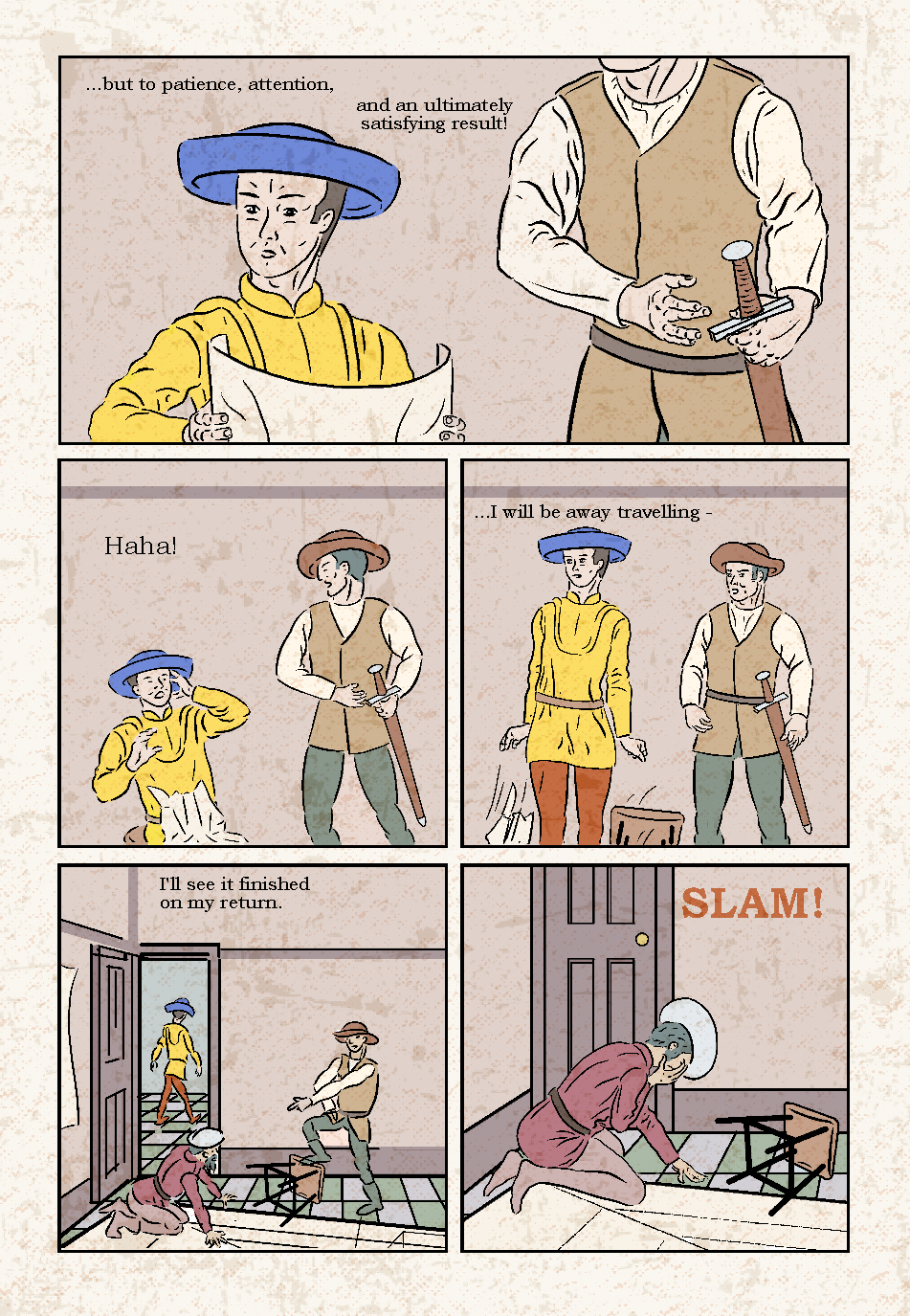 I also worked with the distressed image, using the magic wand an fill tools, to add a cream/ochre overly, that omitted areas, leaving some useful whites, as below.  I the overlaid this on a page, as shown below. 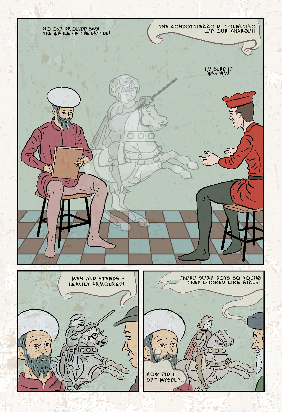 I'm undecided about the one above: the texture layer on it's own looks aesthetic, but overlaid on a page the distressed marks are perhaps too noticeable in places and too subtle in others. It looks like marble though - which would make it work well on the tiled floors.
I had already decided on the 'Alex Toth' hand-lettering font, and as I work through the pages preparing them for flatting, I have been changing the lettering as I go along. The eagle eyed tutor had spotted in my pages (with the original typeset style font) that some text blocks, even on a single page, had different letter spacing. This is s strange effect of having imported some text to Manga Studio 5, from version 4. This effect remained, when I changed the font to Alex Toth. I previously reduced the font size to 7. partly because it reduced the line weight, which I felt was a bit heavy for my drawn lines, however I wondered if that was getting a bit small. It may be that the wider spacing makes it easier to read. I couldn't find a way in the settings to change the letter spacing, is I had to copy then paste a block of text with the wider spacing, and then change the text - a bit laborious, but worth trying on a couple of pages to see if it looks better. On page 6 (see post immediately below) the first version shows MS5's regular spacing, and the second and third post the wider spacing. I had originally in my short version of the story created my own type of balloons, which aimed to look medieval - almost like the scrolls and banners sometimes used in art as photo word balloons. I'd thought os using a different type for each character. I wonder now though if what might have been charming over four pages would become tiring over twenty two pages...?  Figure 1 - showing both spacings on Alex Both font, and my original balloons. I have been leaving the balloons to the end, as I find it easier to do such things all in one go. However, just to make the text readable on my flatted draft versions I roughly marked underneath the text (where required) with a 150 sized marker, and added some ballon tails - I actually like the look. I have made the wide approx70% opaque so it takes some of the colour below. It works on the examples, but experience suggests that it gets complicated riding this over visually busy areas. If opting for this particular style. I'm sure I could finesse it better.
There is a further example of these ad hoc balloons in the post immediately below. This page was originally contained drawings pasted from my original version, though I previously redrew the two faces in panel 1, and the figures in panel 2. I'm wondering if I could get away with the figures in panel 3 - although noticeably less good that where I have used MS5's 3D models (e.g. panel 2) - they are pretty tiny, so I might get away with them, or a quick re-ink without posing models. The drawing of the rider reflects my use of high 'stabilisation' at first, and so looks slightly incongruous, however, it is Salimbini's imagined image (one could fairly say 'fantasy image'), there is a logic that it is more stylised, as with Uccello's (un-named) wife's differently imagined version of Uccello's painting on the previous page. 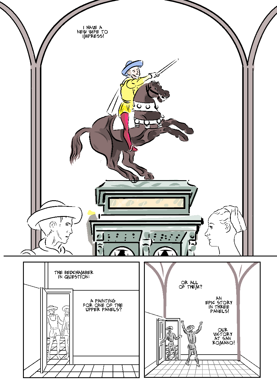 Below is the page ready for colouring. In panel 1 I redrew the male face, the horse, the plinth and the arch. I redrew panel 3 entirely.  And below is the flat coloured version. It looks a lot more coherent that what I started with. some of the adjacent colours are too tonally similar, but i hope I can fix that at the toning stage. There is a lot of single flat colour on this page, but I'm hoping that adding distressing/texture will address that. I'm thinking now that for panel 1, which is already an imaginary scene, I could add as perhaps a translucent overlay of an imagined landscape - perhaps san Roman as seen in Uccello's paintings that are the subject of the story. 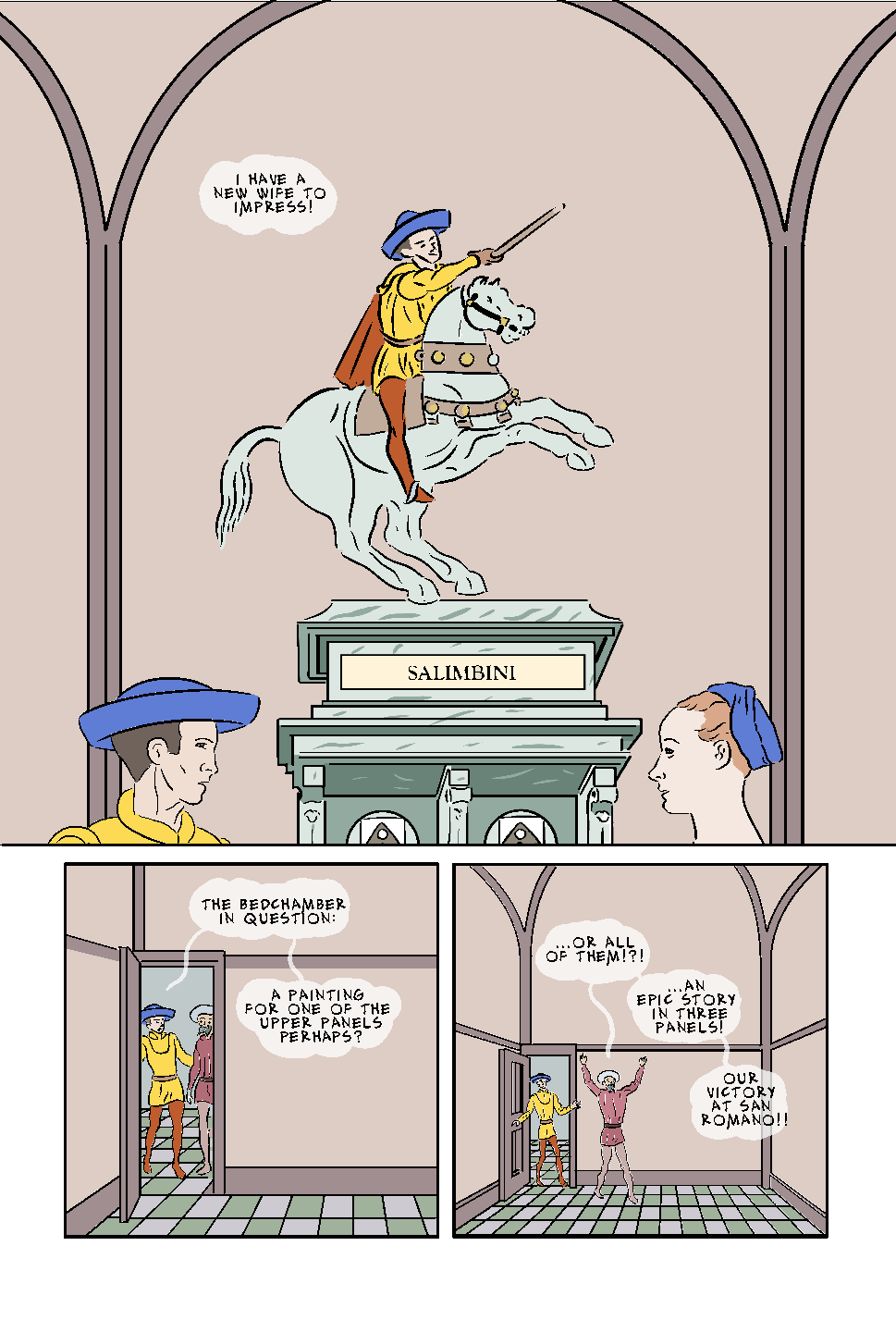 This was one the earliest pages and drawn in MS4 with relatively high 'stabilisation' on the lines. I think it generally works in itself, but does look a bit incongruous with later pages ( and indeed panel 1 of this page, which was drawn later in MS5). 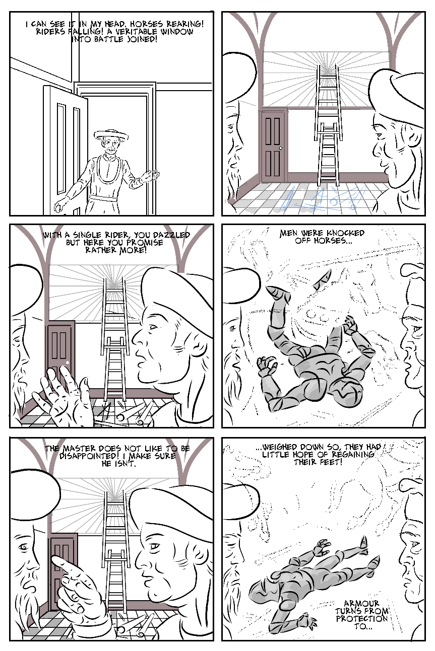 I'll alsoI redrew the background for panel 2, which was originally smaller (as one of 12 panels on an A4 page) and now looks less well resolved than the same view in later pages. I removed the ladder and perspective grid from the upper wall section (this is thought to be where the paintings were originally located, but I'm not going to show him painting up there). I need to apply some 'satisficing' (it's a conflation of satisfying and sacrificing), because I have some time pressure for my course work, and in the longer term, I do want to be able to work faster and more productively. On that basis, I decided to redraw (or rather - re-ink) the Uccello faces (on the left here) with low stabilisation, for consistency, but leave the Rocco ones (on the right), as he is drawn nearer that style, and there are no other close-ups of him that will look different. Later drawings of armoured figures are more fully realised, but that works here as these are imagine images, and so imperfect. Having so fixed panel 2, I did the same to panels 3 and 5, but for the background, simply pasting it from the improved version in panel 2. I redrew (or rather - re-inked) Uccello in each panel, and in particular, made his hat consistent with how it is drawn elsewhere. I had previously redrawn the witness from panels 4 and 6, which had been even more in need of it. I also hid any colours or toned layers, in order to create my bitmap for colouring. This involved having to draw outlines for the wooden beams in the background, and I'm not sure that will actually look better. I' may omit from the bitmap layer, which will allow me to either fill or hide them later. I'll also omit the 'pencil drawn' style imaginary battle scenes from the bitmap 'inks' layer. The next step is colour. 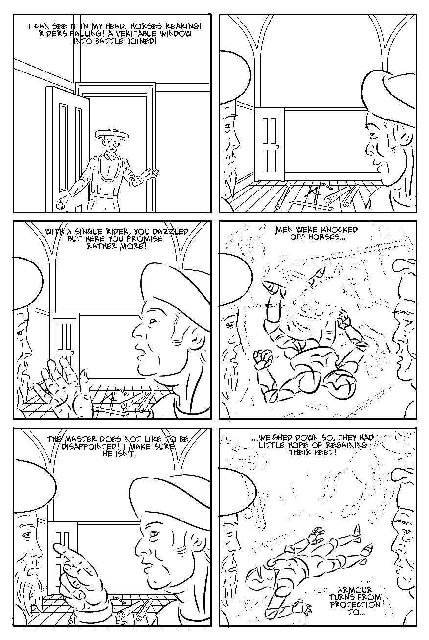 Below is the colour flatted version.  Further to my earlier post about this, I tried two different approaches to the same image. The version immediately below was exported from MS5 at 200dpi PNG, and then cropped and resized in my web editor. the version below that was exported at 150dpi PNG, and is noticeably better quality (though looks slightly pixelated in panel 1). Strange, but I'll use the latter method in future.   I don't know why those images below look so fuzzy - I export them at 200dpi, which I believe is better than screen resolution. I'm not sure if the problem is that that is an incompatible size, or if something happens to the image when I crop (they automatically export from MS5 as A4 pages, and so with a large white border - cropping the border lets them appear bigge) and resize in my web editor.
They take long enough to export at 200dpi, I don't want to have to redo them. In the pat they have appeared fuzzy in my web editor, and then fine when view my published site on a web browser. As I go through the pages to colour, I am also making any necessary corrections and improvements. On page 18 this included changing panel 1 with Rocco holding a helmet, to him holding a glove - this is more logical, as in the following panel, we see Uccello has the second glove on, In practice this wasn't as simple as just erasing a helmet (I usually create these items on different layers, which makes it easier to e.g. copy and paste for other panels) and drawing a glove. In the original, his left hand was hidden by the helmet, and in trying to pose the right hand correctly I had to repose and so redraw the whole figure of Rocco. I am quite please with the drawing of the glove, as the angle and way it is held, with the arm opening pointed toward Uccello, I think, accurately conveys it being proffered to someone to put on After fixing the glove, I completed the colouring - only to realise that I had drawn a right-hand one, when it needed to be left-hand, so I had to go back and fix that. This led to a further issue that Uccello's hand with the other glove seemed disproportioned, and generally not as well drawn. Also Uccello's bare hand was somewhat fudged. This panel had been my first attempt to draw armour in detail - it was okay but somewhat inelegant, and seeming a mass of lines. MY next attempt in panel 2 was, I think, much more successful - it had a generally more confident and controlled quality to the lines. Also keeping the breastplate uncluttered, as a strong white shape seemed to hold the whole figure together. Anyway, as I had to fix the glove in panel 1, I decided just to redraw the whole suit of armour. This did take some time, as i had to make sure it was consistent with panel 2, however, in the end I think it is a small, but significant improvement, 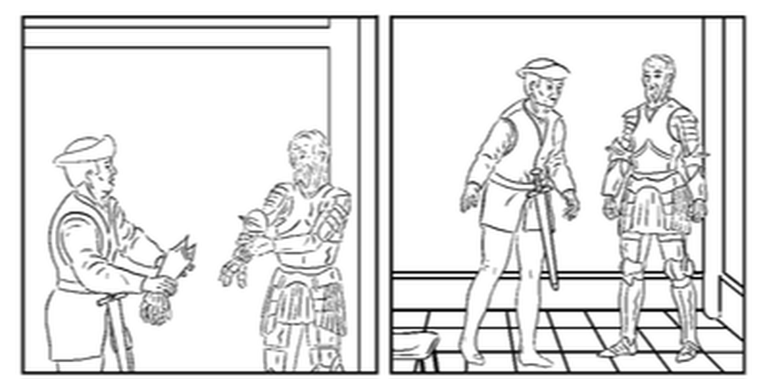 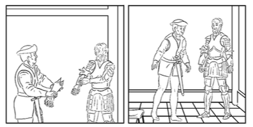 When working on the line art I had in fact made the background reduced opacity, to compensate for the lines being heavier than the figures. This looked good in black and white, but I had to restore the backgrounds to 100% for creating the inks layer. In fact, once they are coloured, the line weight is not a problem. It's worth noting here that I do go to some pains to have aesthetically pleasing lines, that make use of my pressure sensitive graphics tablet, for varied weights. I also use the Stabilisation feature for ink lines_ having this turned up fairly high for armour which requires smooth clean lines. I slightly lower the stabilisation for e.g. Rocco's belt, and sleeveless jacket, which is also meant to look like thick, stiff leather. I draw Rocco's face with medium stabilisation - as he is meant to be a strong and simple man, whereas I use less stabilisation for Uccello's face. I also use low stabilisation for drawing fabric (in this example - Roccco's sleeves). For a difficult line, I can delete and redraw it several times to get the best effect - one advantage of digital over actual pen and ink.The problem that goes with this is that's it's easy to forget to change the stabilisation back - you can the finish the drawing and have decide if it can be left, or needs redone. 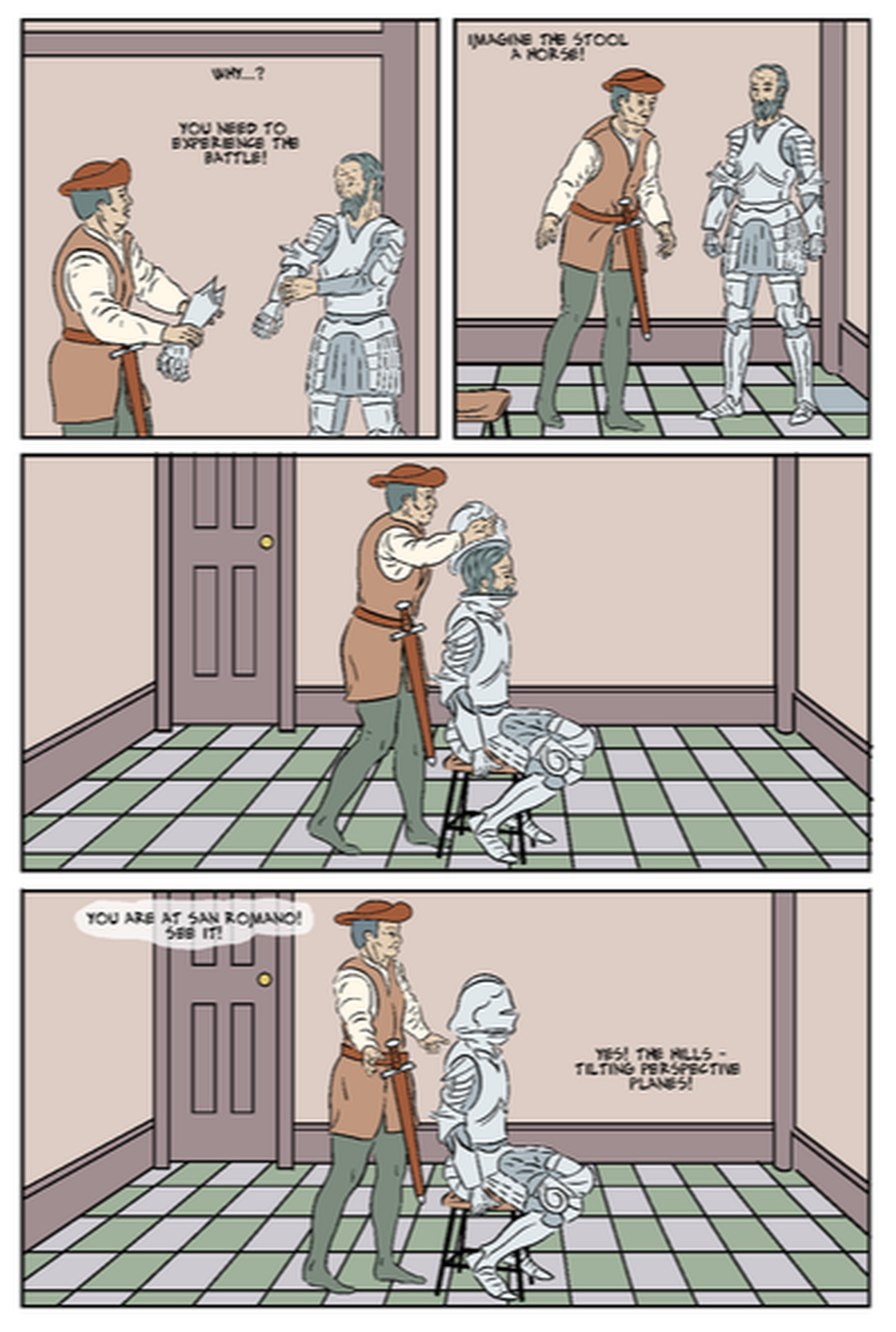 Above is the colour flatted version. as noted above, I had done the colouring before I noticed the glove error. I created a new bitmap layer for the changed drawing, and overlaid that on the completed colour, and then amended the affected area. This took slightly longer than anticipated - there were white lines where ink lines had been erased, making it a fiddly job to fix, especially with the pale colour of the armour. In future it would probably be easier to just select and delete the amended item from the colour flat layer, ands just redo that part from scratch. It would just depend how much needs changed. Some of the tonal relationships in the coloured version are not ideal - the faces and armour are perhaps too close to tonally close to the background, but I should be able to fix that with a tone layer. Pnals 3 and 4 are reprised (n reverse order) on the following page (Figure 4, below), so I have copied and pasted in the colour layer. Once Uccello has the helmet on I will overlay his imagined scenes of the battle, but I'll do that on separate layers, using opacity levels, and possibly masks, but I am thinking at this point it is still helpful to have the flats copied in. I may remove the figure of Rocco from panel 1. 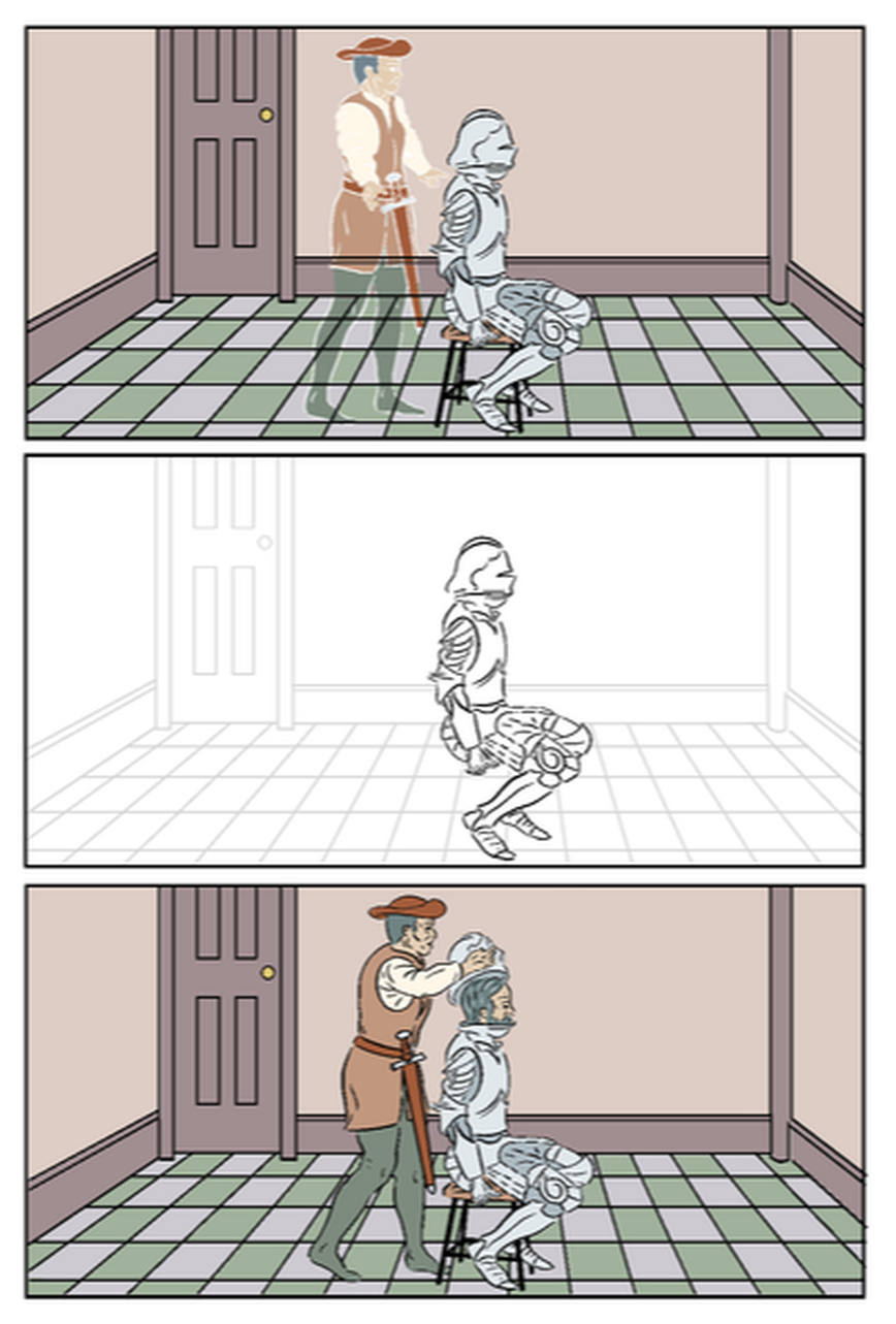 Figure 4 - Page 19 in progress. without any confusing tangentsI had this page inked a few weeks ago, and needed to do some further work before it was ready to colour. Most obviously, it needed the paper falling from Uccello's hands, that I have now added in panel 2. It took some work to both get this aesthetically composed in relation to the figures, to follow the continuity of the previous panel, and also suggest that it was dropped on hearing the klang. Also I wasn't sure if a key action was clear - that Uccello, (while backing away from the threatening Rocco), bumps the armour, so alerting Rocco to its presence, and giving him a crucial idea.. I had discussed this with the tutor, and suggested I add a small inset panel, giving the detail of the foot hitting the armour. While the addition of this inset made storytelling sense, I was worried it would look incongruous. I have based every page on permutations of a three rows / two columns configuration, and this was going to be the only exception. I decided to make sure the inset panel was exactly a quarter (by area - half of each dimension) of the otherwise smallest panel. This size also seemed just right for showing the key detail on the same scale as all the other panels on the page, The 'L' shaped gutter might I thought be too much of a solid, distracting shape, so I looked at angling this slightly, to offset this. In fact it took some time getting it right. There were several things I had to get right in this small panel:
For example it would have meant sense for him to kick a large item like the helmet, which could roll, but on its side it would not read well in the next (big) panel, I opted for one of the armoured gloves, which was nearest to him in the panel next, which I had already drawn. I superimposed a ghost image of this to suggest it moving, and added motion lines to show the movement of his foot and leg. I also made the moved glove move slightly out of the panel border. I also wanted to include the 'KLANG!' sound effect. To include all that, and get a pleasing composition, without any confusing tangents, took a fair bit of time moving the image within the border in all directions in increments of a millimetre or less. I initially had the complete 'KLANG!' in panel two and just 'NG!' in the inset, however, I was quite pleased with my solution of putting only 'KLA' in panel two. It makes the relationship between the two panels clear - the inset is showing us the cause of the klang. Part of why it works is that the word reads vertically so implying a movement down to the character's feet. This is supported by the character (in panel 2) looking down to see the source of the klang. I also had to redraw the armour breastplate, to be consistent with a more exact rendering in a later (drawn) scene. The placement of the box and tipped over stool (its legs pointing towards Uccello) emphasise that there is literally (as well as metaphorically) no easy way out of this. I have previously mentioned that I have been looking at the addition of texture/distressed effects over the pages, and I think that would help on this page. I may distort a texture to emphasise the perspective on the call to the right. These various examples highlight the number of challenges in what might seem a straightforward page, and the effort and creativity in achieving elegant solutions. There are some further tweaks I might make: addition of Uccello's drawing on the wall - for continuity (seen on the previous page), and this would also indicate movement between panels 1 and 2 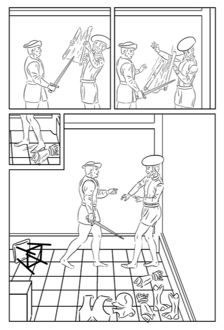 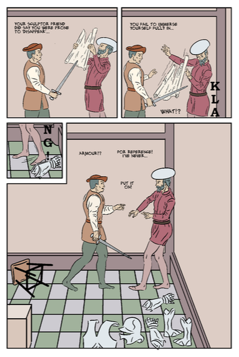 |
AuthorGraham Johnstone ~ Master of Design - Comics and Graphic Novels student 2016-17 Archives
August 2017
Categories |
 RSS Feed